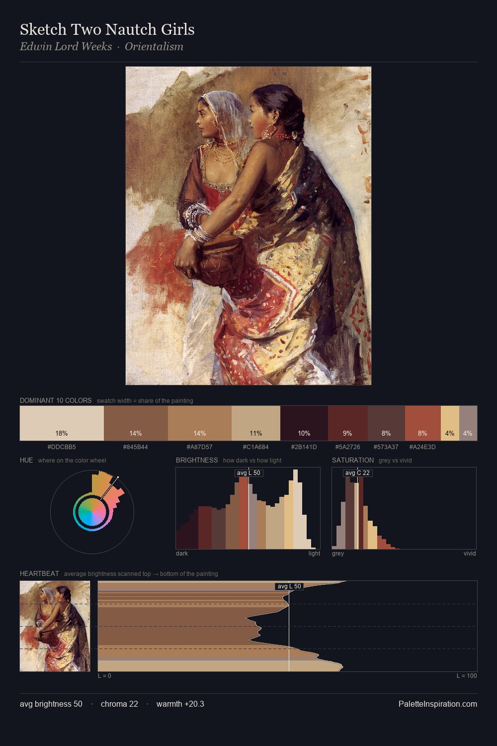
John William Waterhouse Palette 6

Palette Analysis
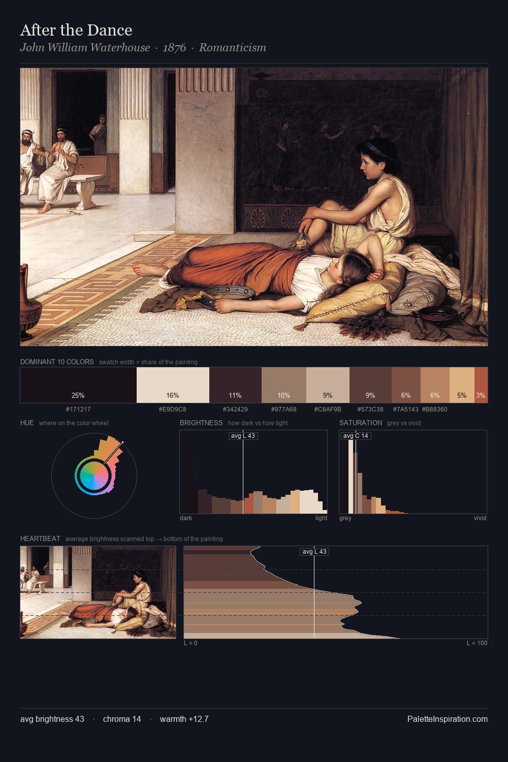
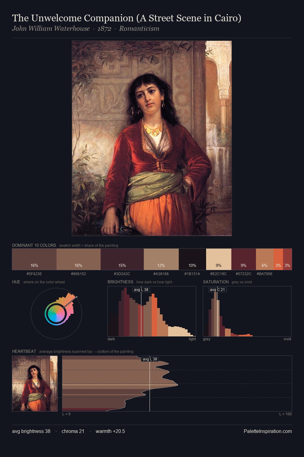
Values in John William Waterhouse rest in the mid-range - neither dramatically lit nor steeped in shadow. Temperature reads distinctly warm: the reds and earth tones from John William Waterhouse carry the compositional weight. Chroma hovers near zero; colour declares itself through subtle shifts in hue rather than outright saturation. John William Waterhouse gives 29.2% of the composition to a single #21181F - a decisive chromatic anchor. Only 3.4% is devoted to #A44540, yet that small allocation delivers the palette's entire chromatic tension. From deepest dark to palest light, the palette traverses 65 units of the value scale - a span that creates natural depth. Palette 6 sits within the larger chromatic argument that John William Waterhouse's complete body of work advances.
Example use cases
- theater design
- jewelry brands
- tobacco-adjacent retail
- event branding
- film & entertainment
I Love This!
Copy, export, or download for your project