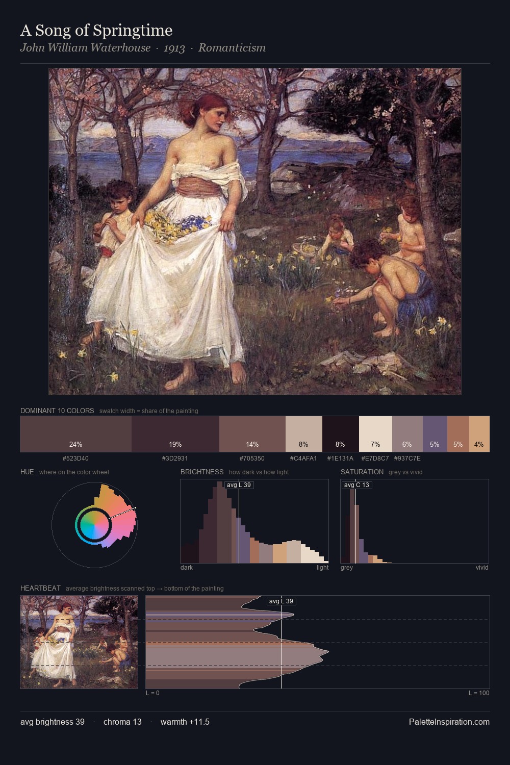
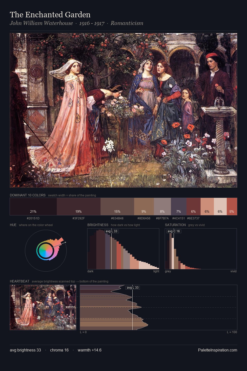
John William Waterhouse Palette 5
Shadowed Tawny
Shadowed Low-key - values weighted toward shadow, the palette of dim interiors and overcast skies.
Tawny Warm orange-brown - a traditional term for the color of tanned leather or lion fur.

Palette Analysis
Values in John William Waterhouse rest in the mid-range - neither dramatically lit nor steeped in shadow. Temperature reads distinctly warm: the reds and earth tones from John William Waterhouse carry the compositional weight. Every colour is desaturated; the palette proceeds through near-neutrals and gently-coloured greys. The saturated accent, #703335, registers at 6.4% - sparse enough to feel like a deliberate surprise. From deepest dark to palest light, the palette traverses 74 units of the value scale - a span that creates natural depth. This is palette 5 of John William Waterhouse's sequence - a single chapter in a chromatic story told across many works.
Example use cases
- ceramics & pottery
- boutique hospitality
- menswear
- heritage food brands
- craft & artisan brands
I Love This!
Use This Palette
Copy, export, or download for your project
Copy, export, or download for your project
Copy:
Download:
Share:

 Palette 6 - Shadowed Bister")


