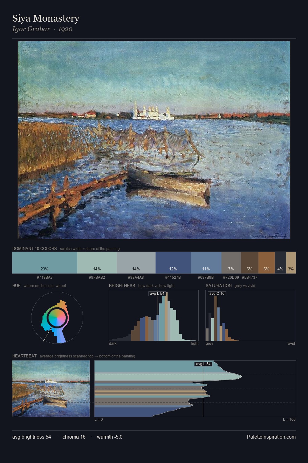
John Peter Russell Palette 5

Palette Analysis
John Peter Russell sits in the centre of the value range, lending the palette a sense of even, sustained light. Blues and teal-greys govern the palette, lending it an aquatic or atmospheric quality. Chroma is kept low across all colours, producing the soft, enveloping quality that characterises tonal painting. The highest-chroma note - #283867 - appears at just 6.4%, deployed as a precision accent against the quieter ground. 44 units of value spread create a palette that is varied but unified - contrast in the service of harmony. High luminosity and cool temperature suggest the plein-air condition: unfiltered daylight and open sky. John Peter Russell's palette 5 carries its own internal logic while remaining in conversation with the artist's broader colour intelligence.
Example use cases
- exhibition design
- foundation branding
- estate management
- art education
- museums & galleries
I Love This!
Copy, export, or download for your project