John Peter Russell Palette 1

Palette Analysis
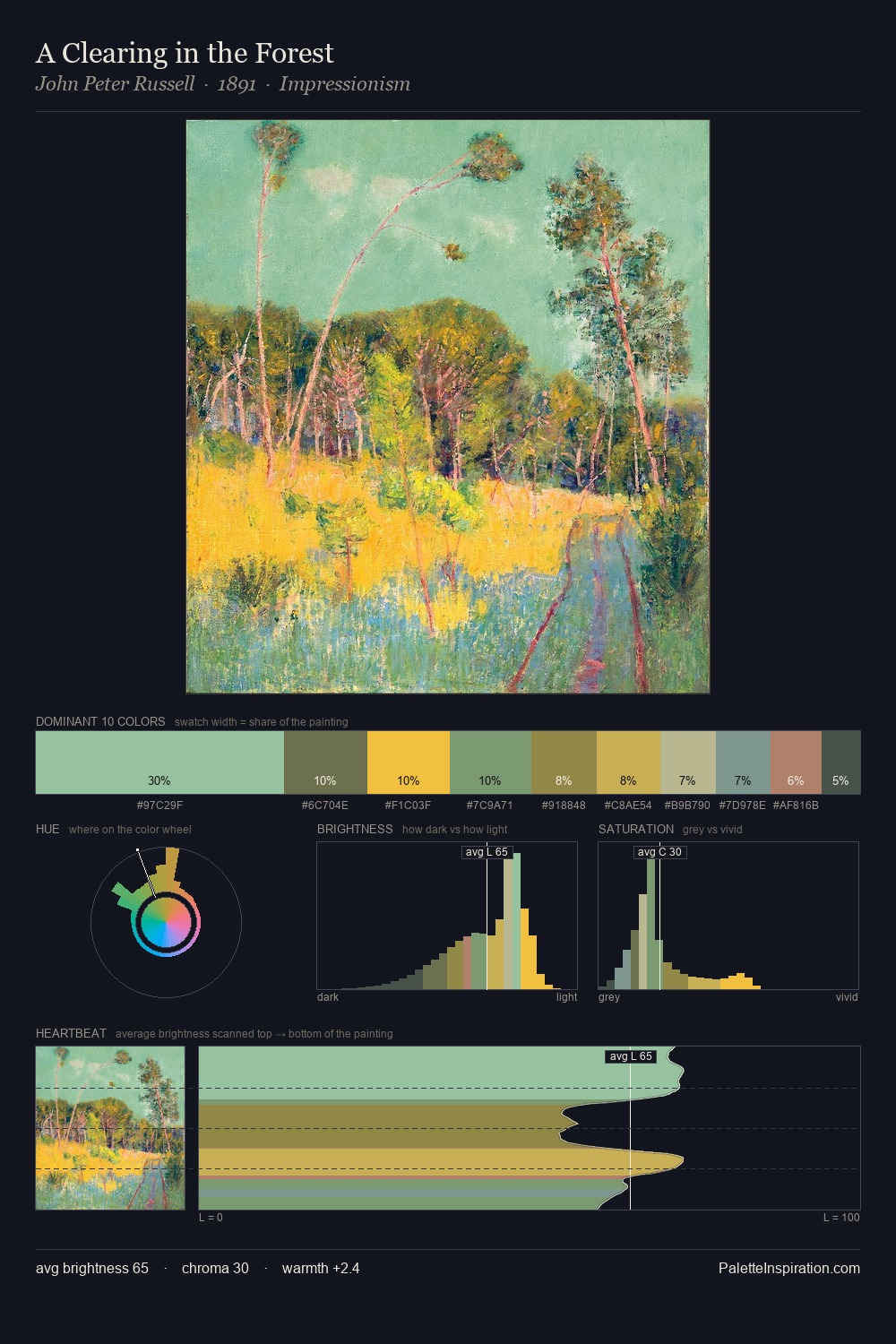
The high-key values of John Peter Russell give it an effulgent, almost bleached quality. John Peter Russell builds on cool foundations: the palette favours the blue-cyan-green arc. Colours are neither washed out nor blazing; they occupy the productive middle ground of the chroma scale. The dominant colour, #9EC4A3, takes 28.0% of the total area, establishing the overall mood before any other hue is introduced. Only 5.9% is devoted to #E0B15C, yet that small allocation delivers the palette's entire chromatic tension. 40 units of value spread create a palette that is varied but unified - contrast in the service of harmony. High luminosity and cool temperature suggest the plein-air condition: unfiltered daylight and open sky. This is palette 1 of John Peter Russell's sequence - a single chapter in a chromatic story told across many works.
Example use cases
- garden centers
- natural beauty
- park & rec design
- sustainable fashion
- sustainability
I Love This!
Copy, export, or download for your project