John Peter Russell Palette 2

Palette Analysis
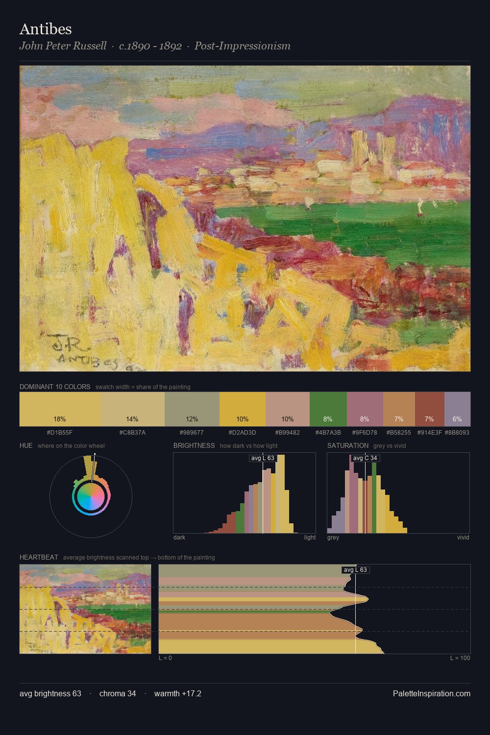
John Peter Russell works in the upper reaches of the value scale, creating an atmosphere of brightness and expansiveness. Warm and cool are kept in productive tension, creating the kind of chromatic harmony that sustains the eye. Chroma is held at a comfortable level - distinct colours, but no single hue is allowed to overwhelm. The most saturated colour, #51793B, is reserved to 5.0% of the surface, where it acts as a focal punctuation. Spanning 26 units on the value axis, the palette achieves the balance between tonal flatness and fragmentation. The palette reads as an Impressionist one - light-biased, chromatically direct, and built on temperature contrast rather than value opposition. This is palette 2 of John Peter Russell's sequence - a single chapter in a chromatic story told across many works.
Example use cases
- ceramics & pottery
- boutique hospitality
- menswear
- heritage food brands
- craft & artisan brands
I Love This!
Copy, export, or download for your project