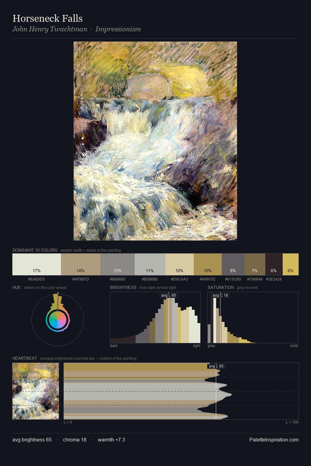
John Henry Twachtman Palette 9
Pale Ivory
Pale High-key and low-chroma - delicate, bleached, washed with light.
Ivory Warm creamy white - the color of natural ivory, warmer than pure white.

Palette Analysis
Values in John Henry Twachtman rest in the mid-range - neither dramatically lit nor steeped in shadow. Neither warm nor cool has the upper hand here; the equilibrium between the two generates the palette's visual energy. The absence of saturated colour is itself an expressive choice: this is a palette of restraint and atmosphere. #DDD8B7 functions as the palette's exclamation mark: highest chroma, lowest percentage (6.8%). From deepest dark to palest light, the palette traverses 69 units of the value scale - a span that creates natural depth. In the context of John Henry Twachtman's full range of palettes, group 9 represents one movement in an ongoing chromatic dialogue.
Example use cases
- exhibition design
- foundation branding
- estate management
- art education
- museums & galleries
I Love This!
Use This Palette
Copy, export, or download for your project
Copy, export, or download for your project
Copy:
Download:
Share: