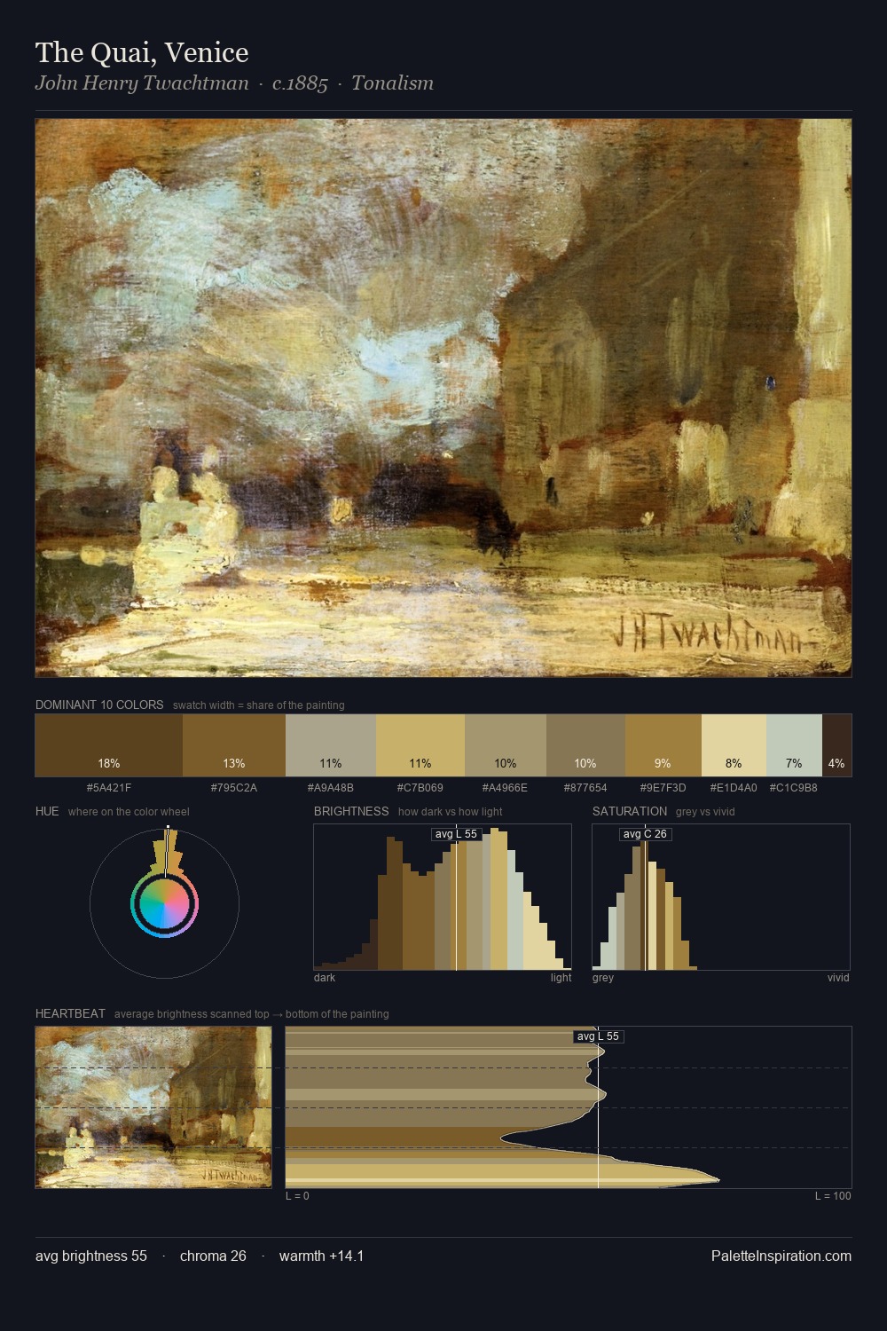
John Henry Twachtman Palette 11
Soft Bisque
Soft Low-contrast, gentle chroma - mid-key values and low saturation, approachable and calm.
Bisque Pale warm beige - soft, slightly pinkish neutral, the color of unglazed ceramic.

Palette Analysis
The value structure of John Henry Twachtman is mid-key: quiet, controlled, and cohesive. A distinctly cool atmosphere runs through this palette: sky, water, and mist given colour form. All colours lean toward grey, building depth through value rather than colour punch. #CBB364 functions as the palette's exclamation mark: highest chroma, lowest percentage (7.1%). The full value range is 63 units: broad enough to build convincing three-dimensional form. High luminosity and cool temperature suggest the plein-air condition: unfiltered daylight and open sky. This is palette 11 of John Henry Twachtman's sequence - a single chapter in a chromatic story told across many works.
Example use cases
- ceramics & pottery
- boutique hospitality
- menswear
- heritage food brands
- craft & artisan brands
I Love This!
Use This Palette
Copy, export, or download for your project
Copy, export, or download for your project
Copy:
Download:
Share: