John Henry Twachtman Palette 14

Palette Analysis
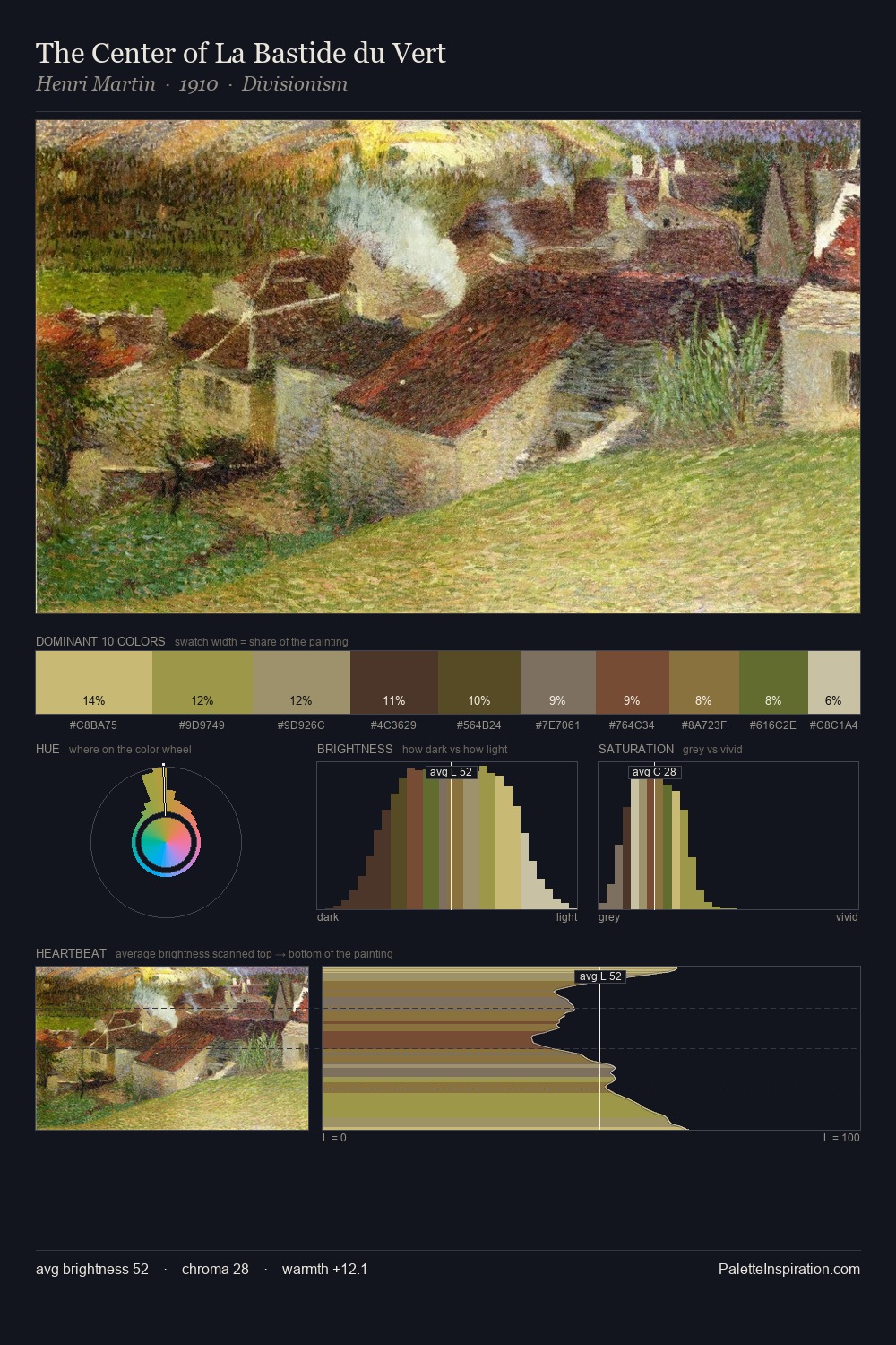
John Henry Twachtman keeps values measured and balanced, a hallmark of tonal restraint. Temperature is cool-dominant, with blue and green families claiming the largest areas. Chroma is kept low across all colours, producing the soft, enveloping quality that characterises tonal painting. The highest-chroma note - #D2BE7B - appears at just 8.8%, deployed as a precision accent against the quieter ground. At 51 units across the value scale, the palette keeps contrast readable without letting it dominate. The mid-to-high key, cool bias, and moderate chroma point to outdoor observation - sky and diffused daylight as the dominant light source. John Henry Twachtman's palette 14 carries its own internal logic while remaining in conversation with the artist's broader colour intelligence.
Example use cases
- craft & artisan brands
- specialty coffee
- home goods
- lifestyle retail
- ceramics & pottery
I Love This!
Copy, export, or download for your project