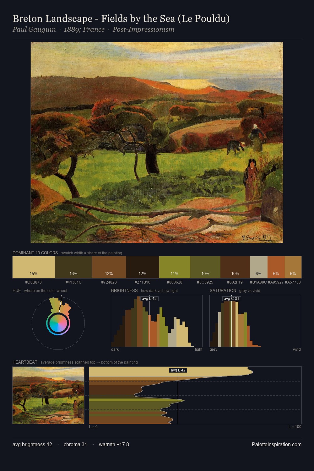
John Atkinson Grimshaw Palette 9

Palette Analysis
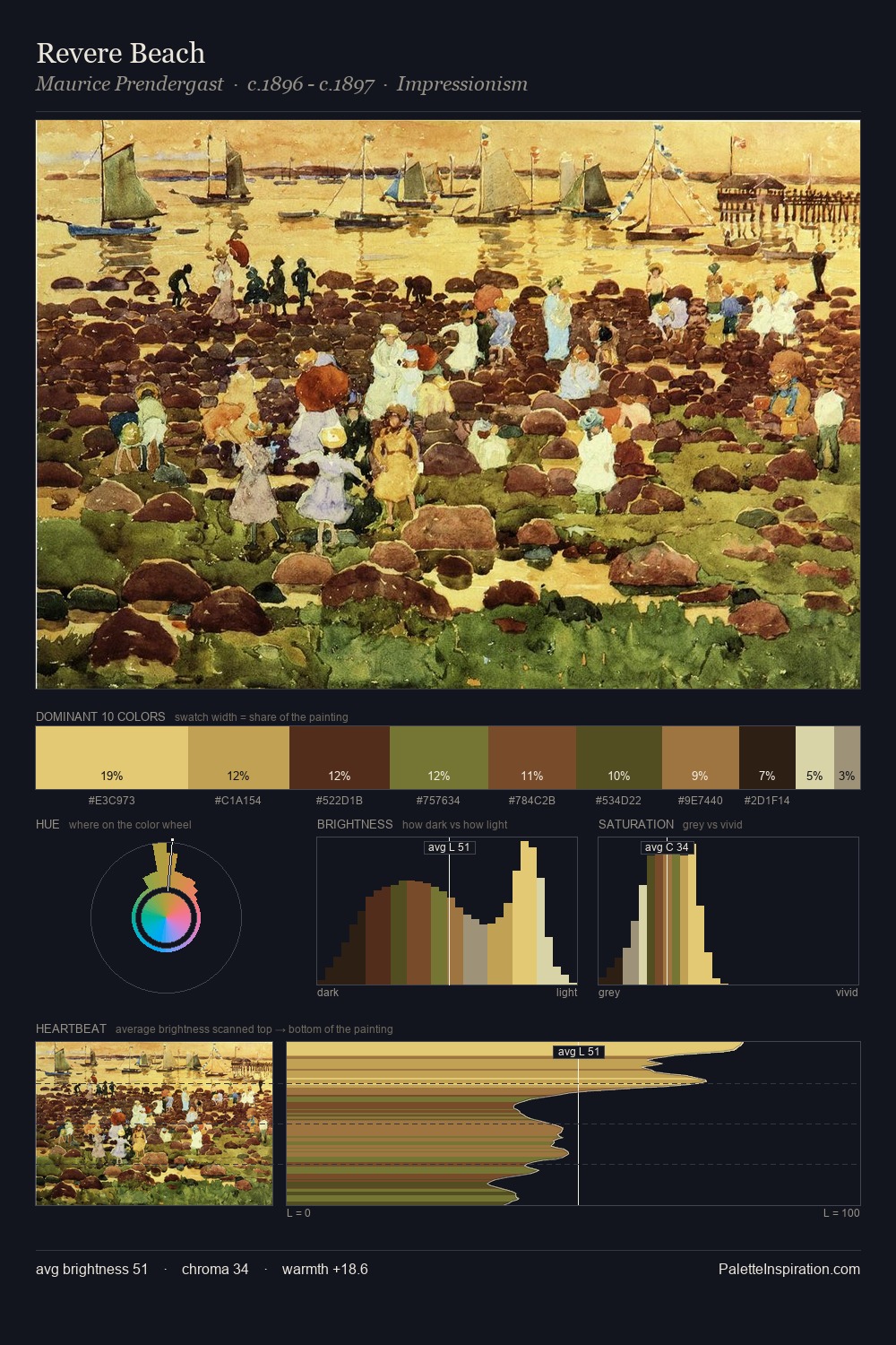
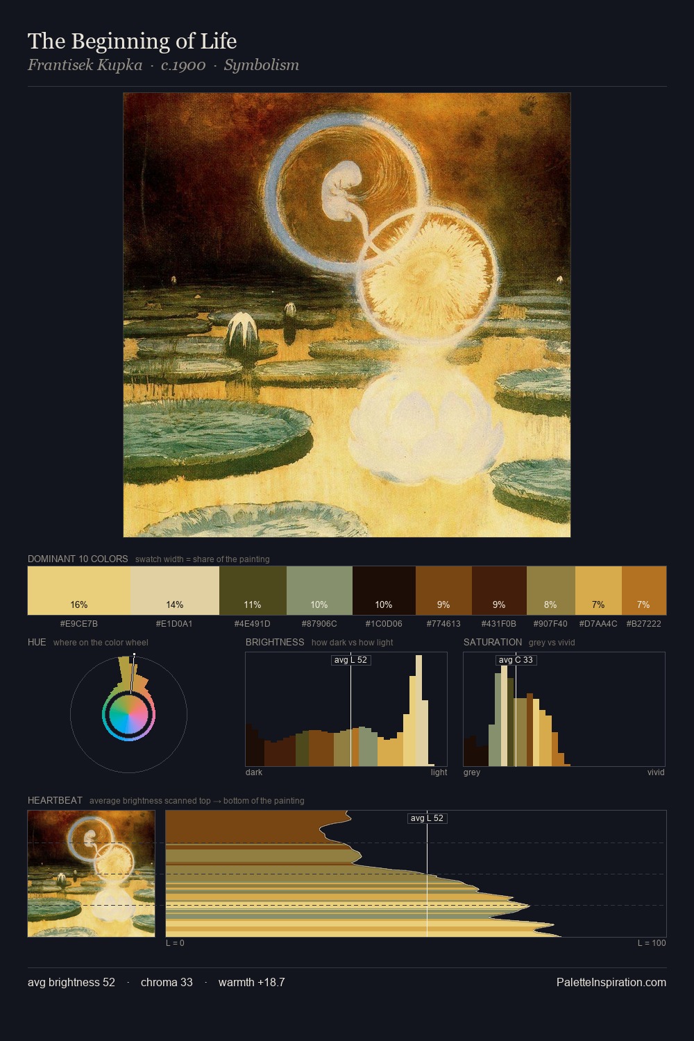
Values in John Atkinson Grimshaw rest in the mid-range - neither dramatically lit nor steeped in shadow. Warm and cool are kept in productive tension, creating the kind of chromatic harmony that sustains the eye. Mid-saturation across the board: the palette has colour character without chromatic excess. #F4BF74 at 21.2% is both the most chromatic and one of the largest colours in the palette - chroma as mass rather than as highlight. 56 units of value range underpin the palette's structural clarity: the eye always knows where light falls. The palette reads as an Impressionist one - light-biased, chromatically direct, and built on temperature contrast rather than value opposition. In the context of John Atkinson Grimshaw's full range of palettes, group 9 represents one movement in an ongoing chromatic dialogue.
Example use cases
- art galleries
- creative studios
- consumer goods
- lifestyle media
- professional services
I Love This!
Copy, export, or download for your project