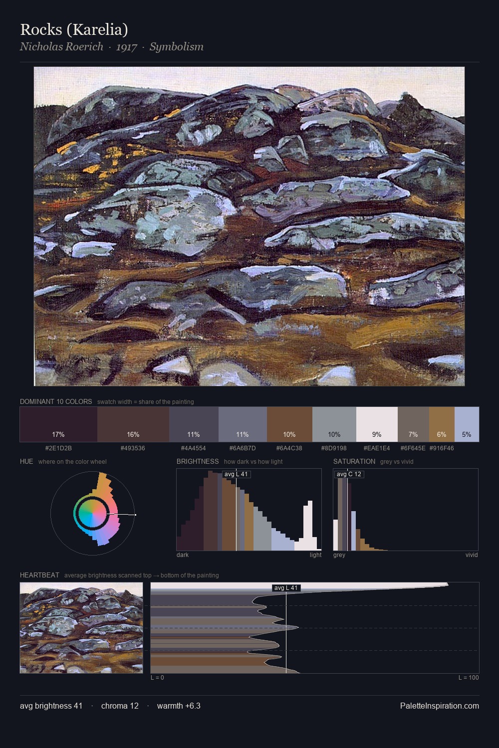
John Atkinson Grimshaw Palette 2
Muted Parchment
Muted Deliberately desaturated - chroma pulled toward gray, the restraint of tonal painting.
Parchment Aged warm neutral - the color of old manuscript parchment, tan and slightly yellowed.

Palette Analysis
Mid-key values give John Atkinson Grimshaw its characteristic quietness - nothing blazes, nothing disappears. John Atkinson Grimshaw keeps warm and cool in parity, a balance that lends the work a perceptual shimmer. Every colour is desaturated; the palette proceeds through near-neutrals and gently-coloured greys. Only 5.8% is devoted to #846F3D, yet that small allocation delivers the palette's entire chromatic tension. The value range spans 70 units across the palette, providing the full gamut from deep shadow to near-white and ensuring clear tonal hierarchy. This is palette 2 of John Atkinson Grimshaw's sequence - a single chapter in a chromatic story told across many works.
Example use cases
- exhibition design
- foundation branding
- estate management
- art education
- museums & galleries
I Love This!
Use This Palette
Copy, export, or download for your project
Copy, export, or download for your project
Copy:
Download:
Share: