Joachim Wtewael Palette 2
Muted Gamboge
Muted Deliberately desaturated - chroma pulled toward gray, the restraint of tonal painting.
Gamboge Deep golden yellow - a traditional warm pigment, rich amber-gold.

Palette Analysis
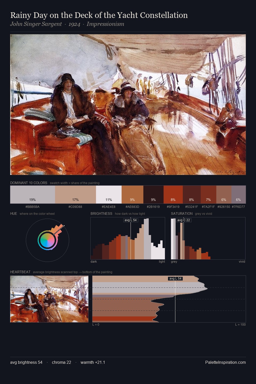
Values in Joachim Wtewael rest in the mid-range - neither dramatically lit nor steeped in shadow. Warmth dominates - the palette of Joachim Wtewael leans heavily on the yellow-orange-red arc of the colour wheel. The absence of saturated colour is itself an expressive choice: this is a palette of restraint and atmosphere. #C14220 delivers the chromatic peak at only 2.9% - a small shot of colour with outsized visual impact. From deepest dark to palest light, the palette traverses 77 units of the value scale - a span that creates natural depth. This is palette 2 of Joachim Wtewael's sequence - a single chapter in a chromatic story told across many works.
Example use cases
- ceramics & pottery
- boutique hospitality
- menswear
- heritage food brands
- craft & artisan brands
I Love This!
Use This Palette
Copy, export, or download for your project
Copy, export, or download for your project
Copy:
Download:
Share: