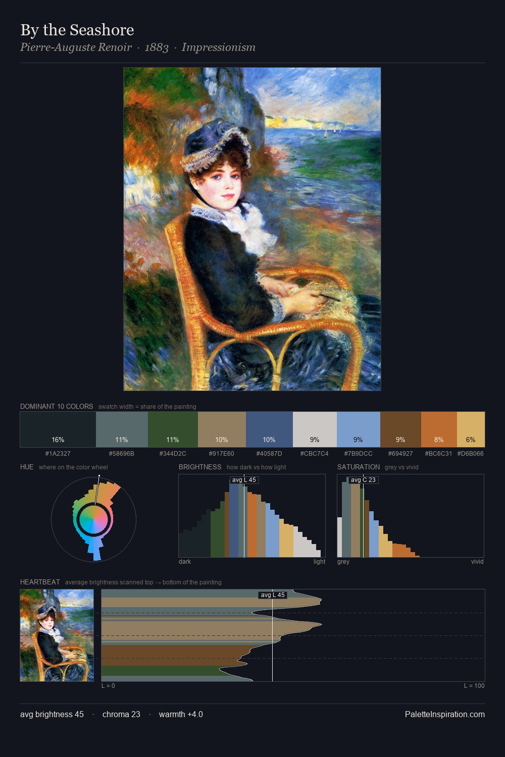
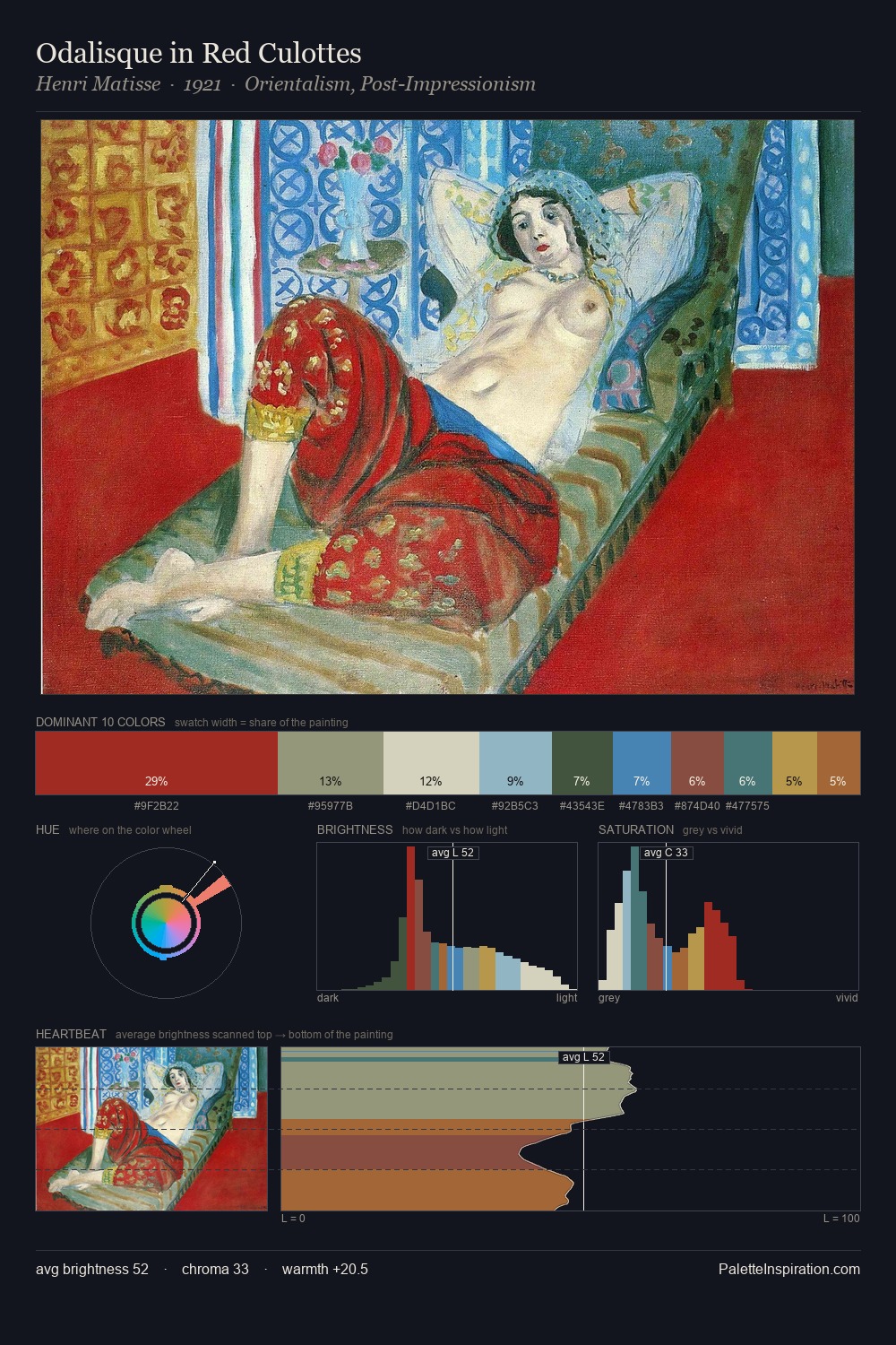
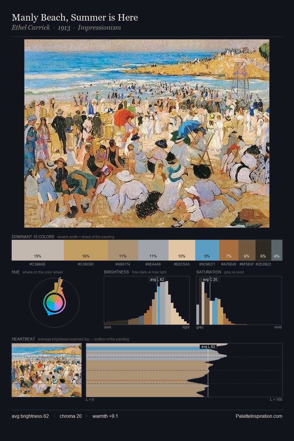
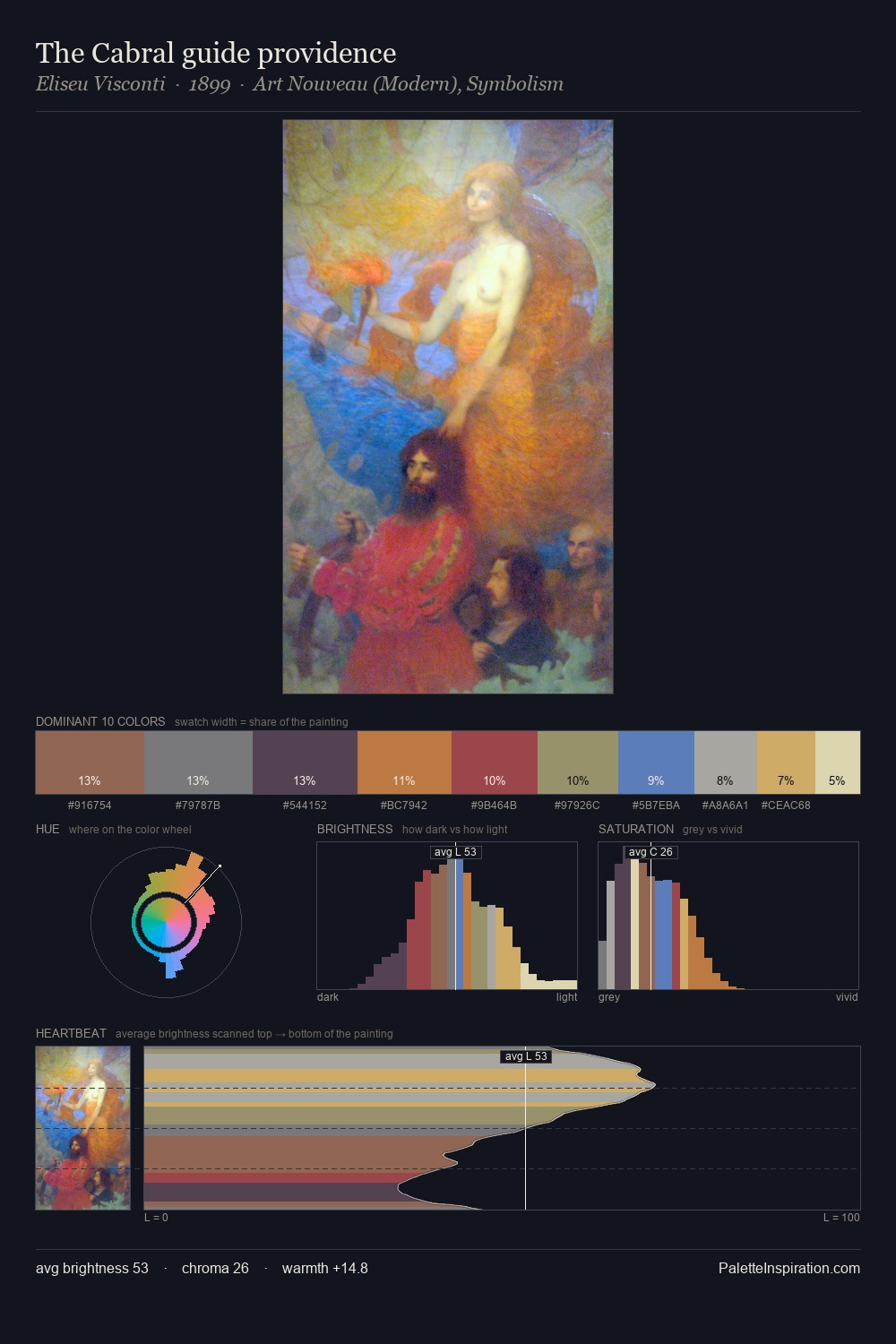
Joachim Wtewael Palette 1
Muted Tawny
Muted Deliberately desaturated - chroma pulled toward gray, the restraint of tonal painting.
Tawny Warm orange-brown - a traditional term for the color of tanned leather or lion fur.

Palette Analysis
Values in Joachim Wtewael rest in the mid-range - neither dramatically lit nor steeped in shadow. Joachim Wtewael tilts toward cool - blues and silver-greys carry the structural weight. A restrained, mid-chroma palette: every hue is present and legible, but nothing shouts. #AA6D42 delivers the chromatic peak at only 10.0% - a small shot of colour with outsized visual impact. 40 units of value spread create a palette that is varied but unified - contrast in the service of harmony. High luminosity and cool temperature suggest the plein-air condition: unfiltered daylight and open sky. In the context of Joachim Wtewael's full range of palettes, group 1 represents one movement in an ongoing chromatic dialogue.
Example use cases
- ceramics & pottery
- boutique hospitality
- menswear
- heritage food brands
- craft & artisan brands
I Love This!
Use This Palette
Copy, export, or download for your project
Copy, export, or download for your project
Copy:
Download:
Share: