Jean Baptiste Vanmour Palette 7

Palette Analysis
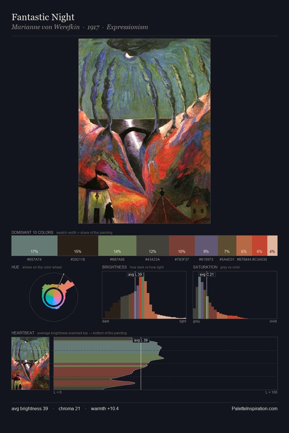
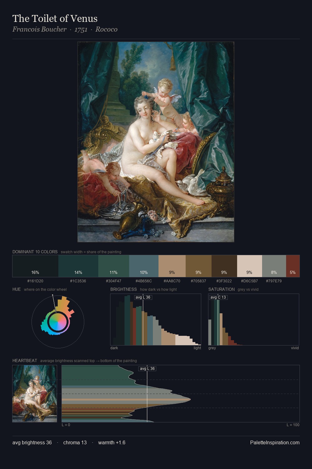
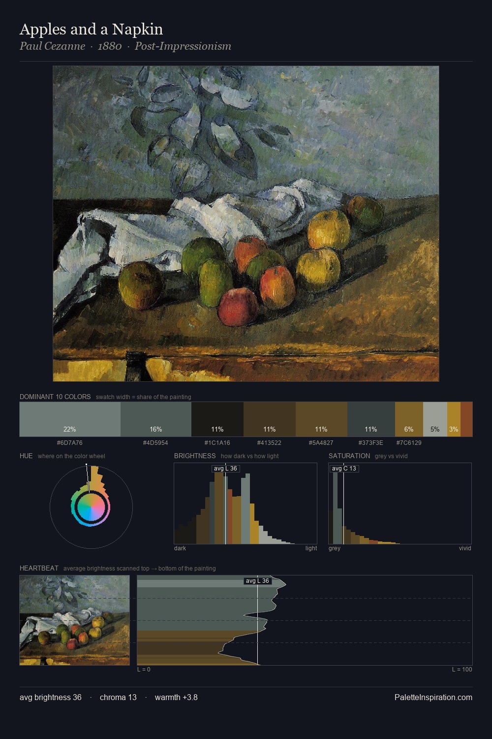
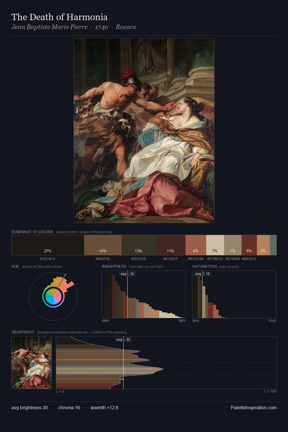
Jean Baptiste Vanmour distributes its values across the middle register, creating harmony without high contrast. Cool hues prevail: blues, greens, and greys anchor the palette's emotional temperature. Chroma hovers near zero; colour declares itself through subtle shifts in hue rather than outright saturation. The highest-chroma note - #4E7D80 - appears at just 6.9%, deployed as a precision accent against the quieter ground. 34 units of value spread create a palette that is varied but unified - contrast in the service of harmony. The mid-to-high key, cool bias, and moderate chroma point to outdoor observation - sky and diffused daylight as the dominant light source. Jean Baptiste Vanmour's palette 7 carries its own internal logic while remaining in conversation with the artist's broader colour intelligence.
Example use cases
- theater design
- jewelry brands
- tobacco-adjacent retail
- event branding
- film & entertainment
I Love This!
Copy, export, or download for your project