Japonism Palette 7
Pale Vermillion
Pale High-key and low-chroma - delicate, bleached, washed with light.
Vermillion Brilliant red-orange - the classic mercury sulfide pigment, vivid and warm.

Palette Analysis
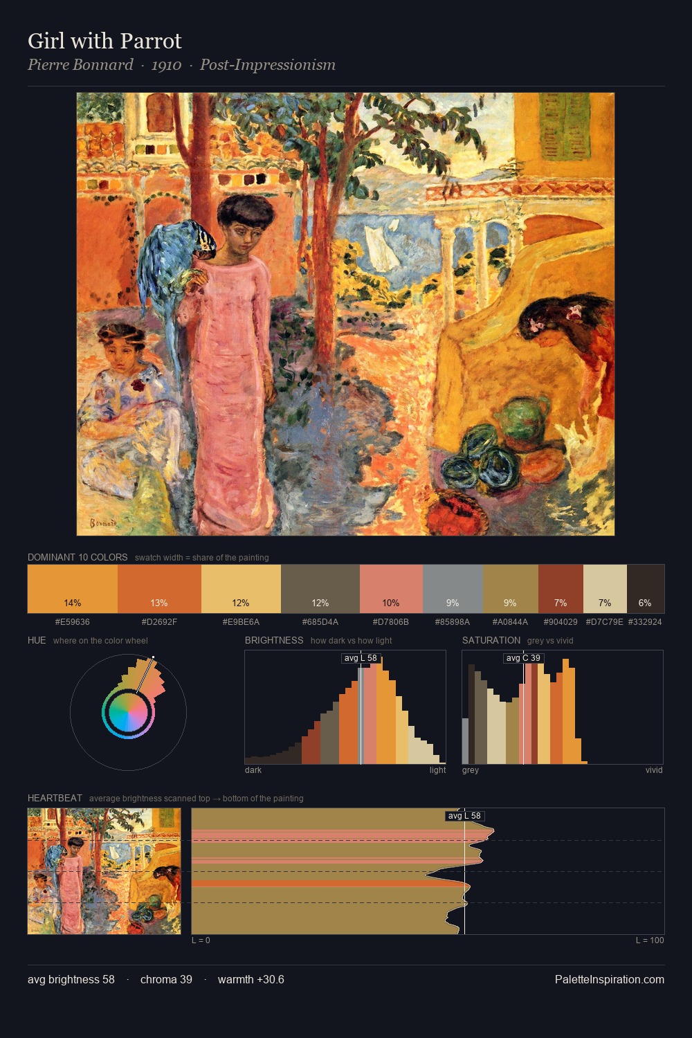
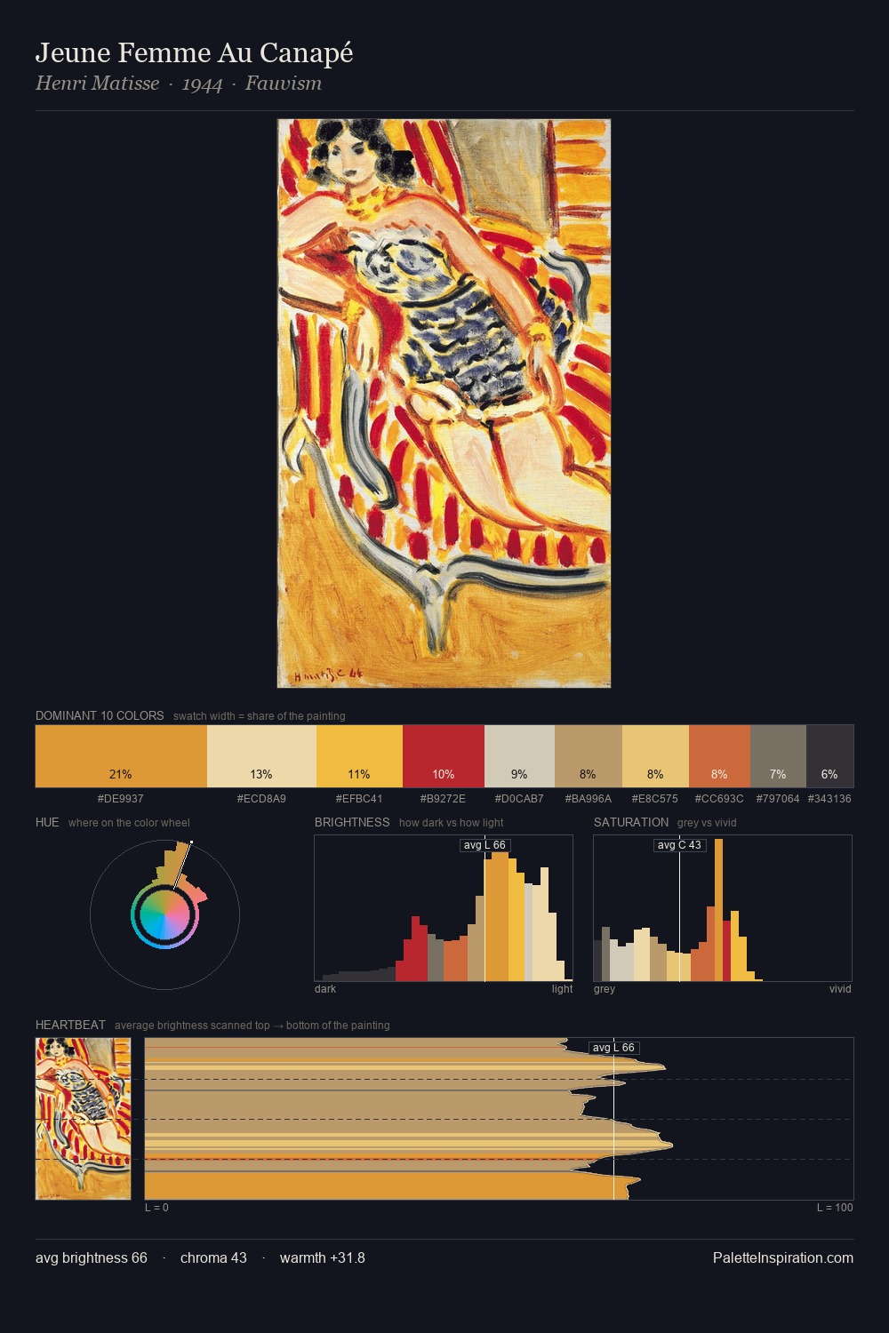
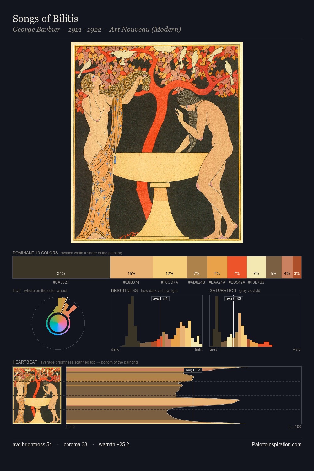
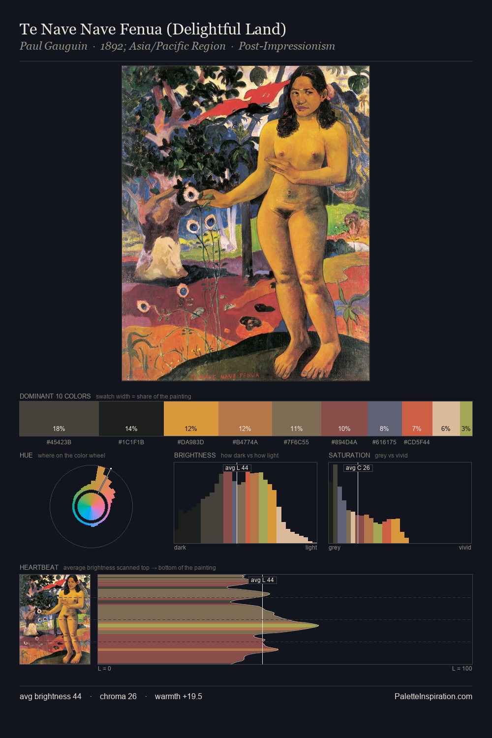
Japonism works in the upper reaches of the value scale, creating an atmosphere of brightness and expansiveness. Warmth dominates - the palette leans heavily on the yellow-orange-red arc of the colour wheel. Colours are neither washed out nor blazing; they occupy the productive middle ground of the chroma scale. #E59A2C at 26.6% of the palette: an overwhelming presence that pulls all other colours into its gravitational field. Rather than a studied accent, #956A33 takes 6.3% - a bold allocation that saturates the composition's atmosphere. The full value range is 60 units: broad enough to build convincing three-dimensional form.
Example use cases
- publishing
- corporate identity
- consumer apps
- hospitality
- design agencies
I Love This!
Use This Palette
Copy, export, or download for your project
Copy, export, or download for your project
Copy:
Download:
Share: