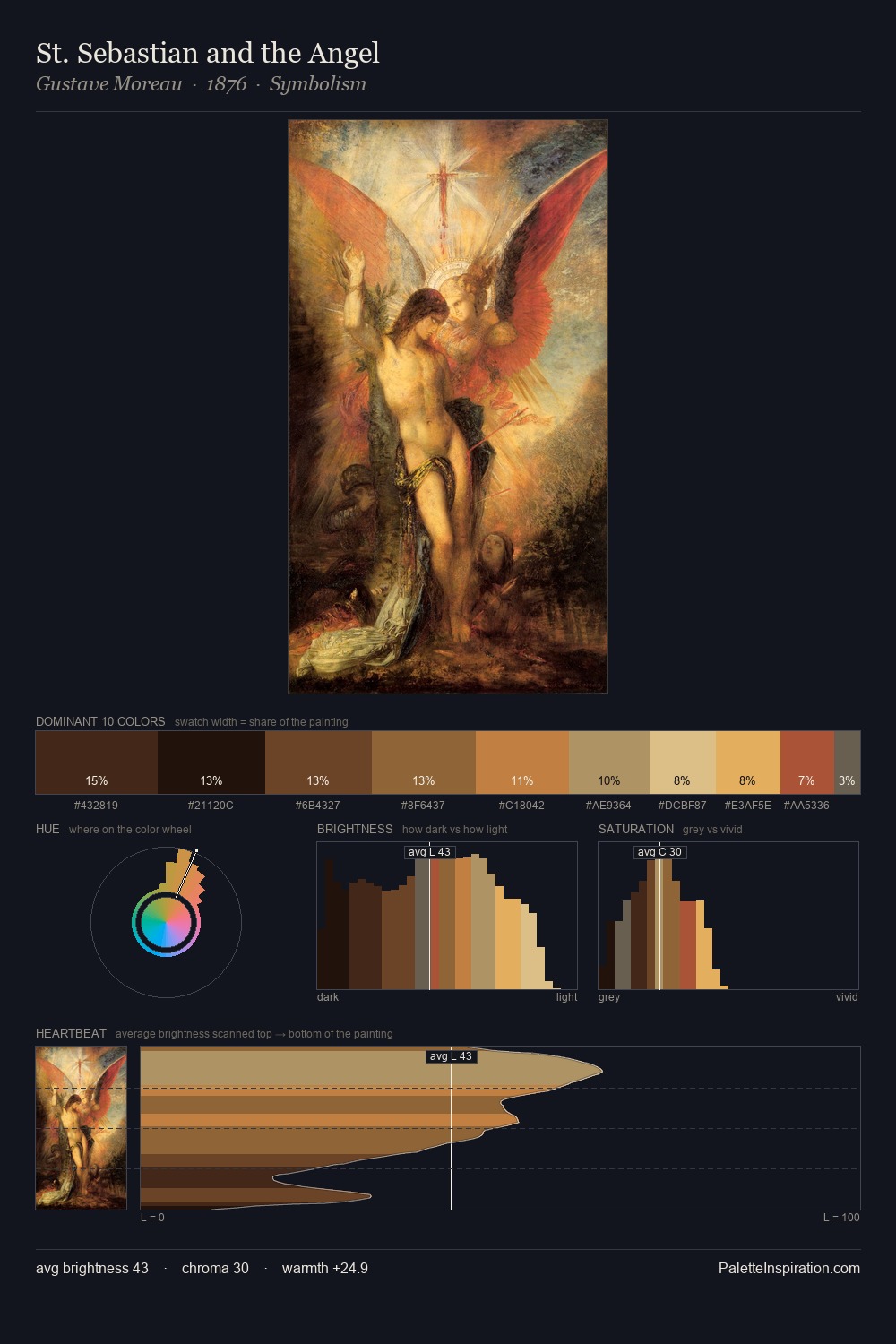
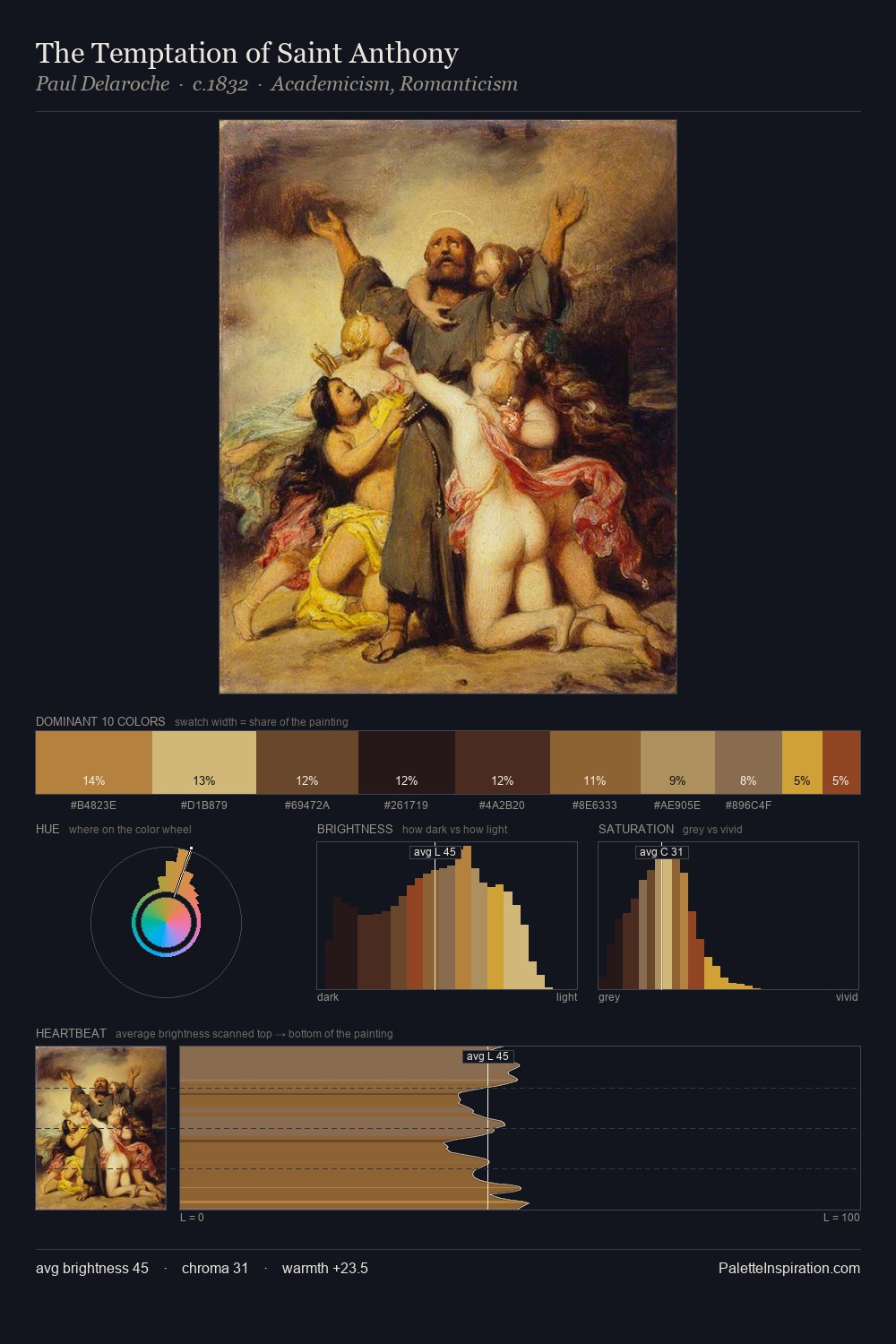
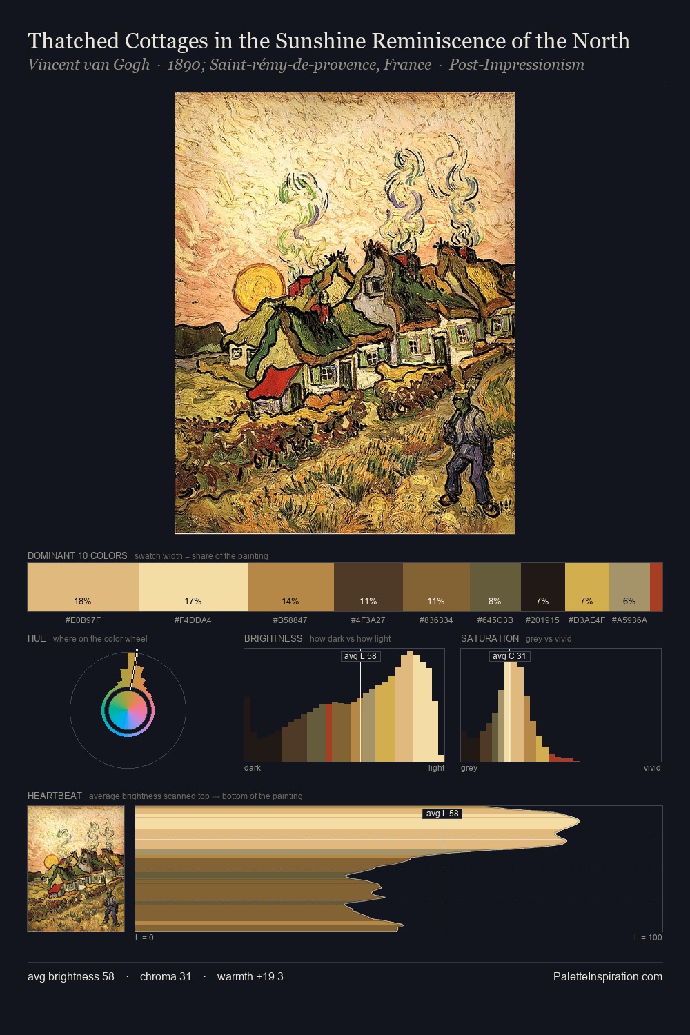
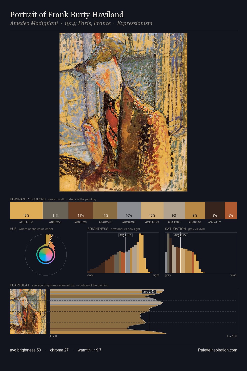
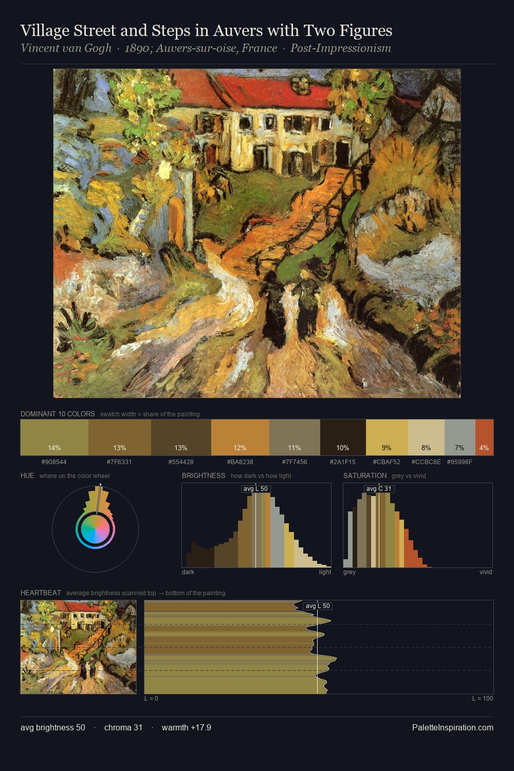
Japonism Palette 11
Shadowed Caramel
Shadowed Low-key - values weighted toward shadow, the palette of dim interiors and overcast skies.
Caramel Warm mid-brown - the color of cooked sugar, smooth and amber-toned.

Palette Analysis
Japonism distributes its values across the middle register, creating harmony without high contrast. The palette orchestrates warmth above all else - reds, ambers, and siennas take the lead. Mid-saturation across the board: the palette has colour character without chromatic excess. The most saturated colour, #DAC89B, is reserved to 5.3% of the surface, where it acts as a focal punctuation. From deepest dark to palest light, the palette traverses 62 units of the value scale - a span that creates natural depth.
Example use cases
- theater design
- jewelry brands
- tobacco-adjacent retail
- event branding
- film & entertainment
I Love This!
Use This Palette
Copy, export, or download for your project
Copy, export, or download for your project
Copy:
Download:
Share: