Japonism Palette 5
Luminous Aureolin
Luminous Self-illuminated feeling - high-key values with an inner glow quality.
Aureolin Bright transparent yellow - a clear, luminous lemon-gold pigment hue.

Palette Analysis
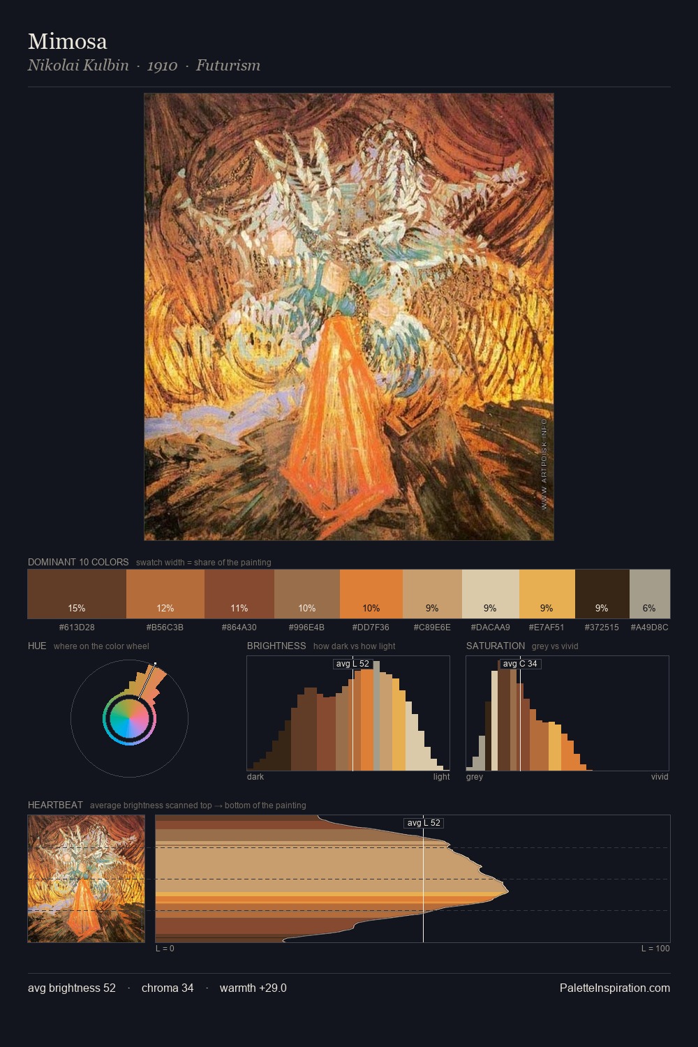
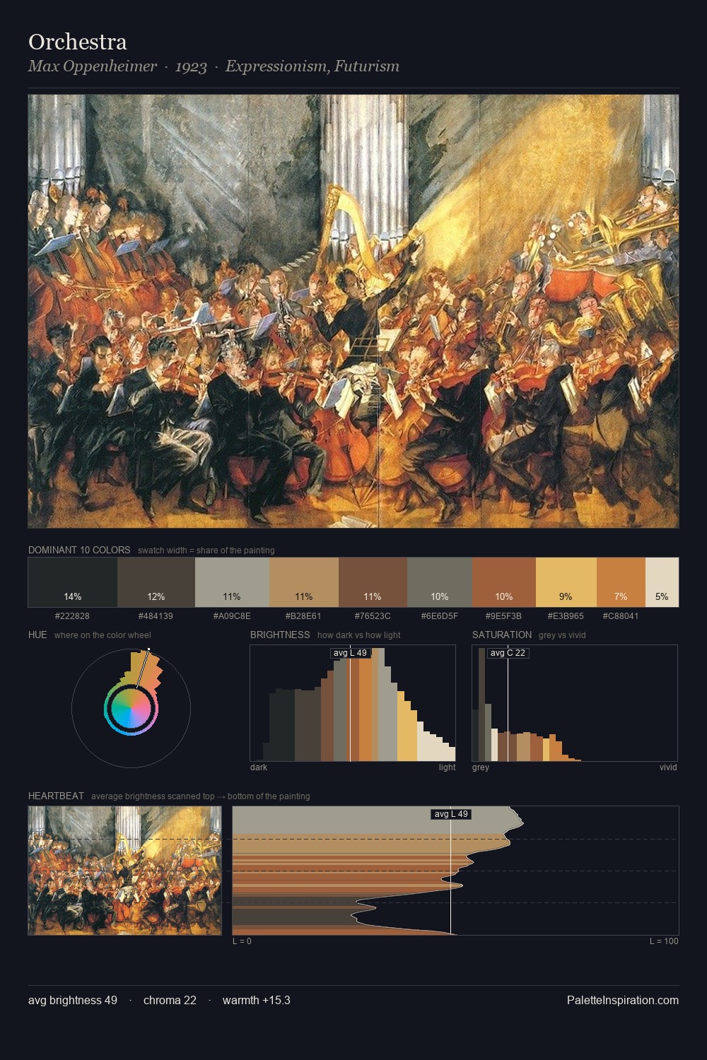
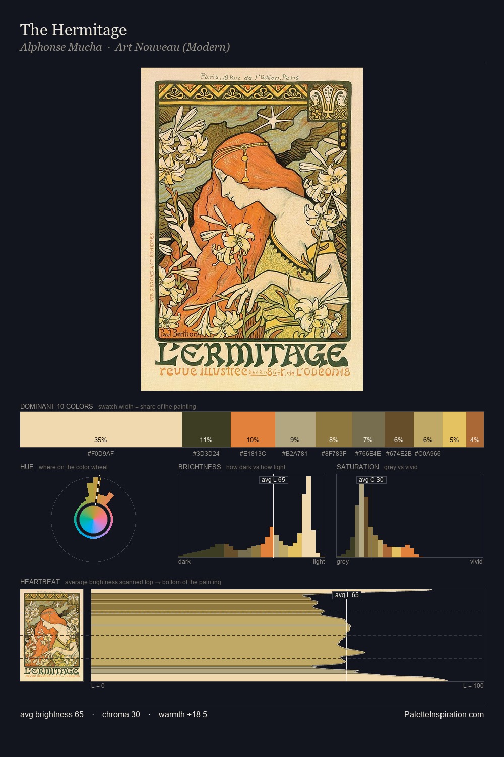
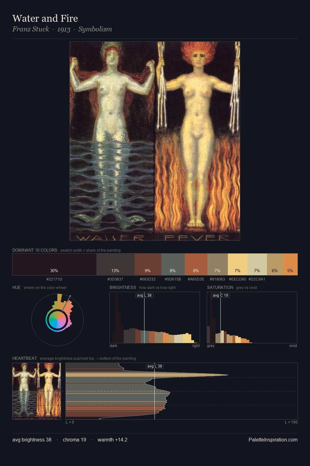
The high-key values of Japonism give it an effulgent, almost bleached quality. Temperature is balanced: the palette pits warm earth against cool sky without declaring a winner. Mid-saturation across the board: the palette has colour character without chromatic excess. The most saturated colour, #A8673F, covers 3.0% of the surface: too much to call an accent, too strong to ignore. At 54 units across the value scale, the palette keeps contrast readable without letting it dominate. Together these qualities point to the open-air Impressionist method: recording light rather than local colour.
Example use cases
- publishing
- corporate identity
- consumer apps
- hospitality
- design agencies
I Love This!
Use This Palette
Copy, export, or download for your project
Copy, export, or download for your project
Copy:
Download:
Share: