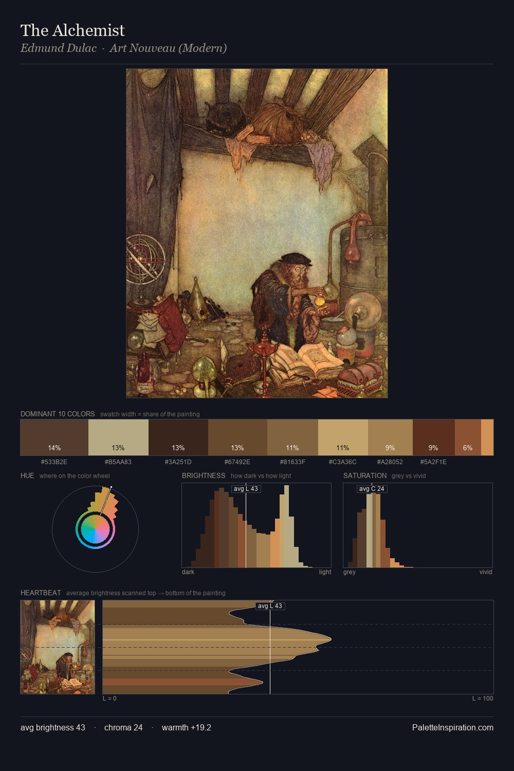
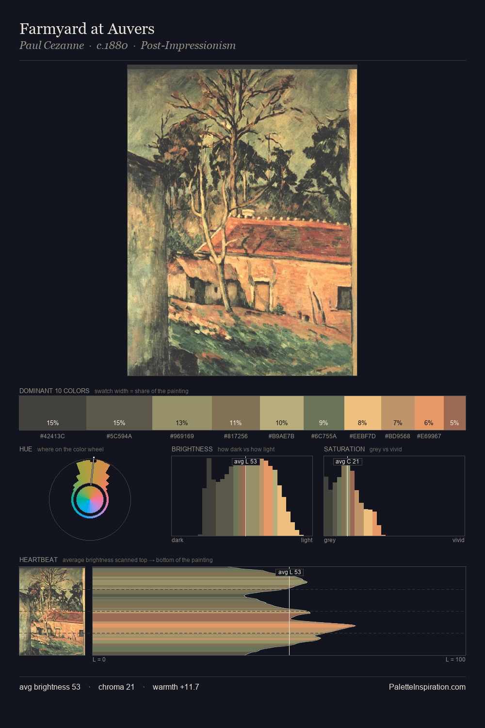
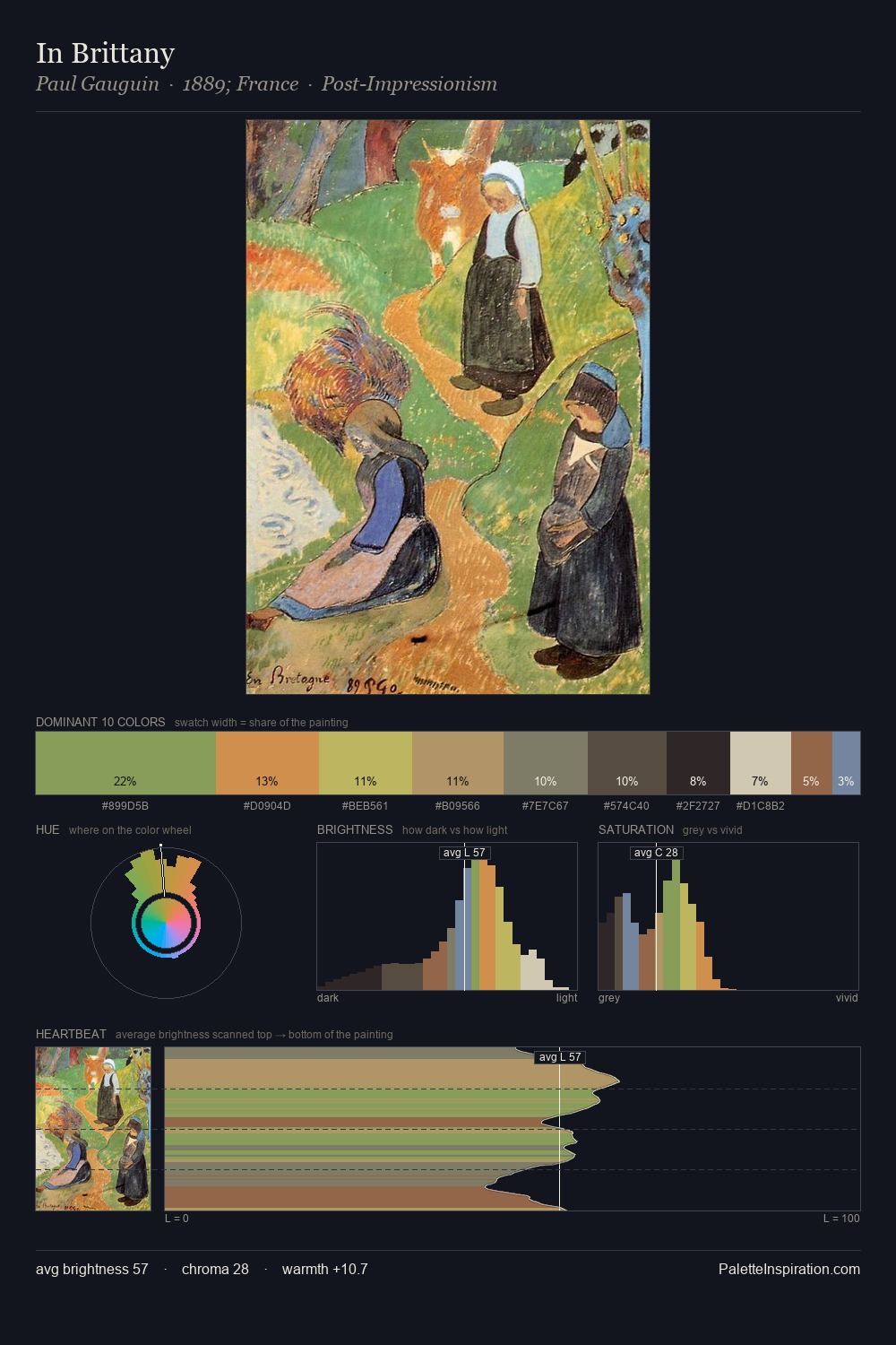
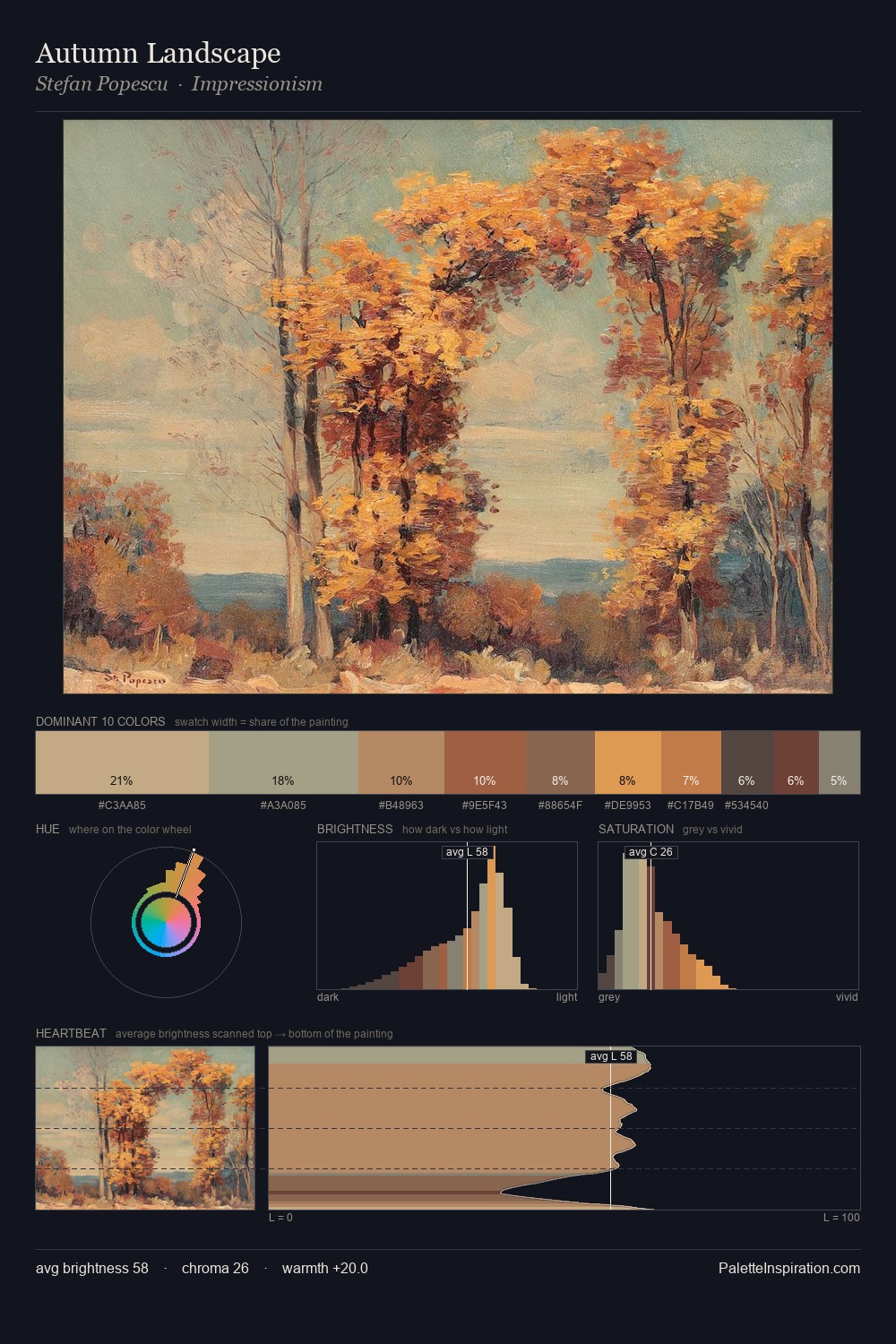
Japonism Palette 3
Soft Fawn
Soft Low-contrast, gentle chroma - mid-key values and low saturation, approachable and calm.
Fawn Light warm tan - the color of a young deer, soft and golden-brown.

Palette Analysis
Light floods Japonism; the palette keeps values pale and airy across its range. The palette orchestrates warmth above all else - reds, ambers, and siennas take the lead. Saturation is measured and controlled, giving the palette presence without visual aggression. Only 1.8% is devoted to #A16051, yet that small allocation delivers the palette's entire chromatic tension. At 43 units across the value scale, the palette keeps contrast readable without letting it dominate.
Example use cases
- ceramics & pottery
- boutique hospitality
- menswear
- heritage food brands
- craft & artisan brands
I Love This!
Use This Palette
Copy, export, or download for your project
Copy, export, or download for your project
Copy:
Download:
Share: