Japonism Palette 1
Blazing Cream
Blazing High-chroma, high-key - the intensity of open flame or direct sunlight.
Cream Warm white - slightly yellowed, rich, the color of heavy dairy.

Palette Analysis
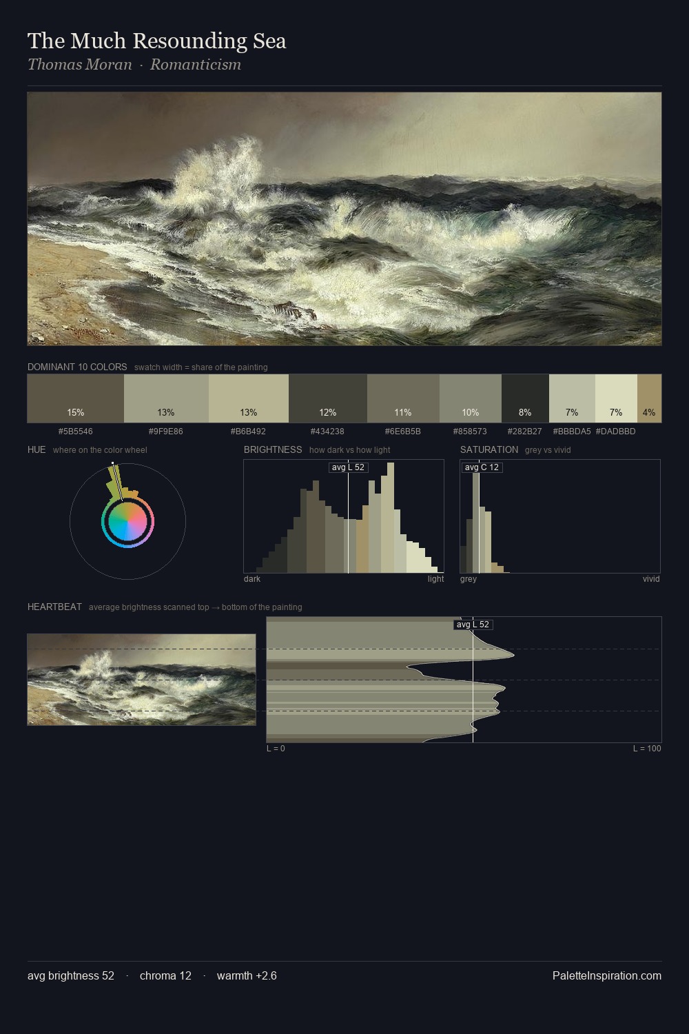
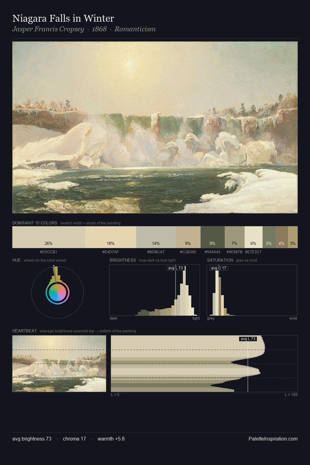
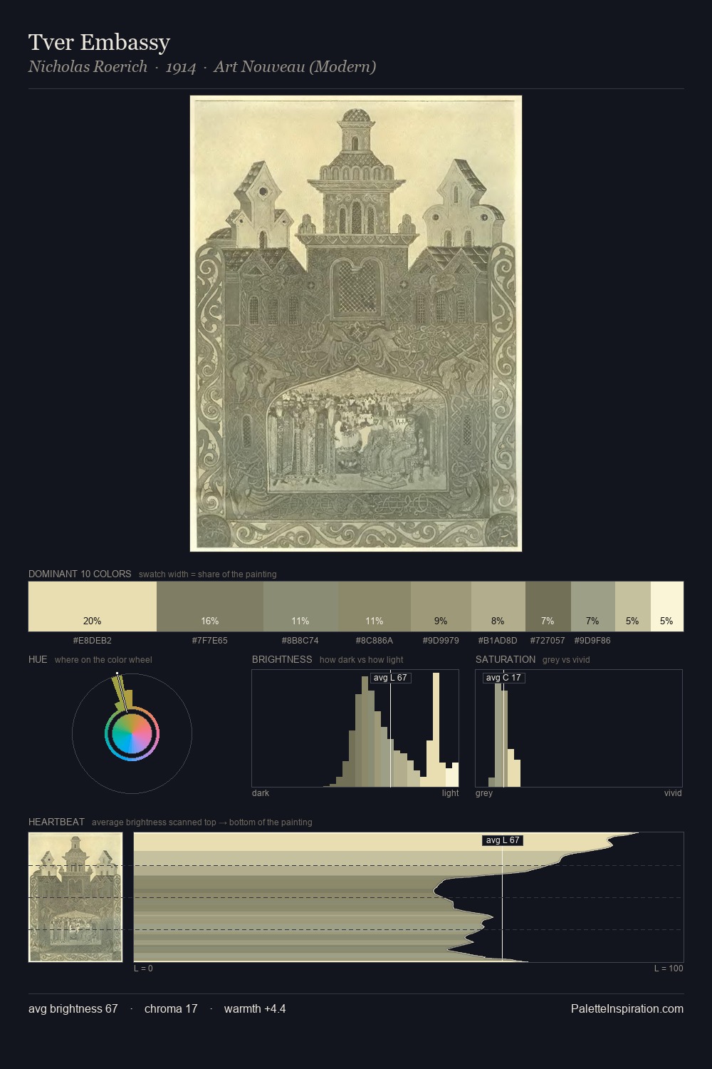
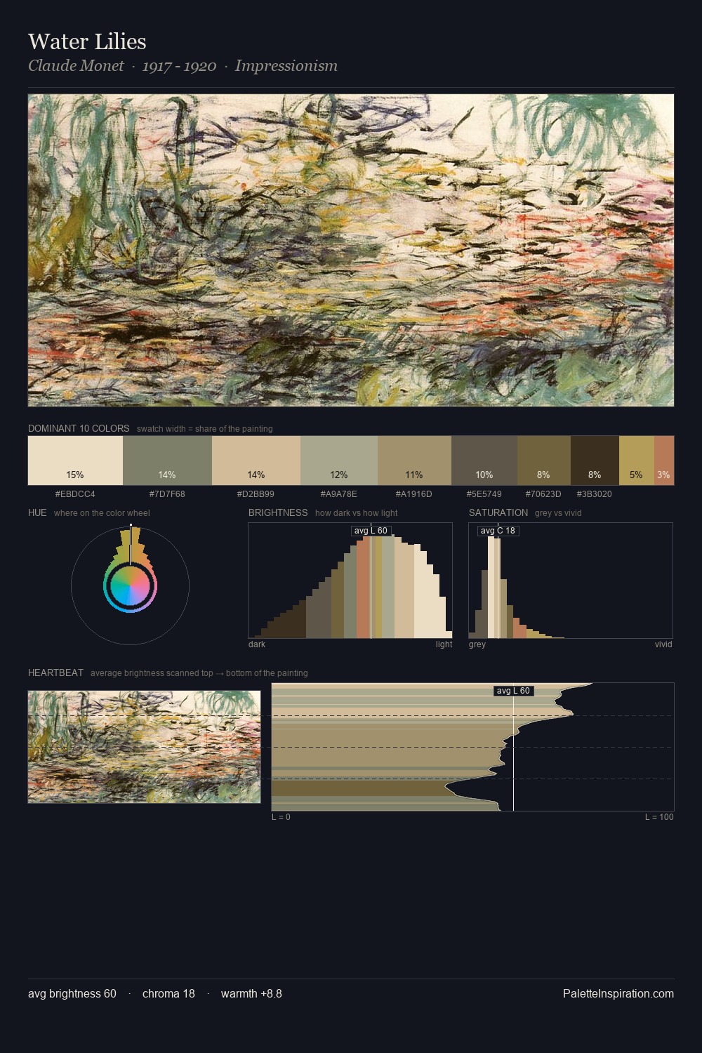
Japonism is strongly light-biased - shadow is suggested rather than declared. Built on cool foundations: the palette favours the blue-cyan-green arc. The absence of saturated colour is itself an expressive choice: this is a palette of restraint and atmosphere. A single dominant - #F1EBD3 at 41.4% - sets the character of the whole composition. The saturated accent, #CBB492, registers at 3.6% - sparse enough to feel like a deliberate surprise. Spanning 35 units on the value axis, the palette achieves the balance between tonal flatness and fragmentation. The mid-to-high key, cool bias, and moderate chroma point to outdoor observation - sky and diffused daylight as the dominant light source.
Example use cases
- publishing
- corporate identity
- consumer apps
- hospitality
- design agencies
I Love This!
Use This Palette
Copy, export, or download for your project
Copy, export, or download for your project
Copy:
Download:
Share: