Jan Dirksz Both Palette 1

Palette Analysis
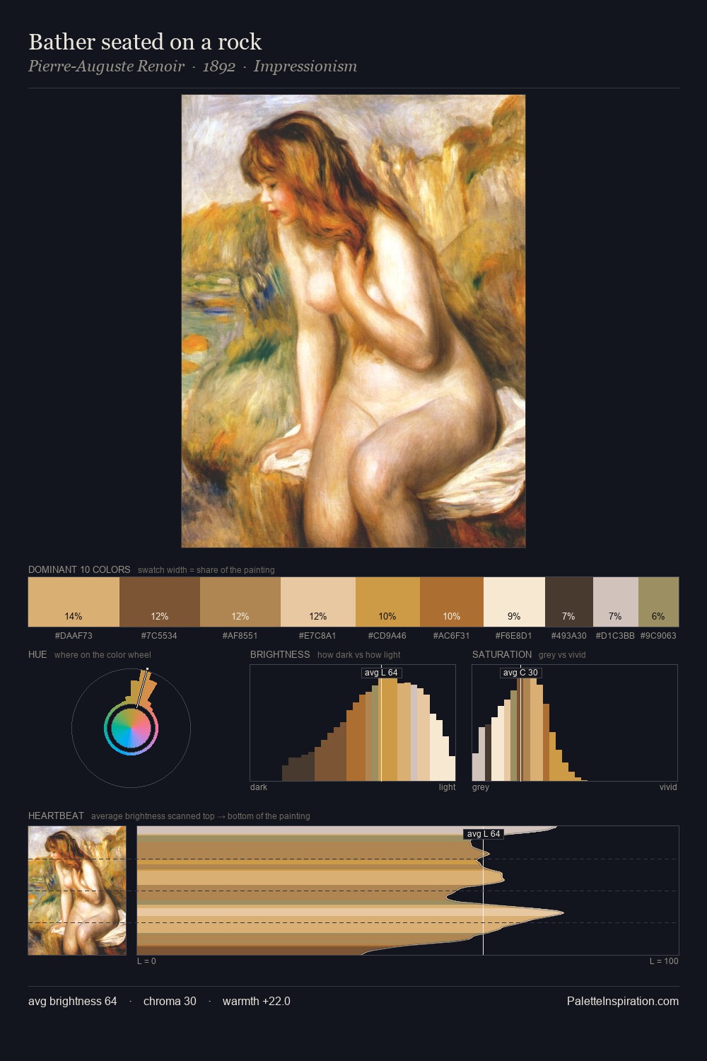
Jan Dirksz Both is high in key: pale, luminous, and filled with optical air. Neither warm nor cool has the upper hand here; the equilibrium between the two generates the palette's visual energy. Chroma is kept low across all colours, producing the soft, enveloping quality that characterises tonal painting. #FEFDFA claims 31.4% of the surface, functioning as the work's tonal foundation. The most saturated colour, #EACFA4, is reserved to 3.7% of the surface, where it acts as a focal punctuation. The value range spans 67 units across the palette, providing the full gamut from deep shadow to near-white and ensuring clear tonal hierarchy. Jan Dirksz Both's palette 1 carries its own internal logic while remaining in conversation with the artist's broader colour intelligence.
Example use cases
- publishing
- corporate identity
- consumer apps
- hospitality
- design agencies
I Love This!
Copy, export, or download for your project