Jan Brueghel the Elder Palette 1

Palette Analysis
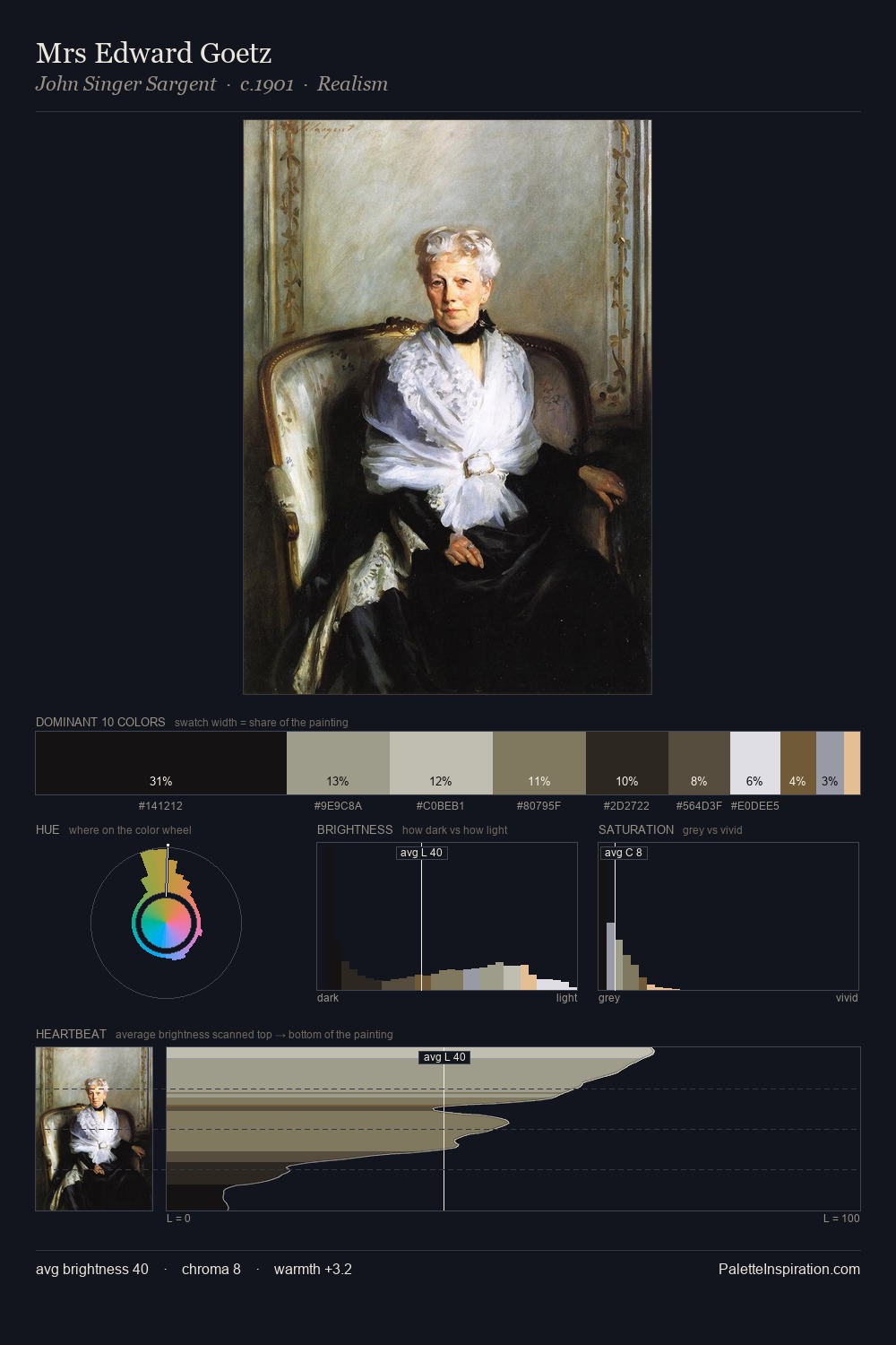
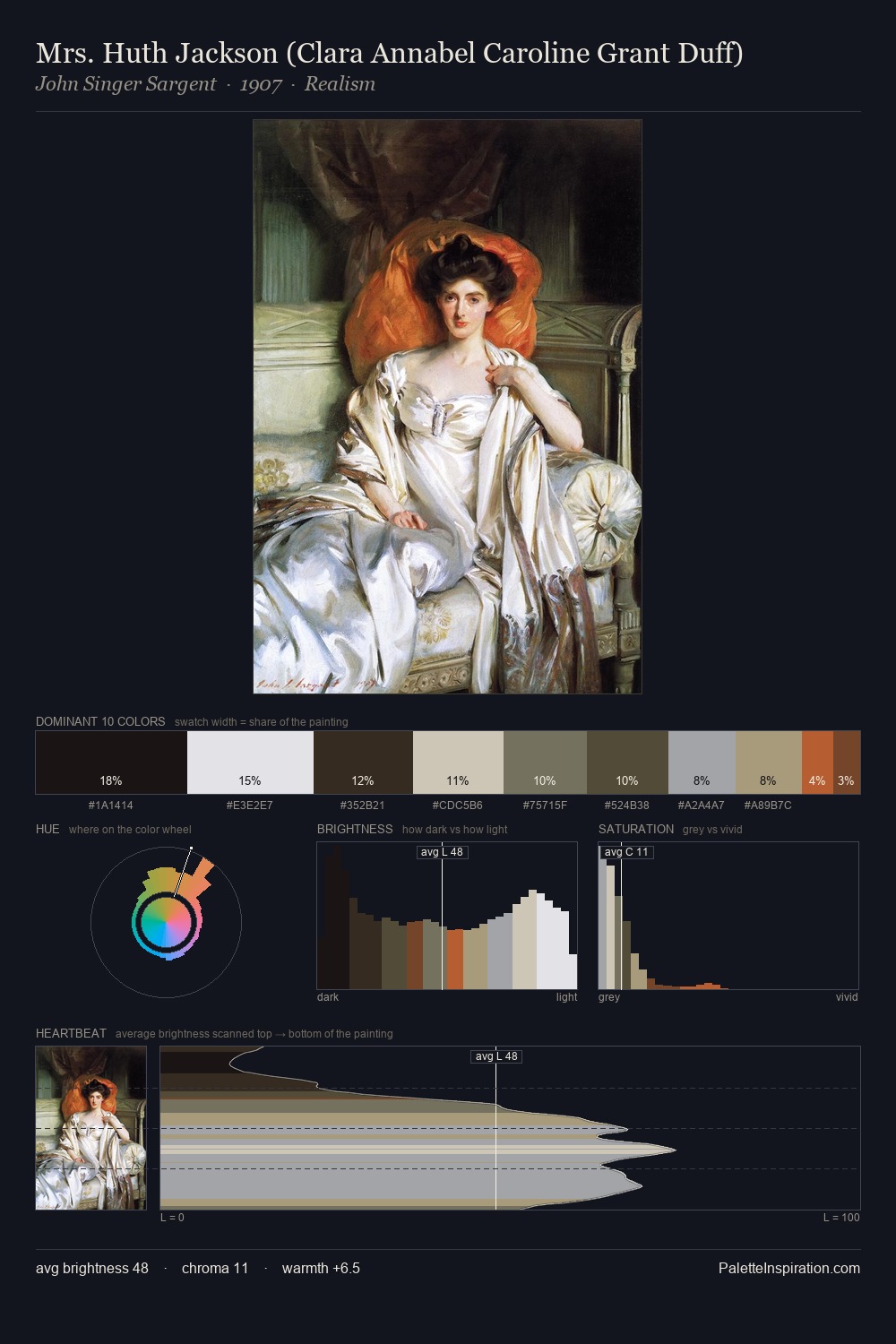
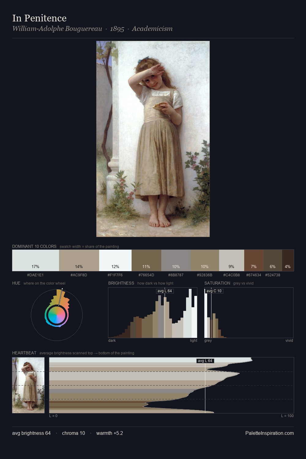
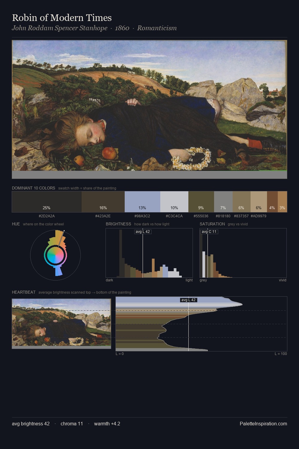
Jan Brueghel the Elder distributes its values across the middle register, creating harmony without high contrast. Temperature is cool-dominant, with blue and green families claiming the largest areas. Chroma hovers near zero; colour declares itself through subtle shifts in hue rather than outright saturation. #744C2D functions as the palette's exclamation mark: highest chroma, lowest percentage (6.2%). At 60 units of value range, the palette has the tonal breadth to sustain complex spatial readings. High luminosity and cool temperature suggest the plein-air condition: unfiltered daylight and open sky. Jan Brueghel the Elder's palette 1 carries its own internal logic while remaining in conversation with the artist's broader colour intelligence.
Example use cases
- museums & galleries
- academic publishing
- heritage brands
- auction houses
- exhibition design
I Love This!
Copy, export, or download for your project