James Ward Palette 3

Palette Analysis
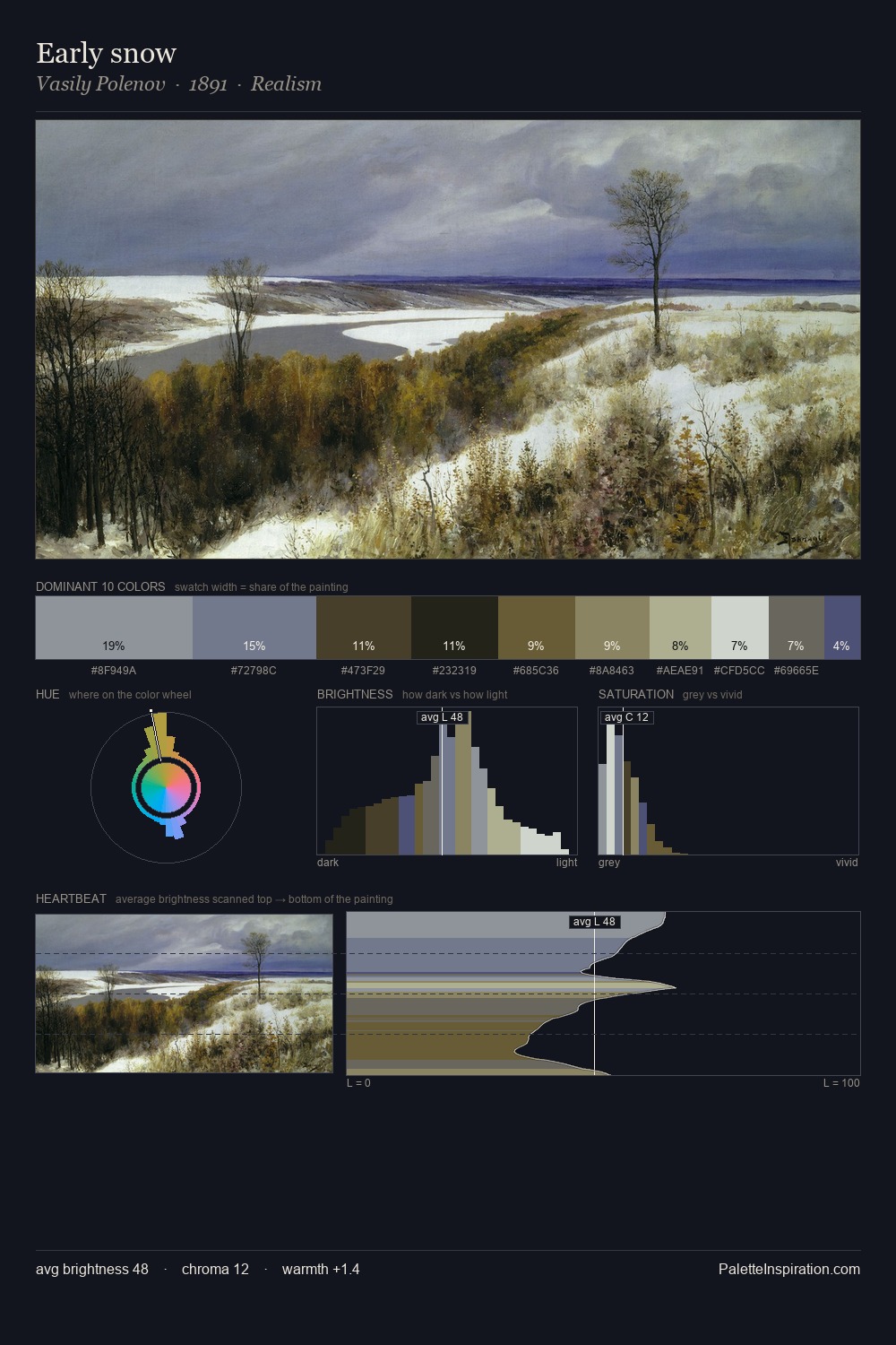
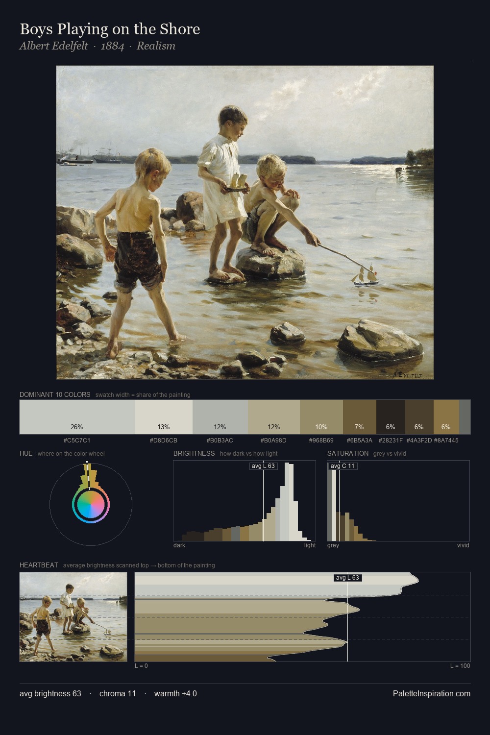
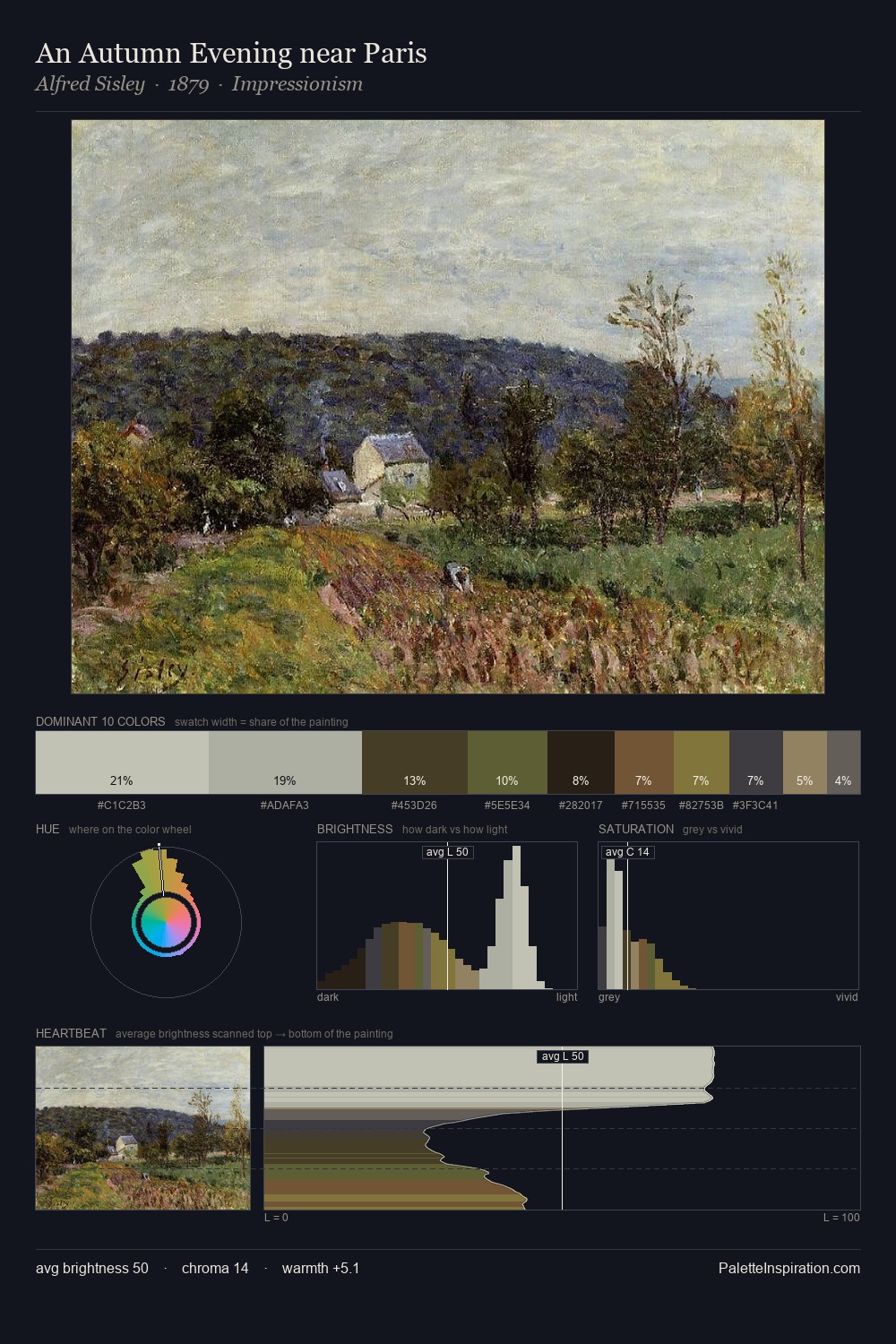
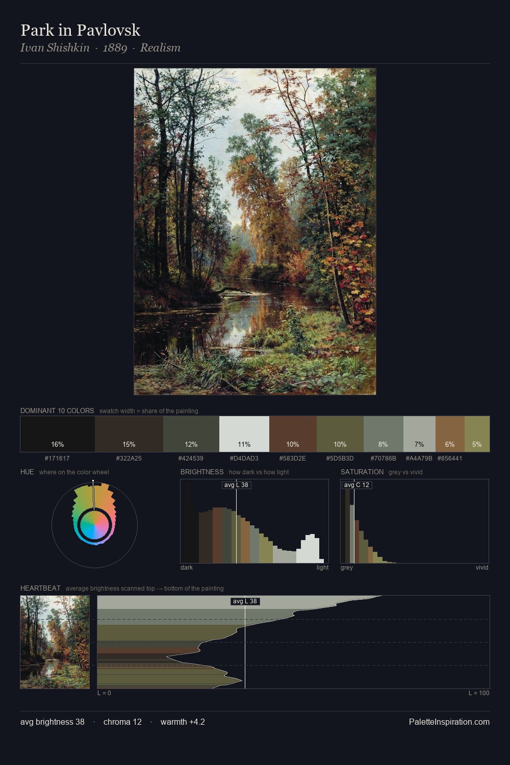
James Ward occupies the comfortable middle of the value scale, avoiding both extremes to hold the eye in a sustained middle grey. James Ward builds on cool foundations: the palette favours the blue-cyan-green arc. Chroma hovers near zero; colour declares itself through subtle shifts in hue rather than outright saturation. Only 6.3% is devoted to #7E5537, yet that small allocation delivers the palette's entire chromatic tension. 59 units of value range underpin the palette's structural clarity: the eye always knows where light falls. The mid-to-high key, cool bias, and moderate chroma point to outdoor observation - sky and diffused daylight as the dominant light source. James Ward's palette 3 carries its own internal logic while remaining in conversation with the artist's broader colour intelligence.
Example use cases
- archival print
- university identity
- rare books
- cultural institutions
- nonprofit identity
I Love This!
Copy, export, or download for your project