James Baker Pyne Palette 2

Palette Analysis
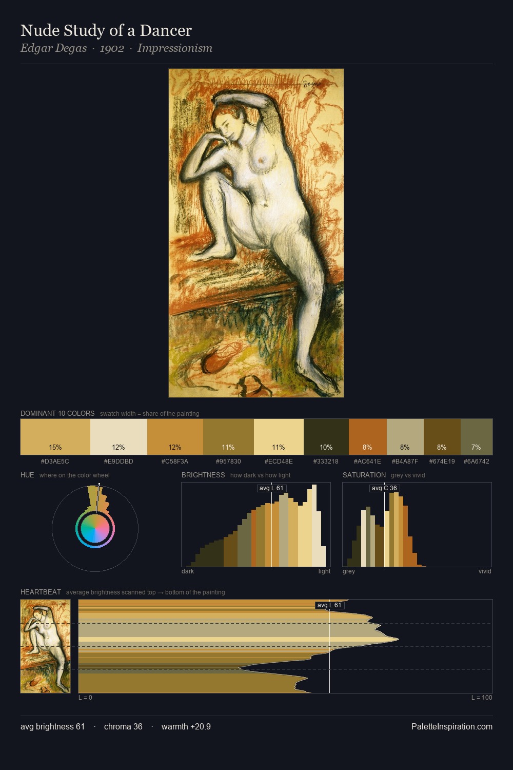
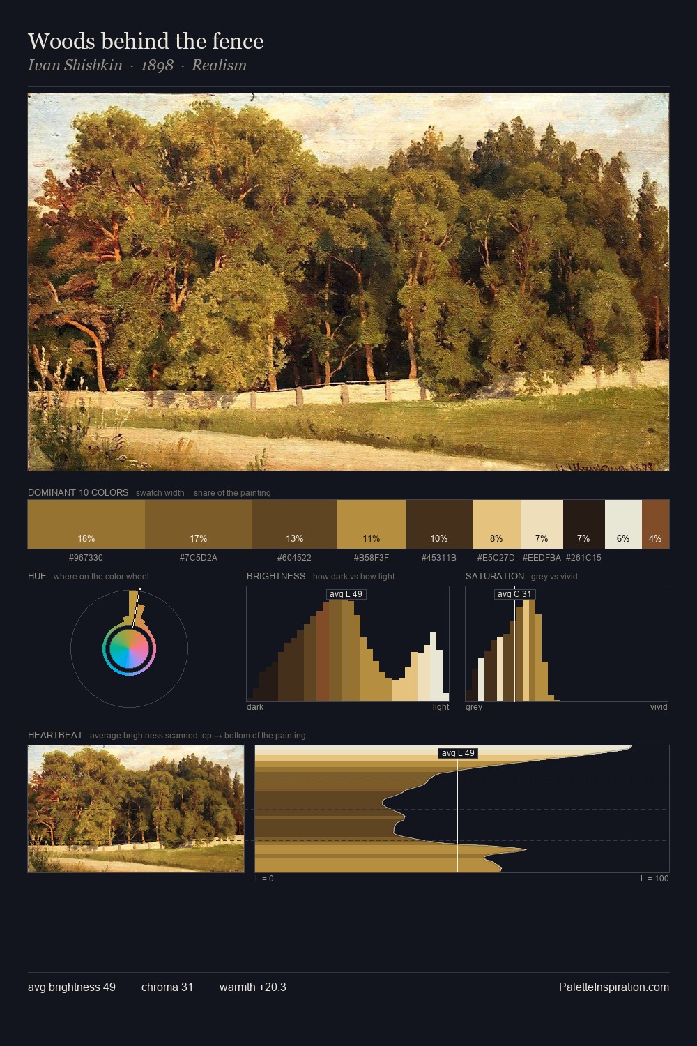
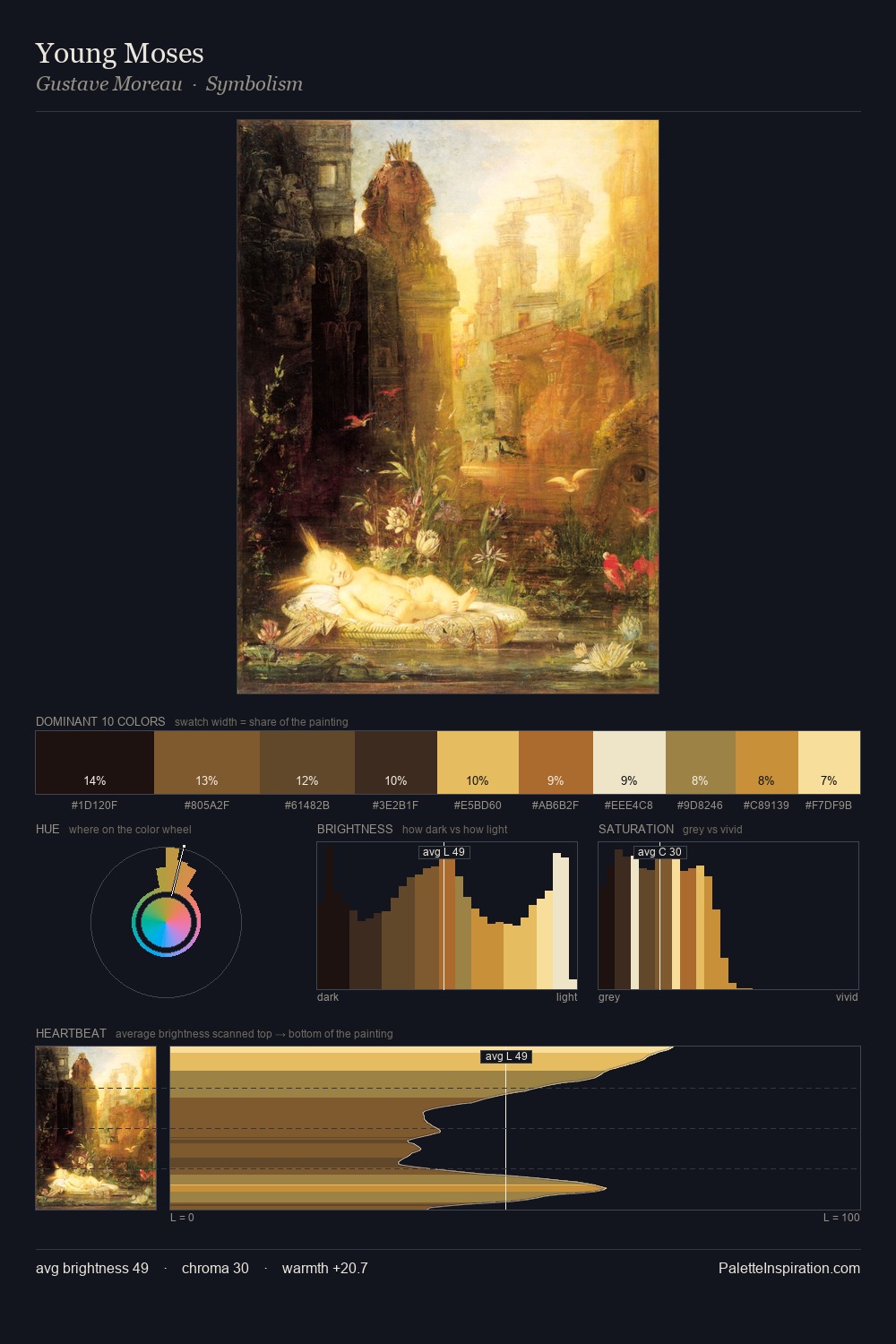
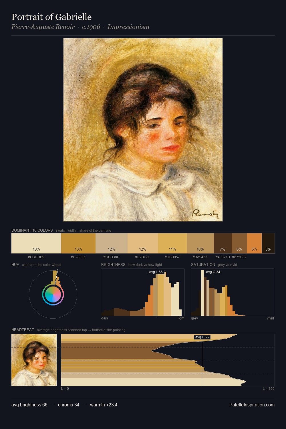
James Baker Pyne works in the upper reaches of the value scale, creating an atmosphere of brightness and expansiveness. Blues and teal-greys govern the palette, lending it an aquatic or atmospheric quality. Colours are neither washed out nor blazing; they occupy the productive middle ground of the chroma scale. The dominant colour, #FAEABD, takes 36.7% of the total area, establishing the overall mood before any other hue is introduced. The highest-chroma note - #D5AA49 - appears at just 4.2%, deployed as a precision accent against the quieter ground. The full value range is 63 units: broad enough to build convincing three-dimensional form. The palette has the character of outdoor light: cool, mid-bright, with colour rendered faithfully rather than expressively. James Baker Pyne's palette 2 carries its own internal logic while remaining in conversation with the artist's broader colour intelligence.
Example use cases
- design agencies
- product brands
- e-commerce
- editorial sites
- publishing
I Love This!
Copy, export, or download for your project