James Baker Pyne Palette 1

Palette Analysis
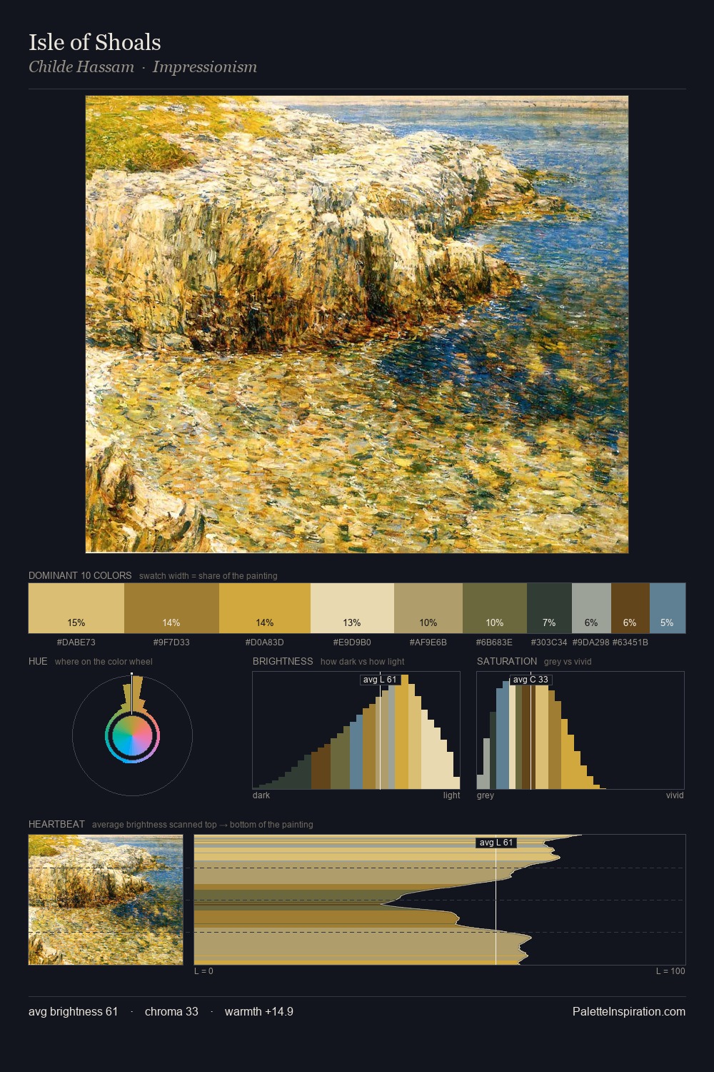
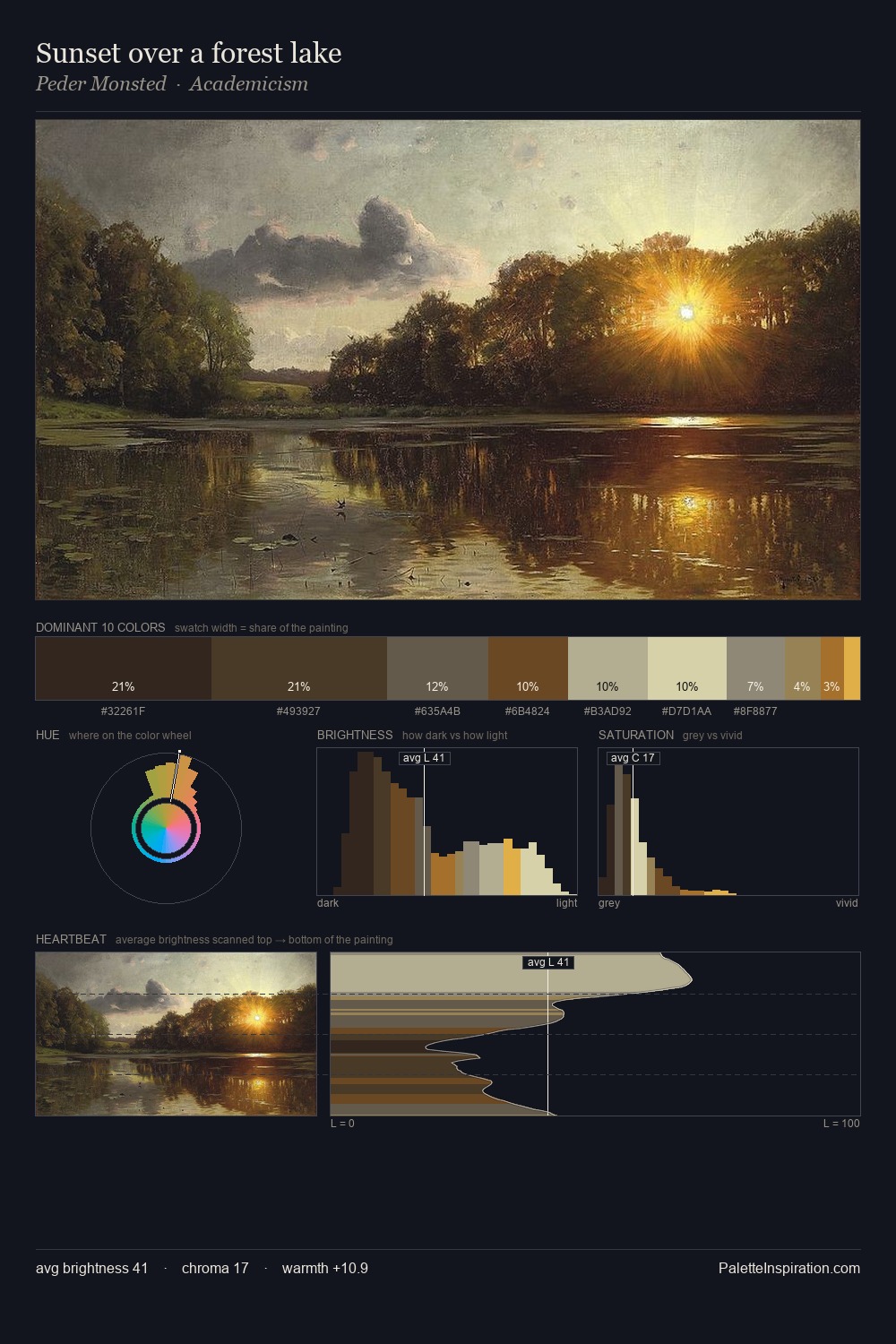
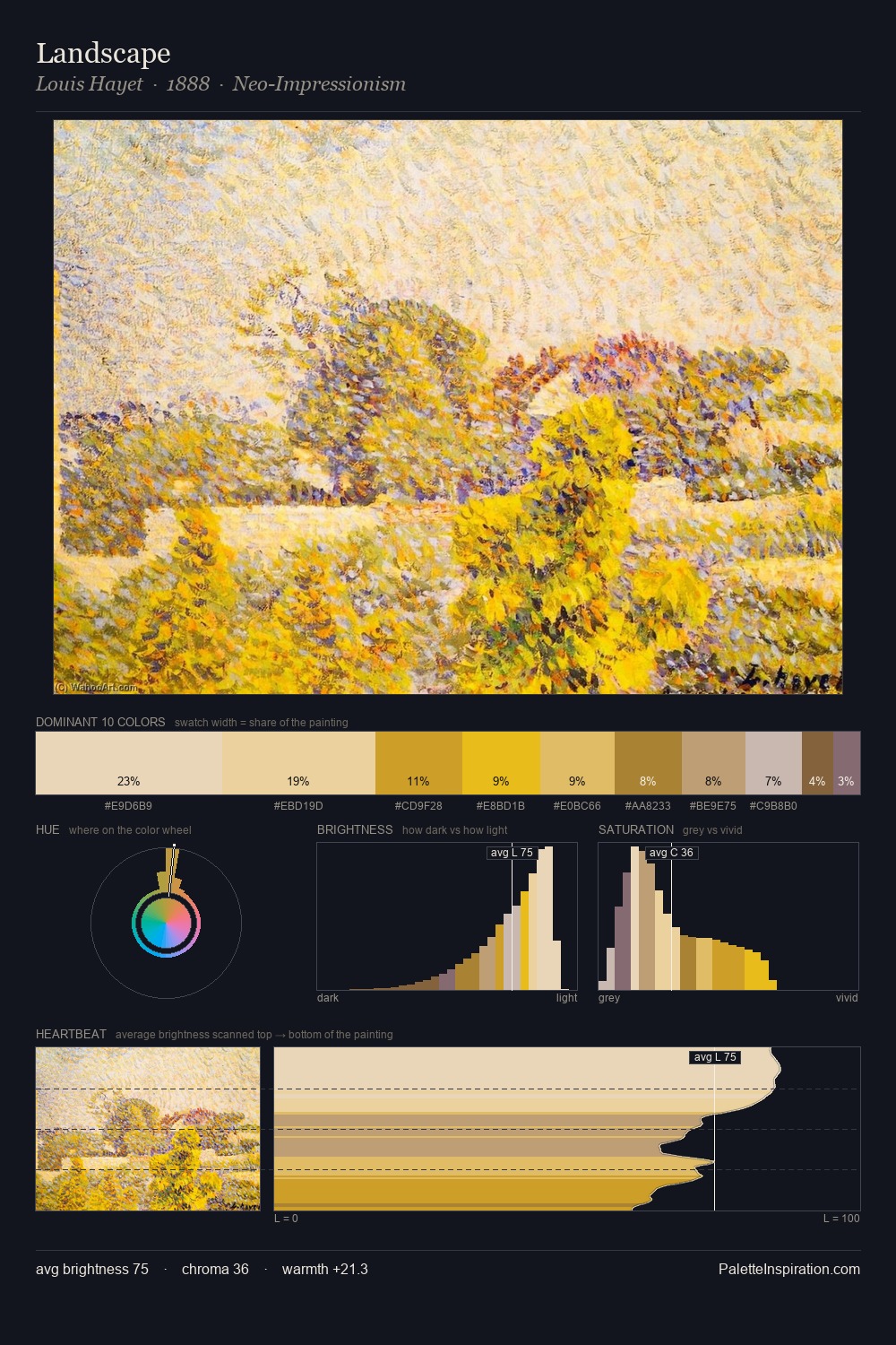
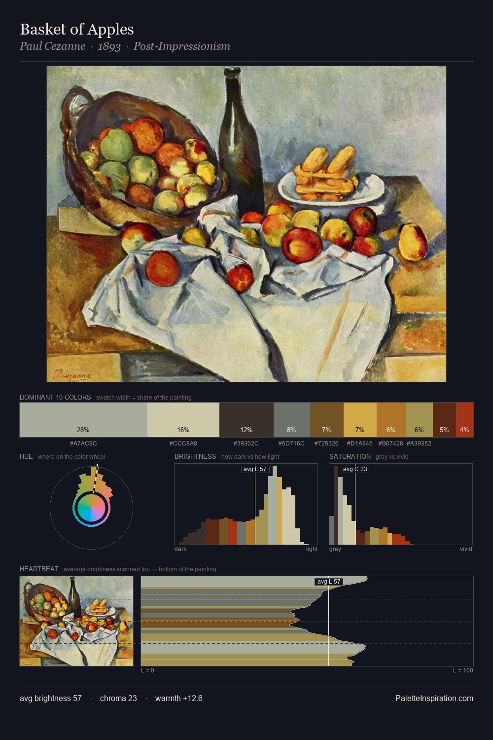
Values in James Baker Pyne tilt decisively toward white, giving the palette its luminous character. Blues and teal-greys govern the palette, lending it an aquatic or atmospheric quality. Mid-saturation across the board: the palette has colour character without chromatic excess. 29.3% of the palette belongs to #EEDFBB, a concentration that makes it the unmistakable visual centre. The saturated accent, #B17F2F, registers at 3.5% - sparse enough to feel like a deliberate surprise. 45 units of value spread create a palette that is varied but unified - contrast in the service of harmony. The mid-to-high key, cool bias, and moderate chroma point to outdoor observation - sky and diffused daylight as the dominant light source. This is palette 1 of James Baker Pyne's sequence - a single chapter in a chromatic story told across many works.
Example use cases
- publishing
- corporate identity
- consumer apps
- hospitality
- design agencies
I Love This!
Copy, export, or download for your project