Jacob van Strij Palette 1

Palette Analysis
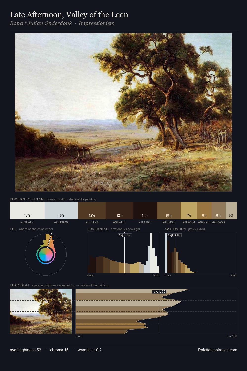
Jacob van Strij is high-key - luminous, open, and weighted toward light. Jacob van Strij tilts toward cool - blues and silver-greys carry the structural weight. Saturation is deliberately withheld - the beauty here lies in the near-monochromatic gradations rather than colour difference. At 9.4%, #DACDA9 carries the palette's sharpest chromatic charge: an accent that earns its place precisely because it is withheld. The value range spans 68 units across the palette, providing the full gamut from deep shadow to near-white and ensuring clear tonal hierarchy. The mid-to-high key, cool bias, and moderate chroma point to outdoor observation - sky and diffused daylight as the dominant light source. Jacob van Strij's palette 1 carries its own internal logic while remaining in conversation with the artist's broader colour intelligence.
Example use cases
- ceramics & pottery
- boutique hospitality
- menswear
- heritage food brands
- craft & artisan brands
I Love This!
Copy, export, or download for your project