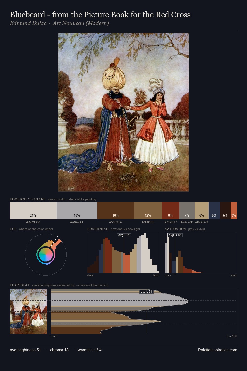
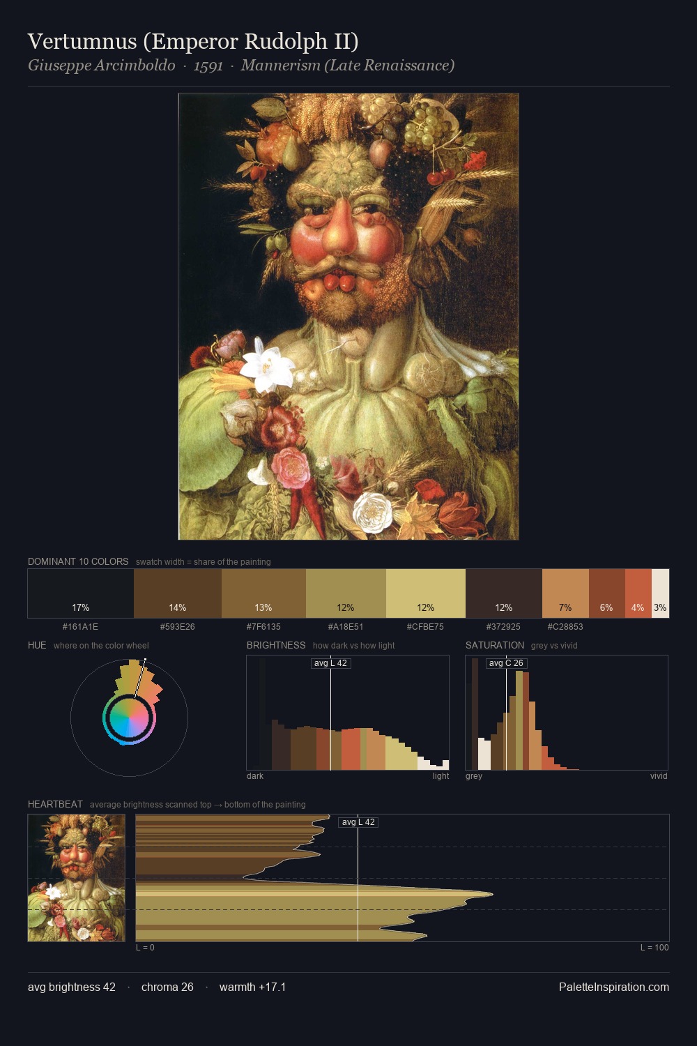
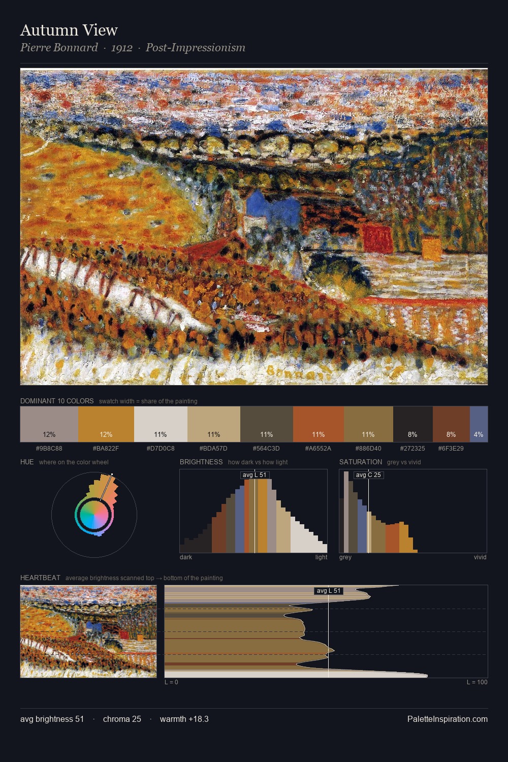
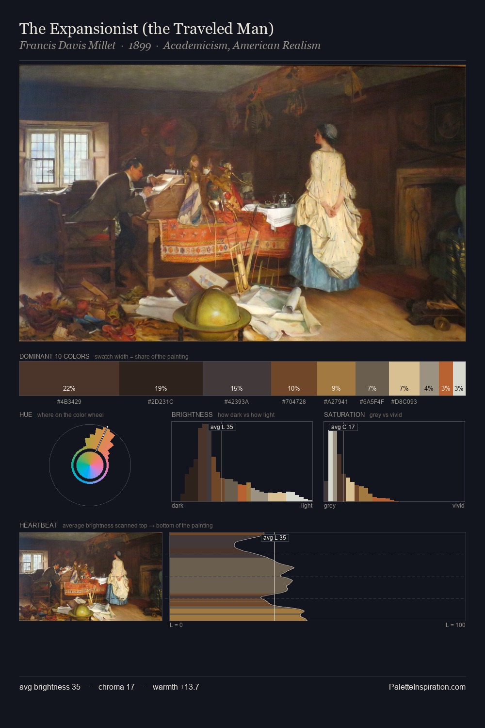
Jacob de Wit Master Palette

Palette Analysis
Jacob de Wit sits in the centre of the value range, lending the palette a sense of even, sustained light. Warm and cool tones are held in careful balance - neither family dominates, creating tension and resolution simultaneously. Chroma is moderate: colours carry enough saturation to be read as colour, but the palette stops well short of garish intensity. #C6B585 delivers the chromatic peak at only 10.0% - a small shot of colour with outsized visual impact. 64 units of value range underpin the palette's structural clarity: the eye always knows where light falls. The palette reads as an Impressionist one - light-biased, chromatically direct, and built on temperature contrast rather than value opposition. The palette is a signature: Jacob de Wit's particular sense of value, warmth, and colour weight made legible.
Example use cases
- music labels
- luxury hospitality
- editorial photography
- leather goods
- premium streaming
I Love This!
Copy, export, or download for your project