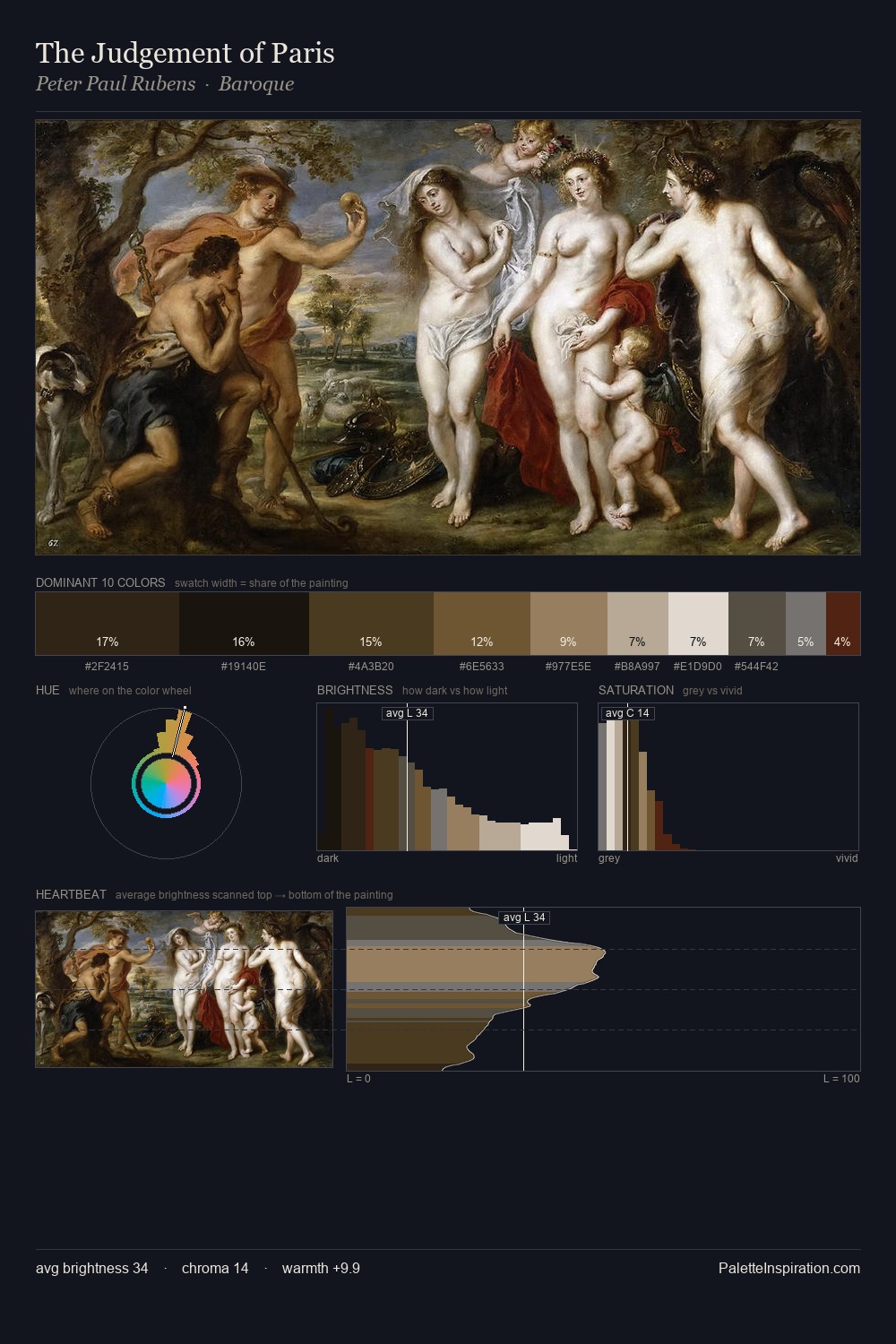
Jacob de Wit Palette 5

Palette Analysis
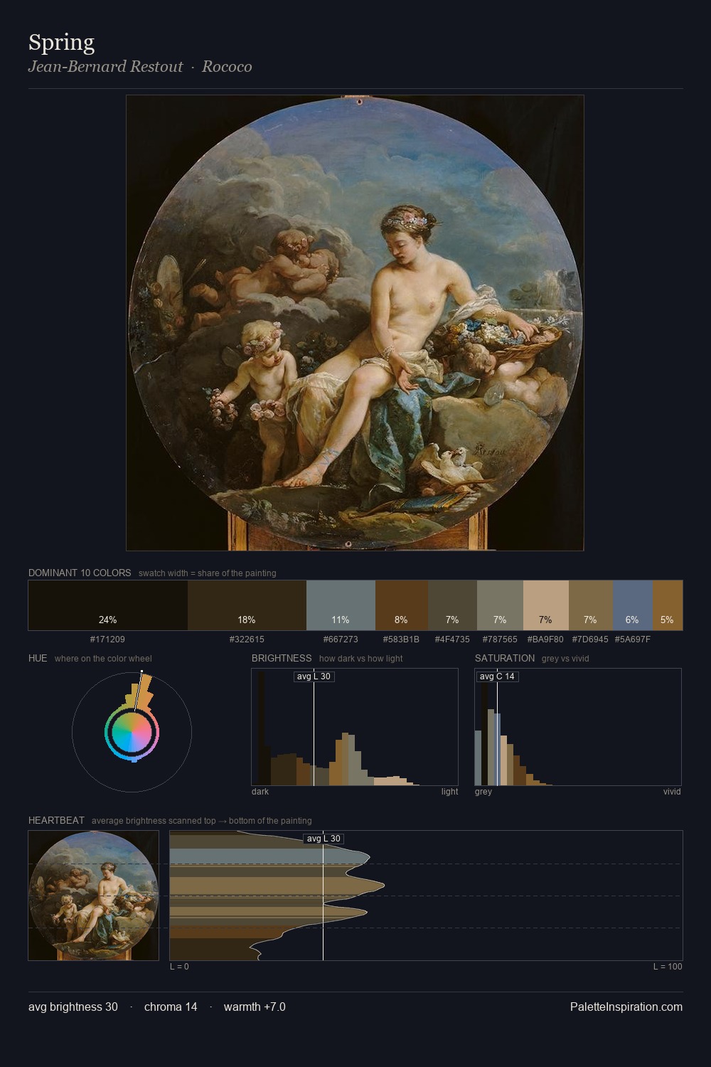
The palette of Jacob de Wit sits in the lower register of the value scale - dense, contained, and weighted. Temperature reads distinctly warm: the reds and earth tones from Jacob de Wit carry the compositional weight. The absence of saturated colour is itself an expressive choice: this is a palette of restraint and atmosphere. The dominant colour, #251E15, takes 26.4% of the total area, establishing the overall mood before any other hue is introduced. #61431C functions as the palette's exclamation mark: highest chroma, lowest percentage (5.6%). The value range of 38 units sits in the comfortable middle: enough depth, enough light, neither extreme. This tonal restraint is characteristic of the Jacob de Wit approach: colour serves light, not the reverse. Palette 5 sits within the larger chromatic argument that Jacob de Wit's complete body of work advances.
Example use cases
- theater design
- jewelry brands
- tobacco-adjacent retail
- event branding
- film & entertainment
I Love This!
Copy, export, or download for your project