Jacob de Wit Palette 2

Palette Analysis
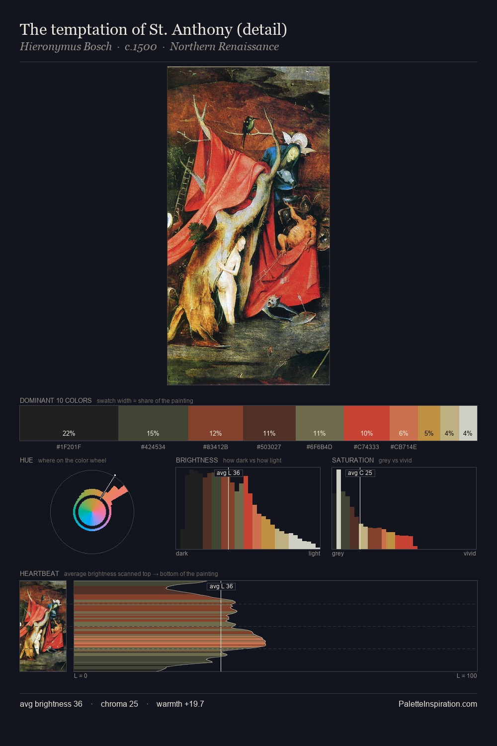
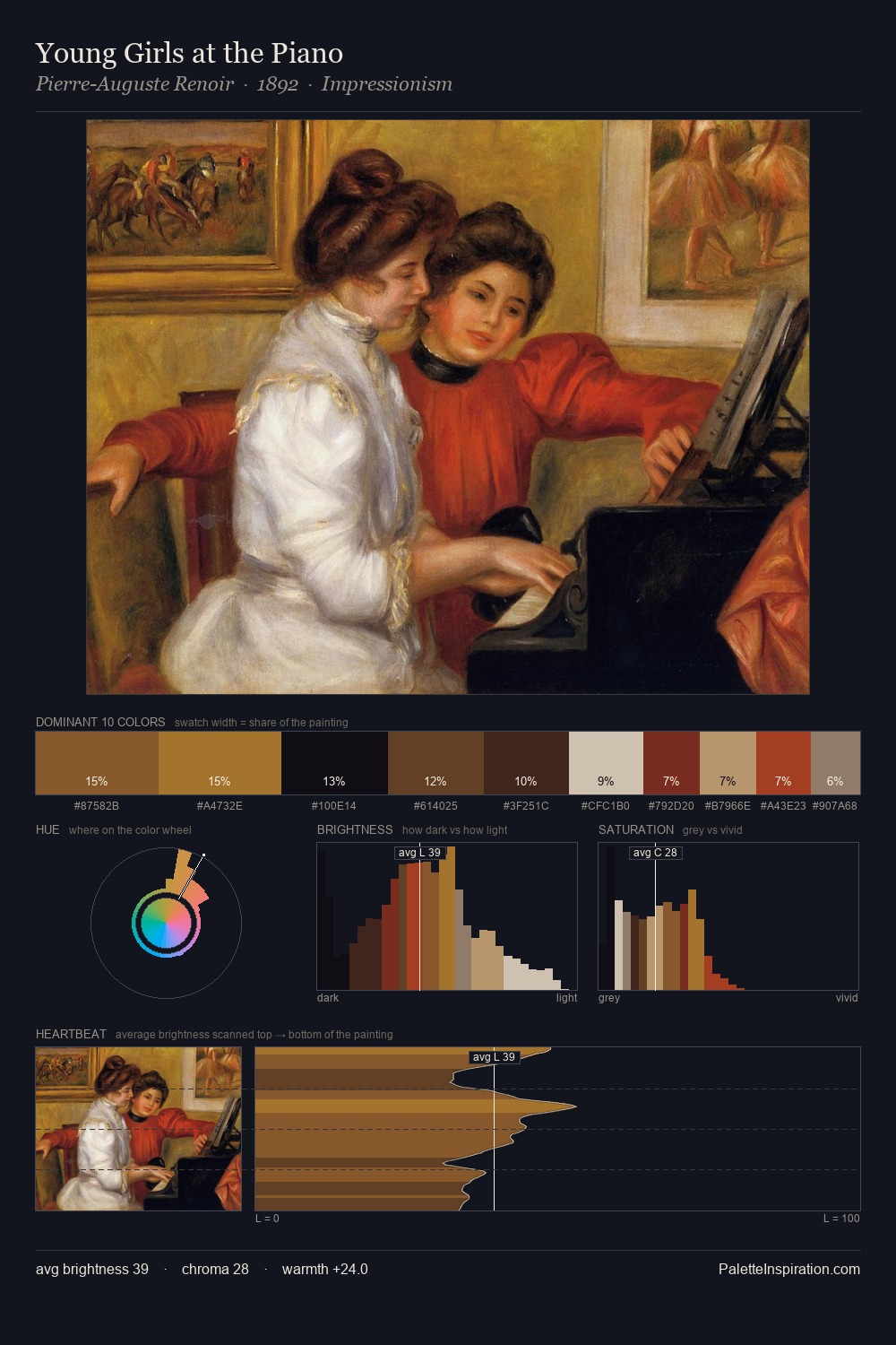
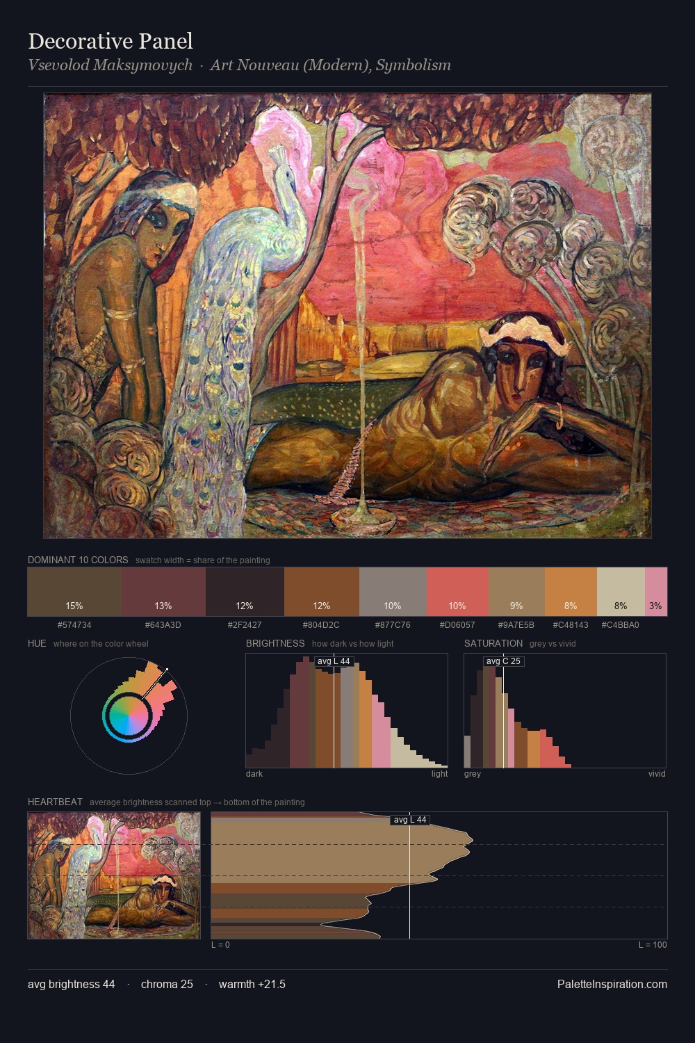
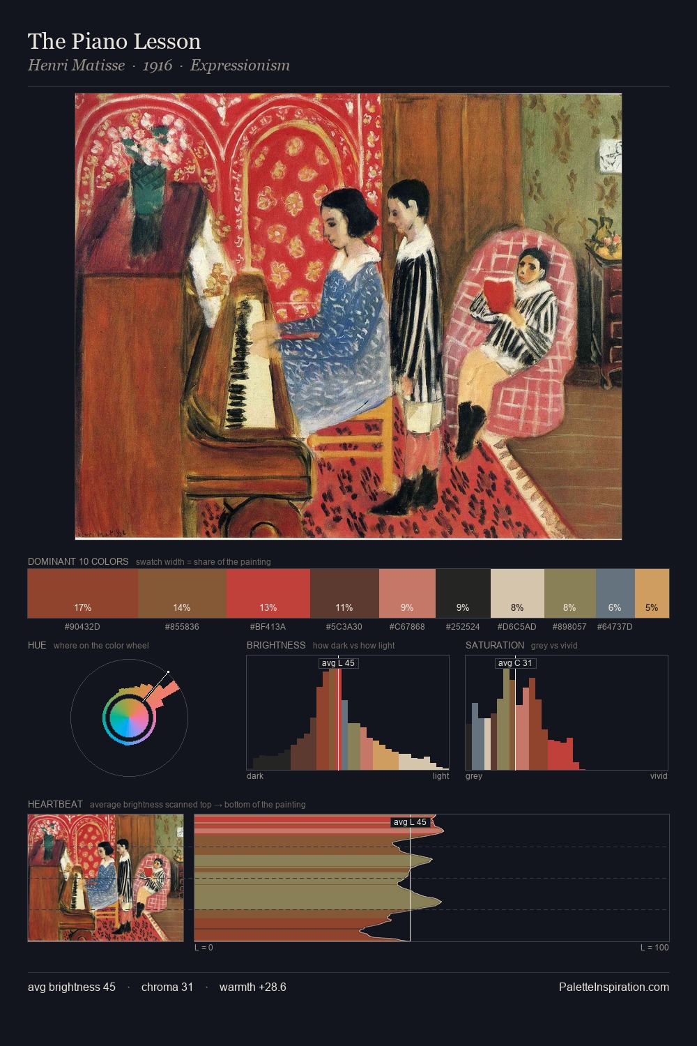
Values in Jacob de Wit rest in the mid-range - neither dramatically lit nor steeped in shadow. Jacob de Wit balances warm and cool with remarkable evenness, giving the composition its characteristic vibrancy. Mid-saturation across the board: the palette has colour character without chromatic excess. #BF4738 delivers the chromatic peak at only 9.9% - a small shot of colour with outsized visual impact. At 63 units of value range, the palette has the tonal breadth to sustain complex spatial readings. The combination of mid-to-high key, balanced temperature, and elevated chroma is characteristic of Impressionist observation: light broken into its component hues. This is palette 2 of Jacob de Wit's sequence - a single chapter in a chromatic story told across many works.
Example use cases
- food packaging
- leather accessories
- travel & outdoor
- natural cosmetics
- interior design
I Love This!
Copy, export, or download for your project