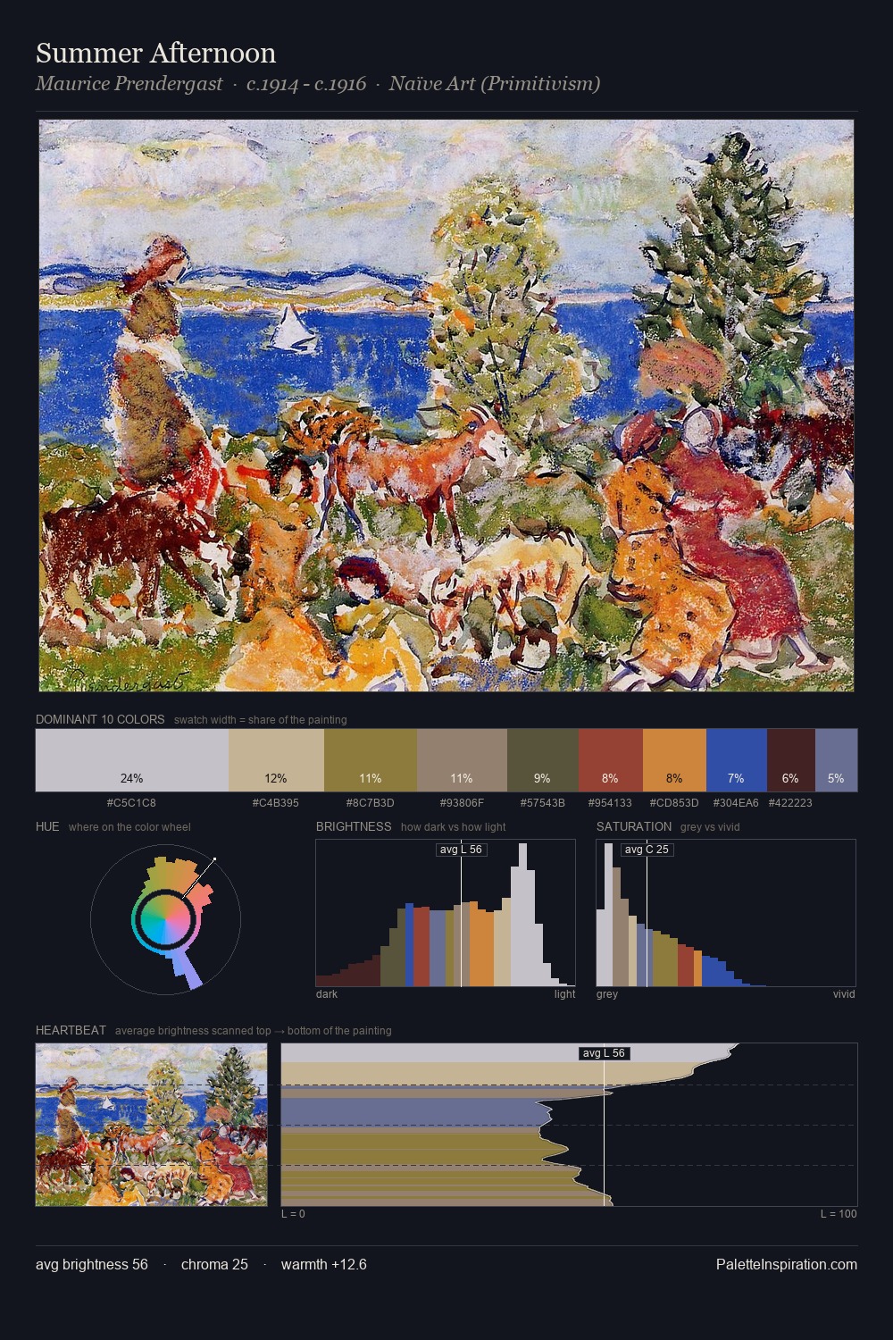
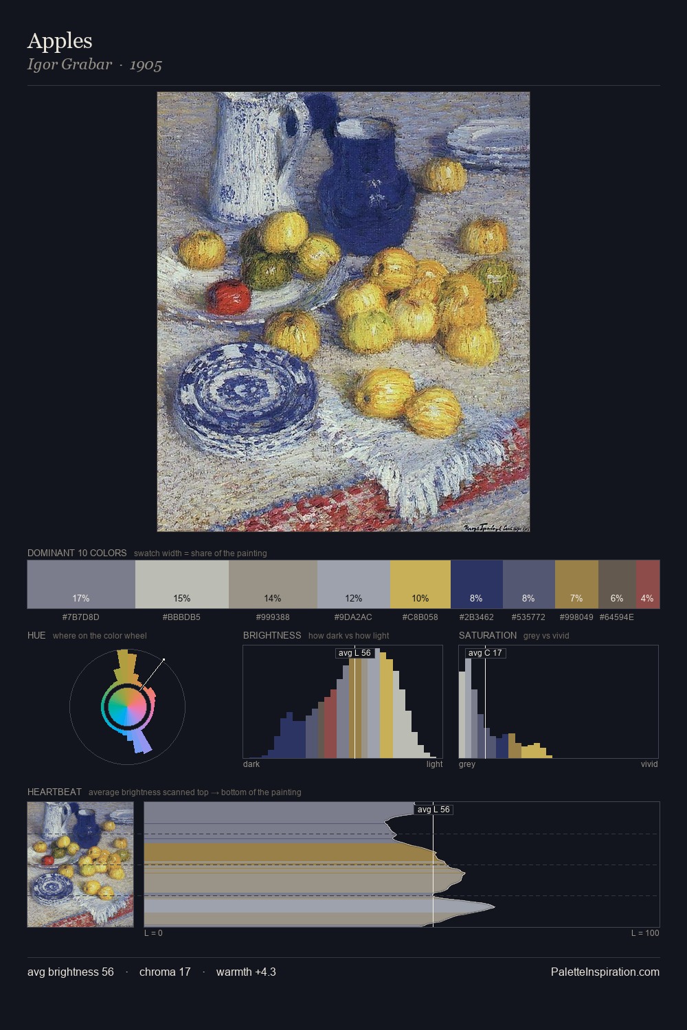
International Gothic Palette 3
Pale Ivory
Pale High-key and low-chroma - delicate, bleached, washed with light.
Ivory Warm creamy white - the color of natural ivory, warmer than pure white.
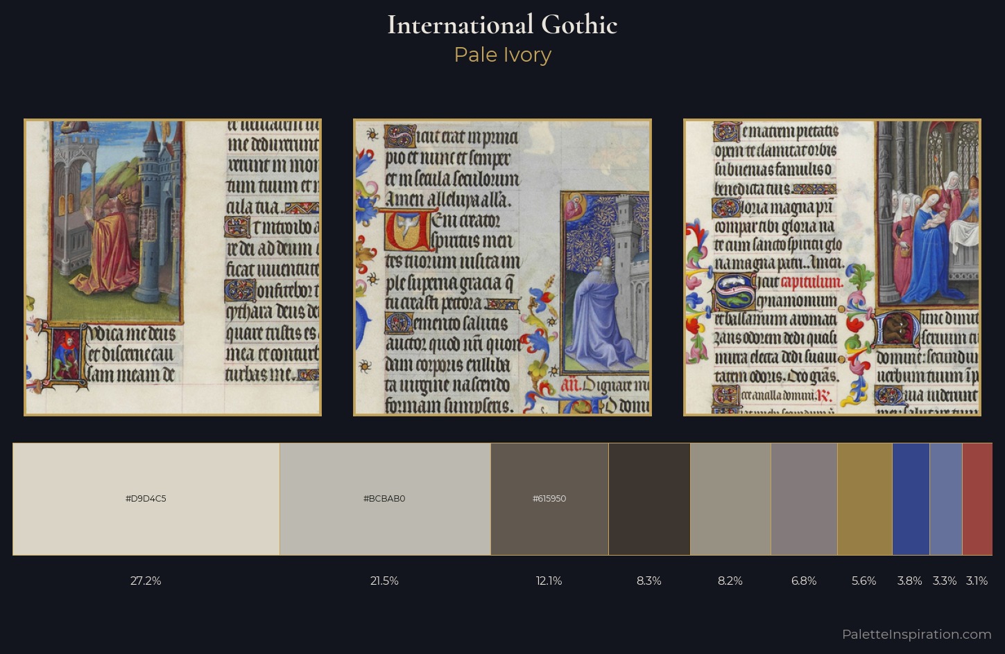
Palette Analysis
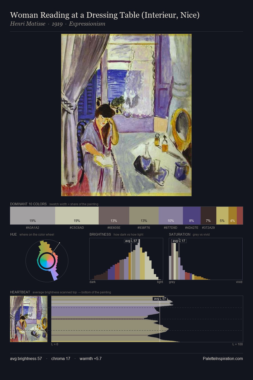
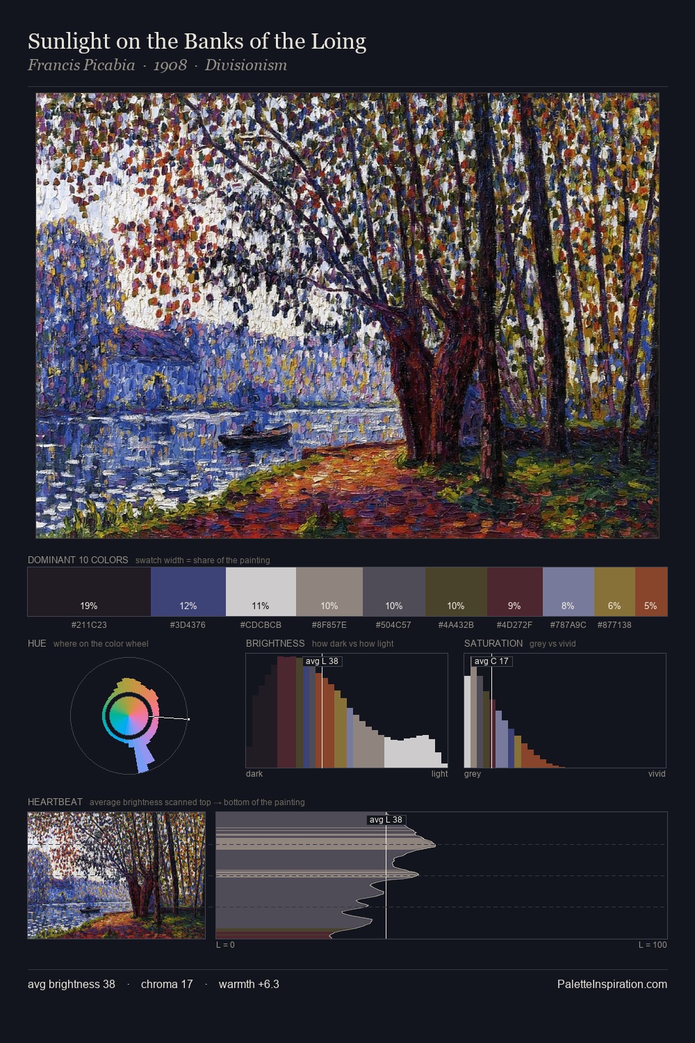
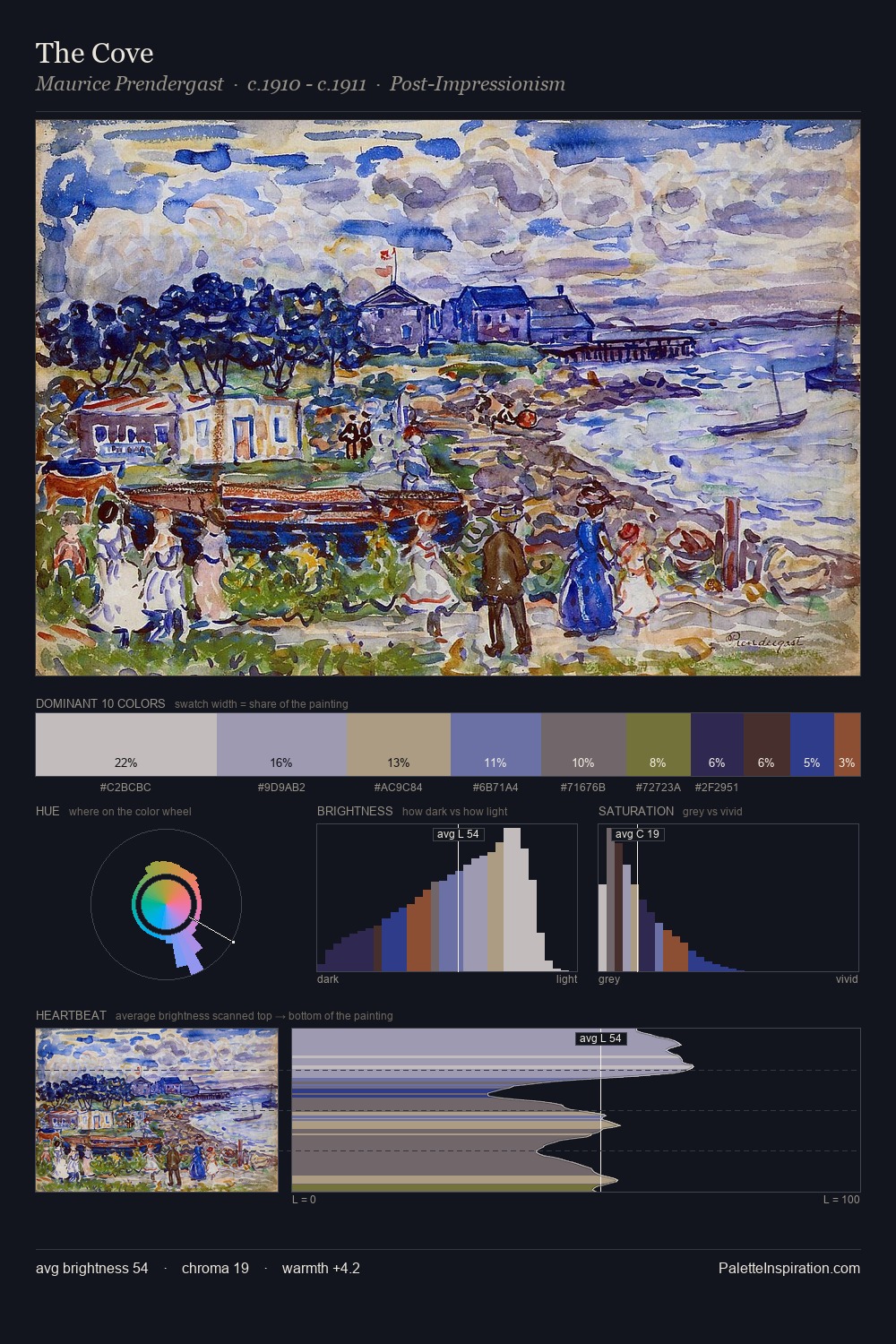
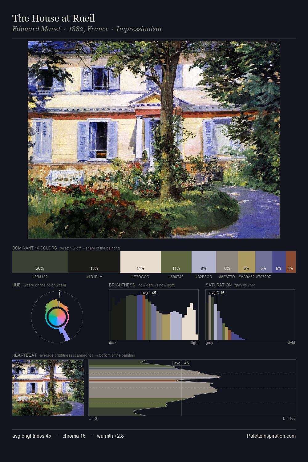
International Gothic is high-key - luminous, open, and weighted toward light. The palette tilts toward cool - blues and silver-greys carry the structural weight. Chroma hovers near zero; colour declares itself through subtle shifts in hue rather than outright saturation. The dominant colour, #D9D4C5, takes 27.2% of the total area, establishing the overall mood before any other hue is introduced. #99443F functions as the palette's exclamation mark: highest chroma, lowest percentage (3.1%). 53 units of value spread create a palette that is varied but unified - contrast in the service of harmony. The palette has the character of outdoor light: cool, mid-bright, with colour rendered faithfully rather than expressively.
Example use cases
- archival print
- university identity
- rare books
- cultural institutions
- nonprofit identity
I Love This!
Use This Palette
Copy, export, or download for your project
Copy, export, or download for your project
Copy:
Download:
Share: