International Gothic Palette 11
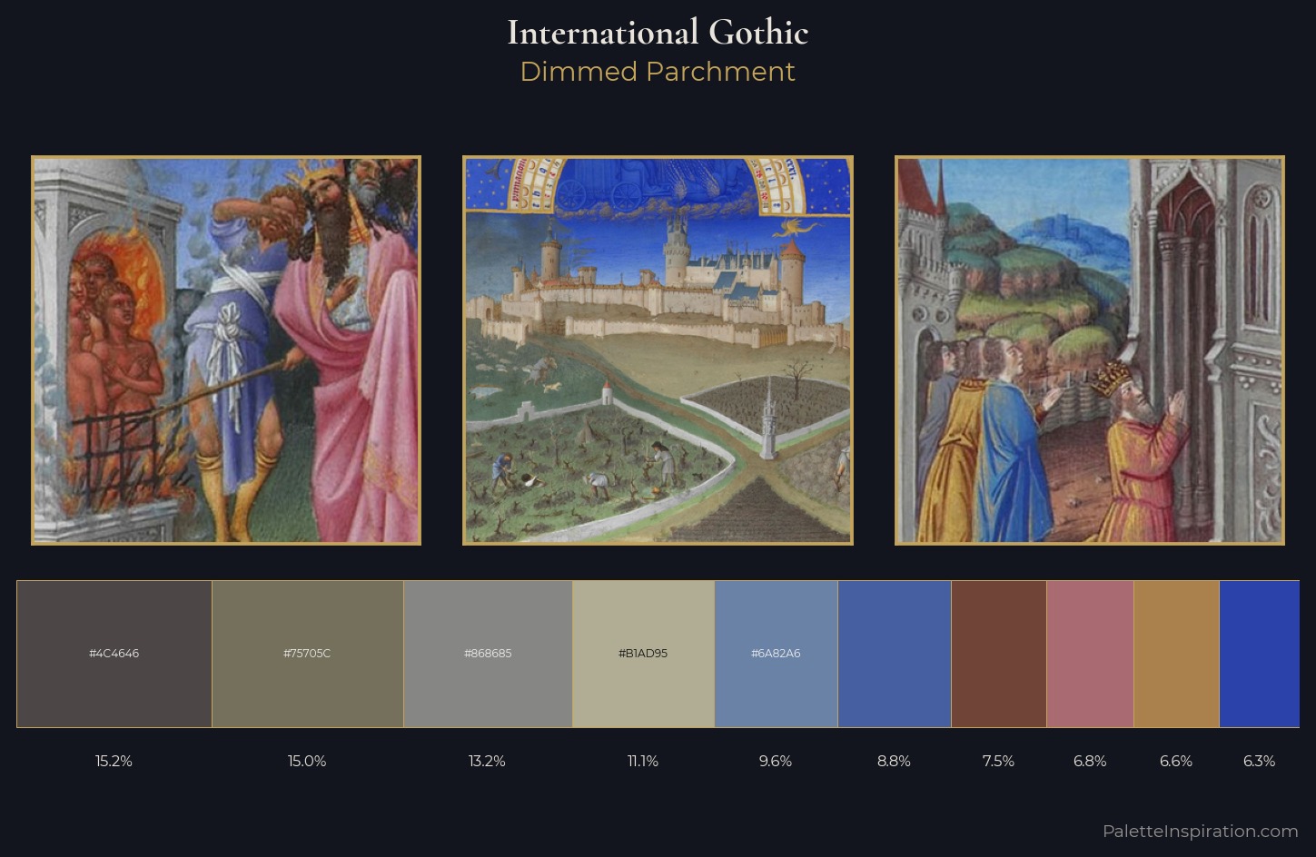
Dimmed Parchment
Dimmed Moderate shadow - values pulled toward mid-dark, as if a light source has been reduced.
Parchment Aged warm neutral - the color of old manuscript parchment, tan and slightly yellowed.
Palette Analysis
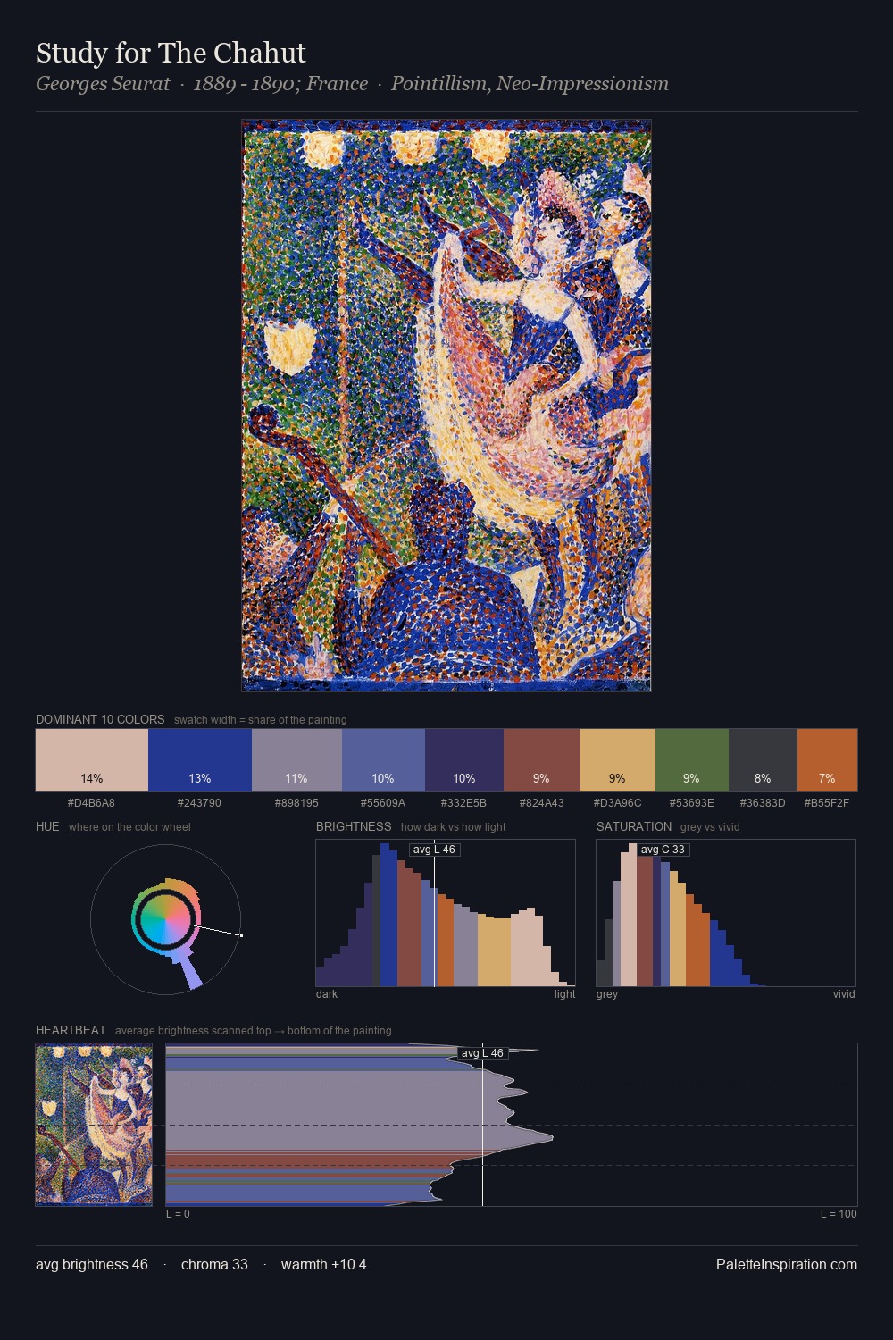
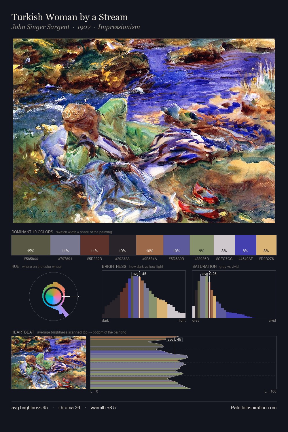
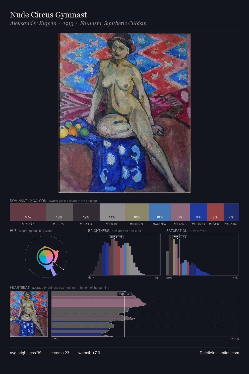
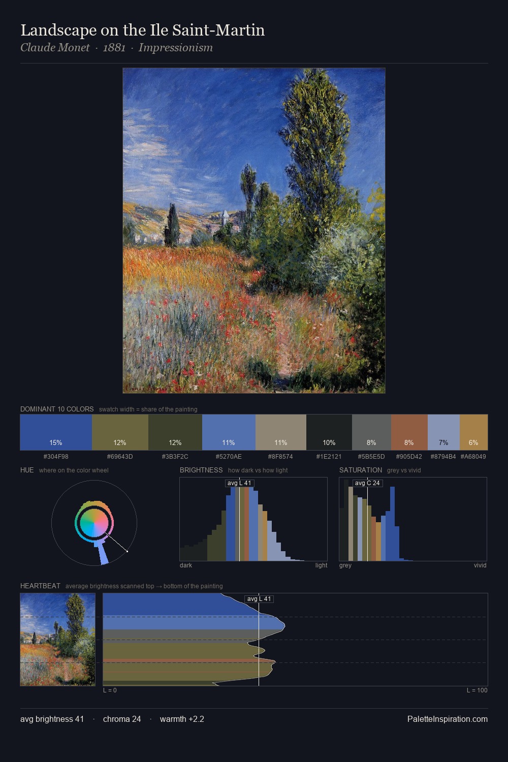
The value structure of International Gothic is mid-key: quiet, controlled, and cohesive. Cool tones set the register here - the blues and greens easily outweigh any warm accents. Every colour is desaturated; the palette proceeds through near-neutrals and gently-coloured greys. The highest-chroma note - #2B42AB - appears at just 6.3%, deployed as a precision accent against the quieter ground. At 34 units across the value scale, the palette keeps contrast readable without letting it dominate. The palette has the character of outdoor light: cool, mid-bright, with colour rendered faithfully rather than expressively.
Example use cases
- exhibition design
- foundation branding
- estate management
- art education
- museums & galleries
I Love This!
Use This Palette
Copy, export, or download for your project
Copy, export, or download for your project
Copy:
Download:
Share: