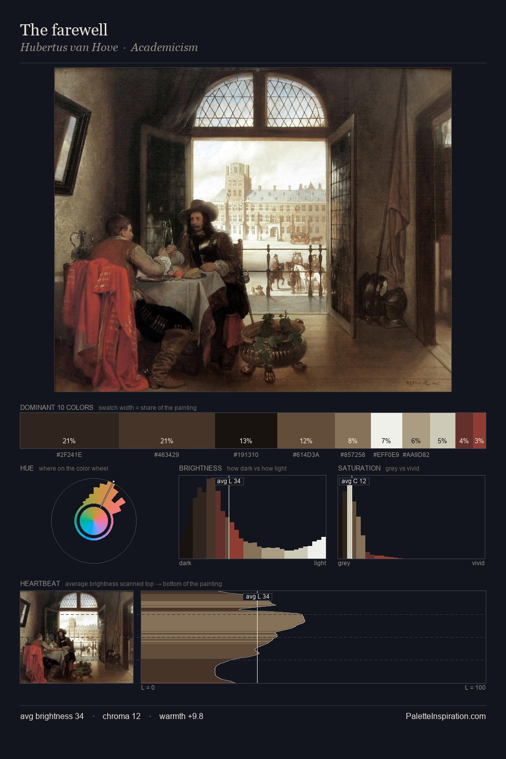
Hubertus van Hove Palette 6
Shadowed Sienna
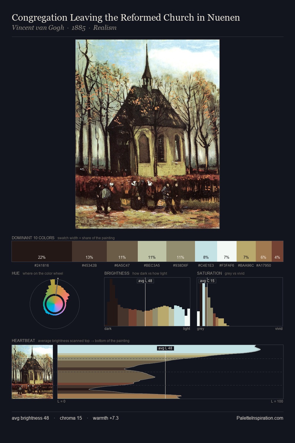
Shadowed Low-key - values weighted toward shadow, the palette of dim interiors and overcast skies.
Sienna Warm red-brown earth - named after the Sienese pigment, a fundamental artist earth color.

Palette Analysis
Values in Hubertus van Hove rest in the mid-range - neither dramatically lit nor steeped in shadow. Heat pervades this palette; warm chromatic identities outweigh cool ones at almost every weight. Saturation is deliberately withheld - the beauty here lies in the near-monochromatic gradations rather than colour difference. The highest-chroma note - #2B1815 - appears at just 8.7%, deployed as a precision accent against the quieter ground. 81 units of value range underpin the palette's structural clarity: the eye always knows where light falls. Palette 6 sits within the larger chromatic argument that Hubertus van Hove's complete body of work advances.
Example use cases
- premium streaming
- cocktail bars
- fashion campaigns
- book covers
- music labels
I Love This!
Use This Palette
Copy, export, or download for your project
Copy, export, or download for your project
Copy:
Download:
Share: