Hubertus van Hove Palette 3

Palette Analysis
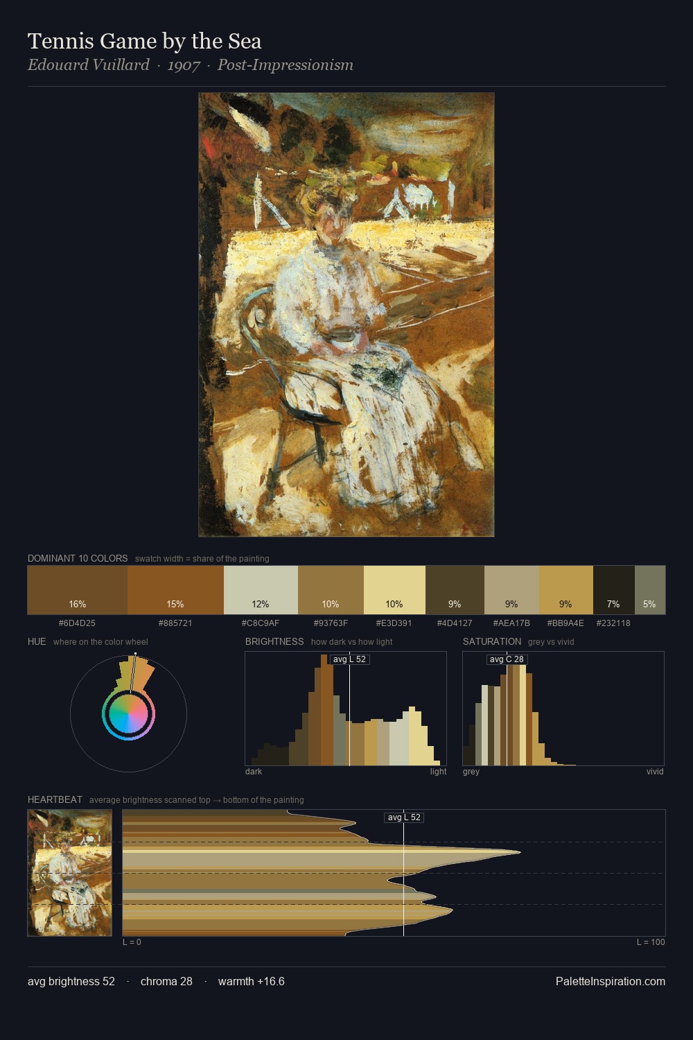
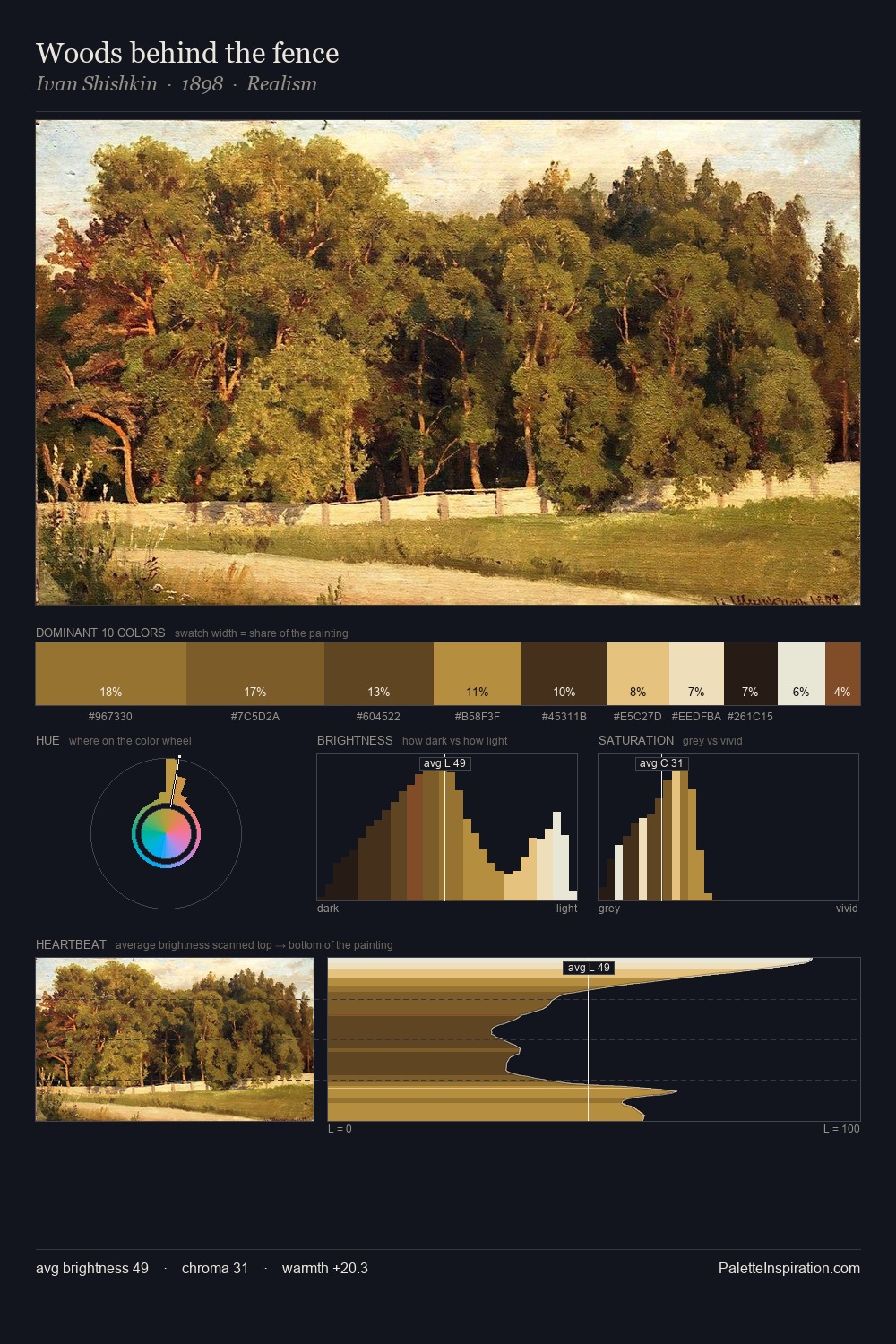
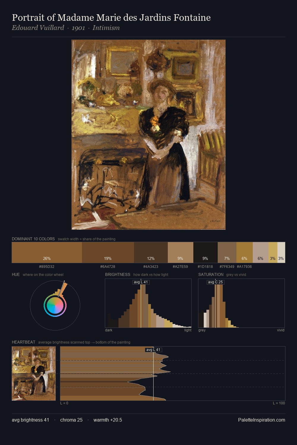
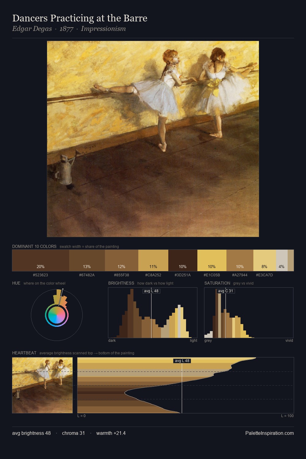
Hubertus van Hove keeps values measured and balanced, a hallmark of tonal restraint. Hubertus van Hove keeps warm and cool in parity, a balance that lends the work a perceptual shimmer. Colours are neither washed out nor blazing; they occupy the productive middle ground of the chroma scale. #825E24 delivers the chromatic peak at only 10.3% - a small shot of colour with outsized visual impact. 57 units of value range underpin the palette's structural clarity: the eye always knows where light falls. The palette reads as an Impressionist one - light-biased, chromatically direct, and built on temperature contrast rather than value opposition. Hubertus van Hove's palette 3 carries its own internal logic while remaining in conversation with the artist's broader colour intelligence.
Example use cases
- theater design
- jewelry brands
- tobacco-adjacent retail
- event branding
- film & entertainment
I Love This!
Copy, export, or download for your project