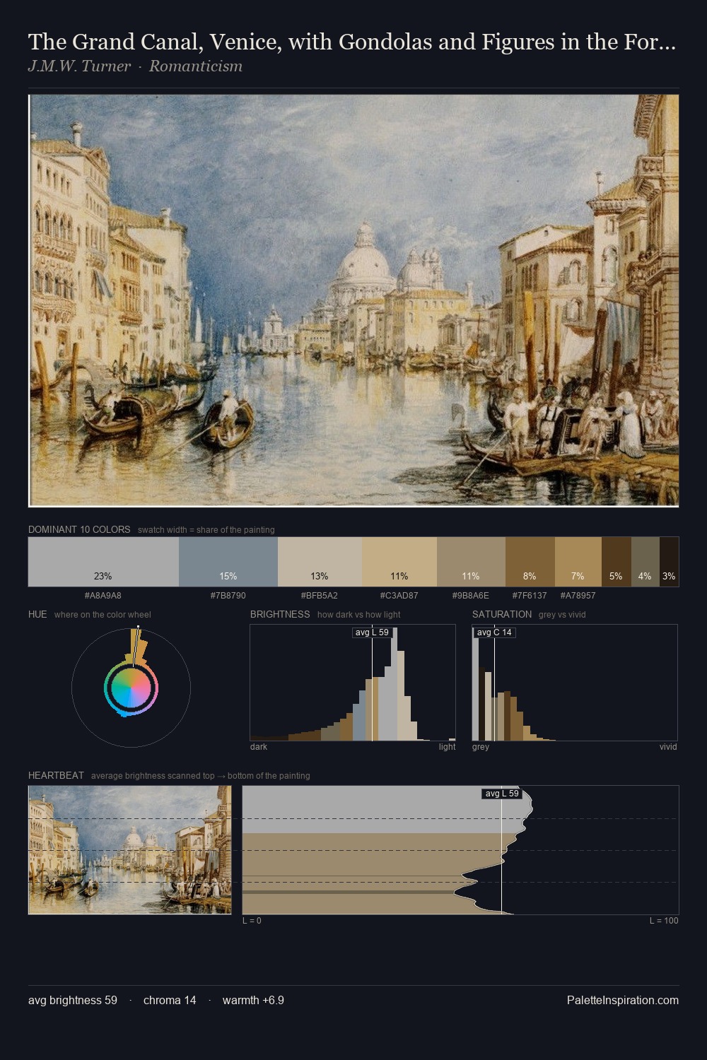
Herbert James Draper Palette 1
Soft Ecru
Soft Low-contrast, gentle chroma - mid-key values and low saturation, approachable and calm.
Ecru Unbleached linen - warm mid-neutral, slightly grayed, raw and natural.

Palette Analysis
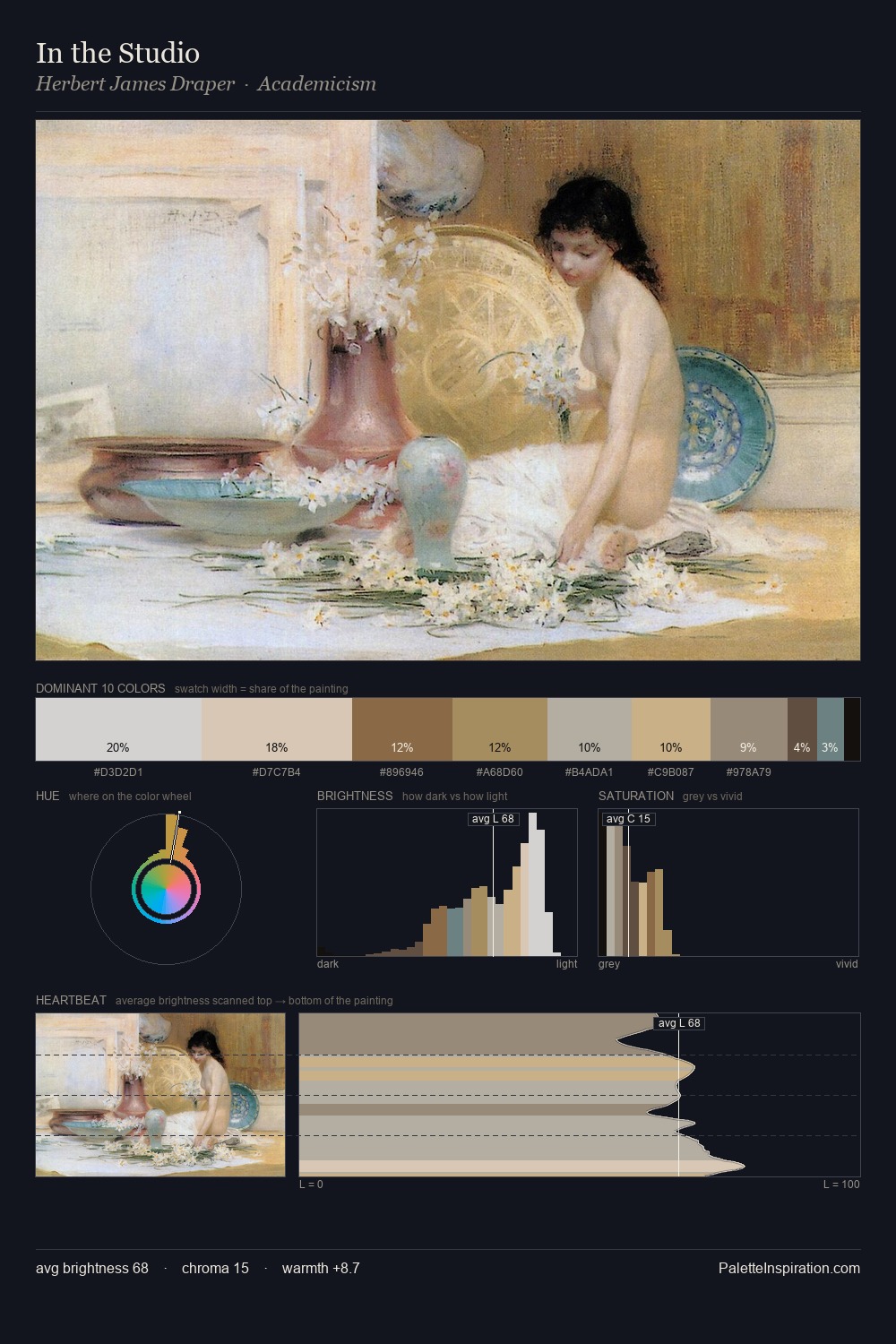
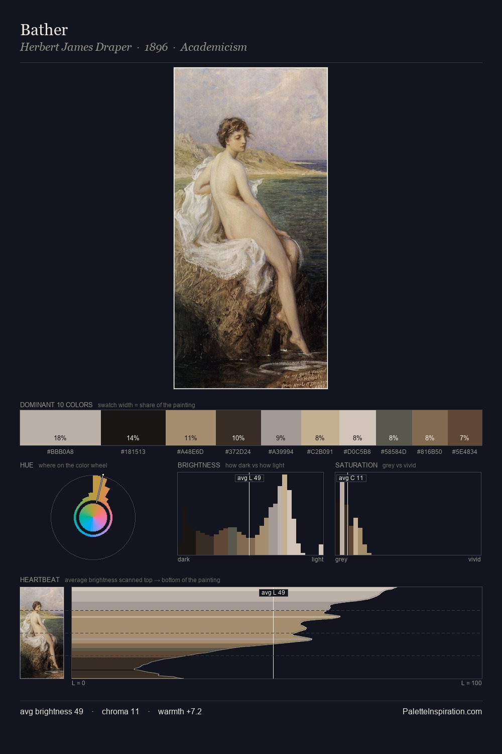
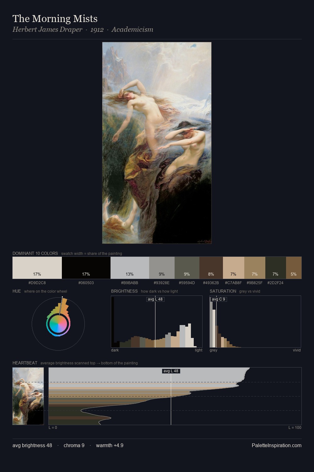
Herbert James Draper is high-key - luminous, open, and weighted toward light. The palette achieves thermal balance - reds and blues, ochres and greens, each holding the other in check. Chroma hovers near zero; colour declares itself through subtle shifts in hue rather than outright saturation. The saturated accent, #A3895B, registers at 9.2% - sparse enough to feel like a deliberate surprise. The full value range is 64 units: broad enough to build convincing three-dimensional form. In the context of Herbert James Draper's full range of palettes, group 1 represents one movement in an ongoing chromatic dialogue.
Example use cases
- florist branding
- event design
- real estate
- jewelry retail
- hospitality branding
I Love This!
Use This Palette
Copy, export, or download for your project
Copy, export, or download for your project
Copy:
Download:
Share: