Antonio Corradini Palette 2
Soft Ivory
Soft Low-contrast, gentle chroma - mid-key values and low saturation, approachable and calm.
Ivory Warm creamy white - the color of natural ivory, warmer than pure white.

Palette Analysis
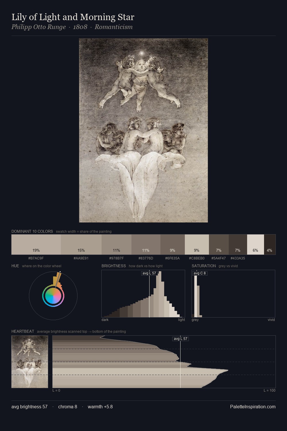
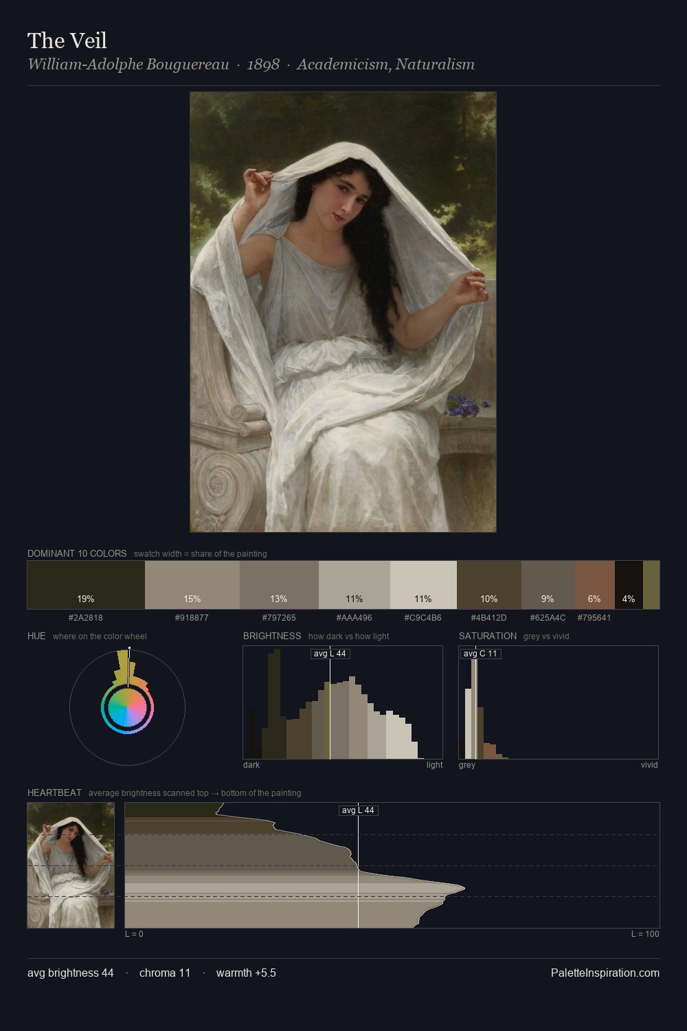
Antonio Corradini is high in key: pale, luminous, and filled with optical air. Heat pervades this palette; warm chromatic identities outweigh cool ones at almost every weight. Chroma hovers near zero; colour declares itself through subtle shifts in hue rather than outright saturation. At 8.9%, #E0D8D0 carries the palette's sharpest chromatic charge: an accent that earns its place precisely because it is withheld. At 57 units of value range, the palette has the tonal breadth to sustain complex spatial readings. Antonio Corradini's palette 2 carries its own internal logic while remaining in conversation with the artist's broader colour intelligence.
Example use cases
- exhibition design
- foundation branding
- estate management
- art education
- museums & galleries
I Love This!
Use This Palette
Copy, export, or download for your project
Copy, export, or download for your project
Copy:
Download:
Share: