Antonio Corradini Master Palette
Muted Parchment
Muted Deliberately desaturated - chroma pulled toward gray, the restraint of tonal painting.
Parchment Aged warm neutral - the color of old manuscript parchment, tan and slightly yellowed.

Palette Analysis
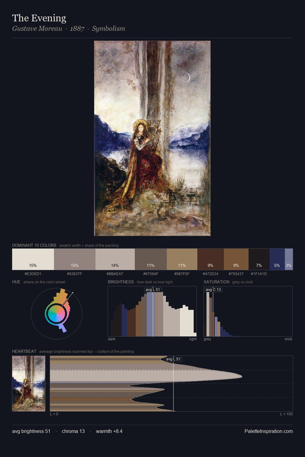
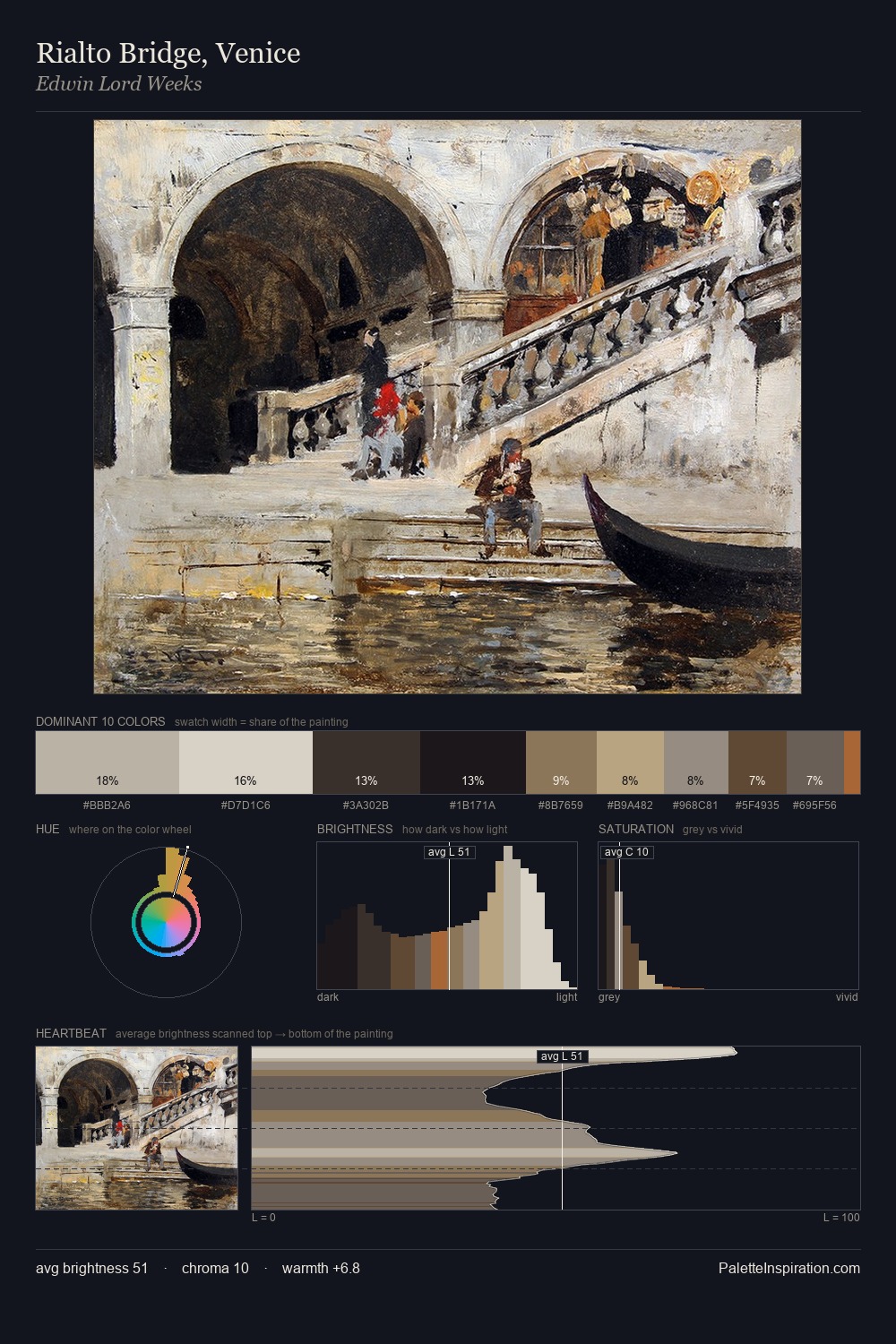
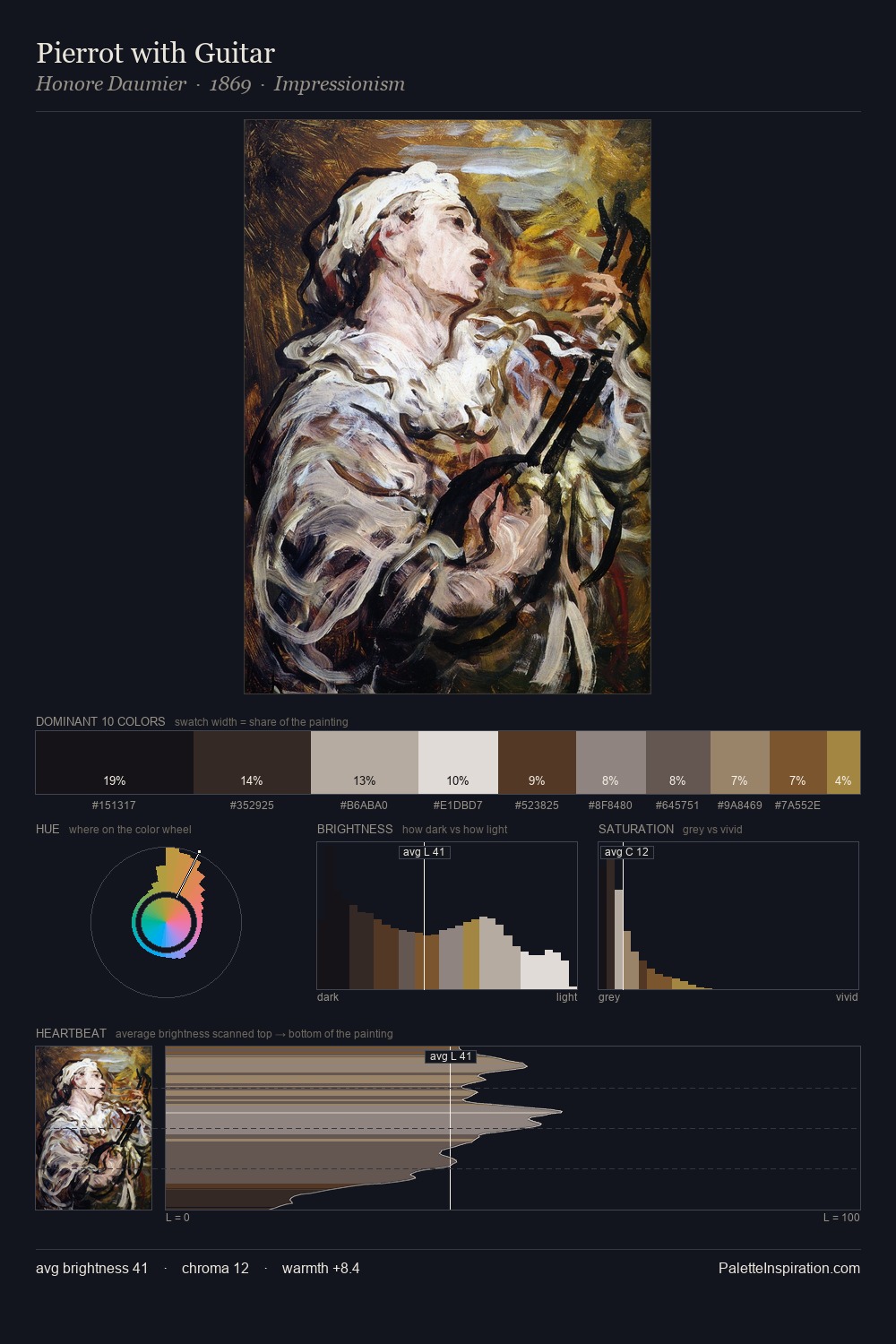
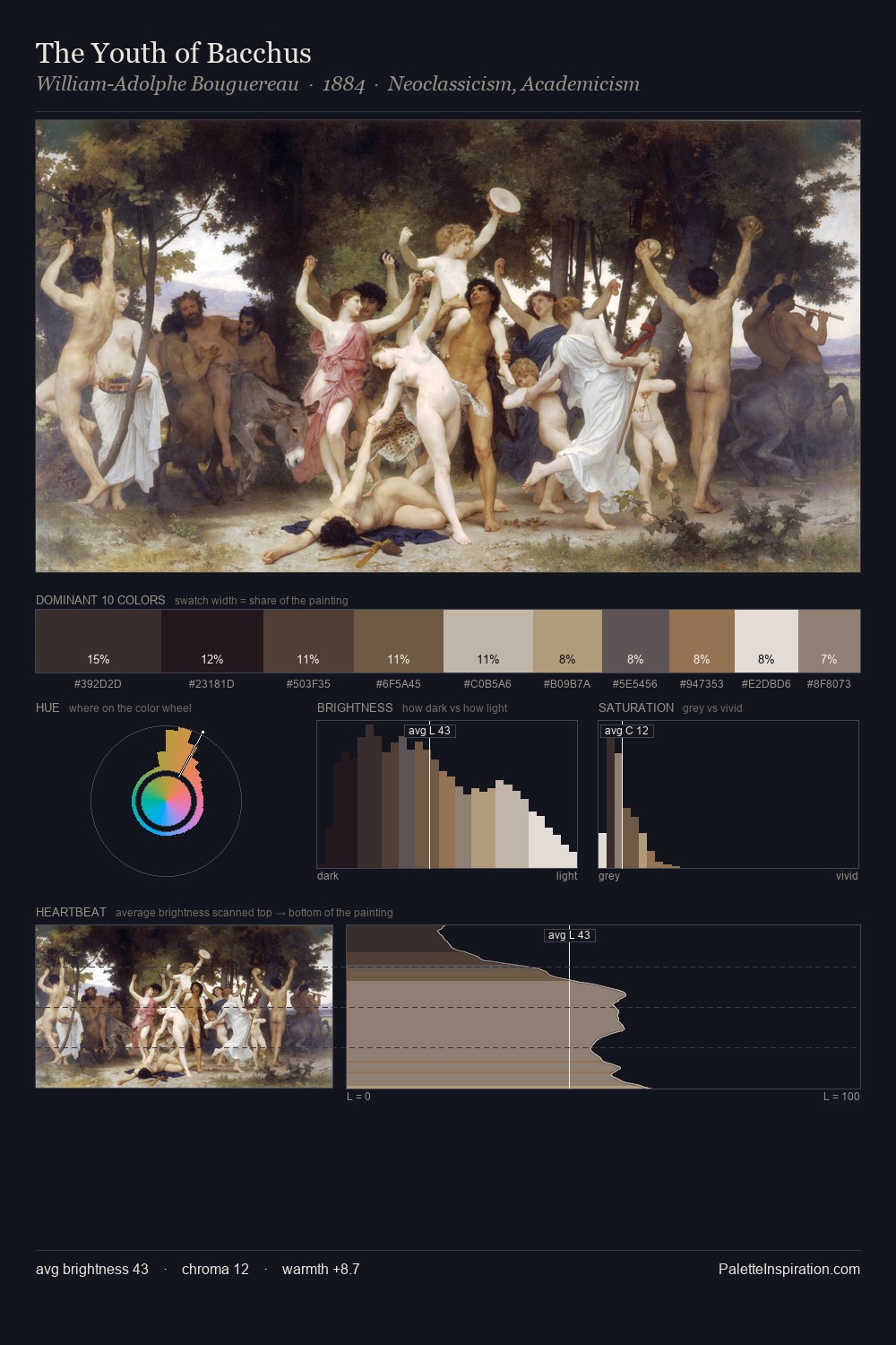
The value structure of Antonio Corradini is mid-key: quiet, controlled, and cohesive. Antonio Corradini orchestrates warmth above all else - reds, ambers, and siennas take the lead. The absence of saturated colour is itself an expressive choice: this is a palette of restraint and atmosphere. The highest-chroma note - #CDBCA8 - appears at just 8.0%, deployed as a precision accent against the quieter ground. From deepest dark to palest light, the palette traverses 66 units of the value scale - a span that creates natural depth. These proportions encode Antonio Corradini's instinctive sense of how much of each quality the eye can hold.
Example use cases
- exhibition design
- foundation branding
- estate management
- art education
- museums & galleries
I Love This!
Use This Palette
Copy, export, or download for your project
Copy, export, or download for your project
Copy:
Download:
Share: