Herbert James Draper Palette 7

Palette Analysis
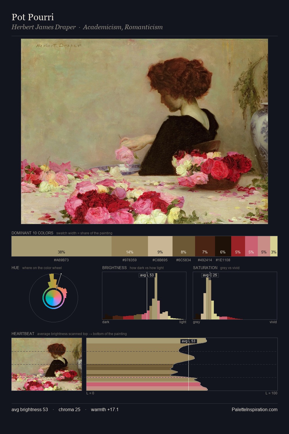
Values in Herbert James Draper rest in the mid-range - neither dramatically lit nor steeped in shadow. Blues and teal-greys govern the palette, lending it an aquatic or atmospheric quality. Chroma is moderate: colours carry enough saturation to be read as colour, but the palette stops well short of garish intensity. #A59A73 claims 42.2% of the surface, functioning as the work's tonal foundation. The most saturated colour, #462012, is reserved to 8.3% of the surface, where it acts as a focal punctuation. From deepest dark to palest light, the palette traverses 61 units of the value scale - a span that creates natural depth. The palette has the character of outdoor light: cool, mid-bright, with colour rendered faithfully rather than expressively. Herbert James Draper's palette 7 carries its own internal logic while remaining in conversation with the artist's broader colour intelligence.
Example use cases
- food packaging
- leather accessories
- travel & outdoor
- natural cosmetics
- interior design
I Love This!
Copy, export, or download for your project