Herbert James Draper Palette 9
Penumbral Bister
Penumbral Partial shadow - the transitional zone between light and full dark, soft-edged.
Bister Dark warm brown - a traditional ink and wash pigment made from wood soot.

Palette Analysis
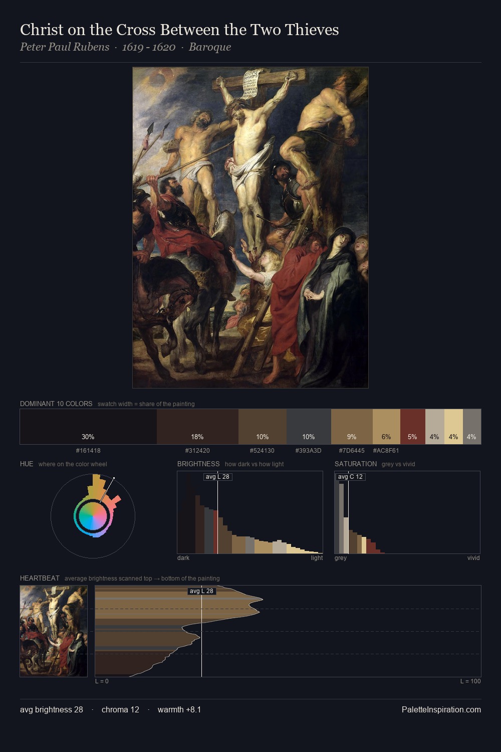
Herbert James Draper keeps values measured and balanced, a hallmark of tonal restraint. Heat pervades this palette; warm chromatic identities outweigh cool ones at almost every weight. All colours lean toward grey, building depth through value rather than colour punch. Only 11.5% is devoted to #725133, yet that small allocation delivers the palette's entire chromatic tension. At 65 units of value range, the palette has the tonal breadth to sustain complex spatial readings. Palette 9 sits within the larger chromatic argument that Herbert James Draper's complete body of work advances.
Example use cases
- theater design
- jewelry brands
- tobacco-adjacent retail
- event branding
- film & entertainment
I Love This!
Use This Palette
Copy, export, or download for your project
Copy, export, or download for your project
Copy:
Download:
Share: