Henry Scott Tuke Palette 1

Palette Analysis
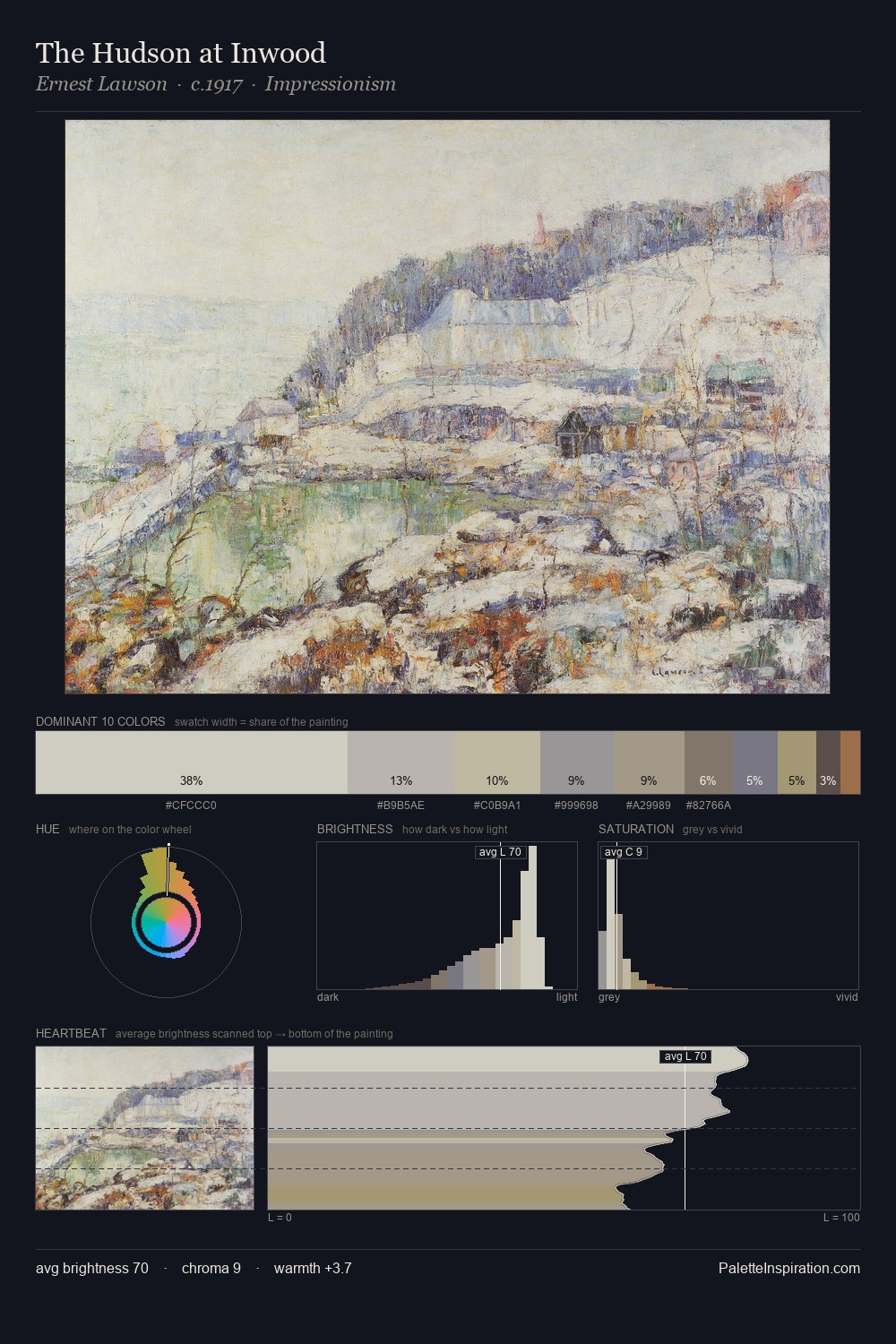
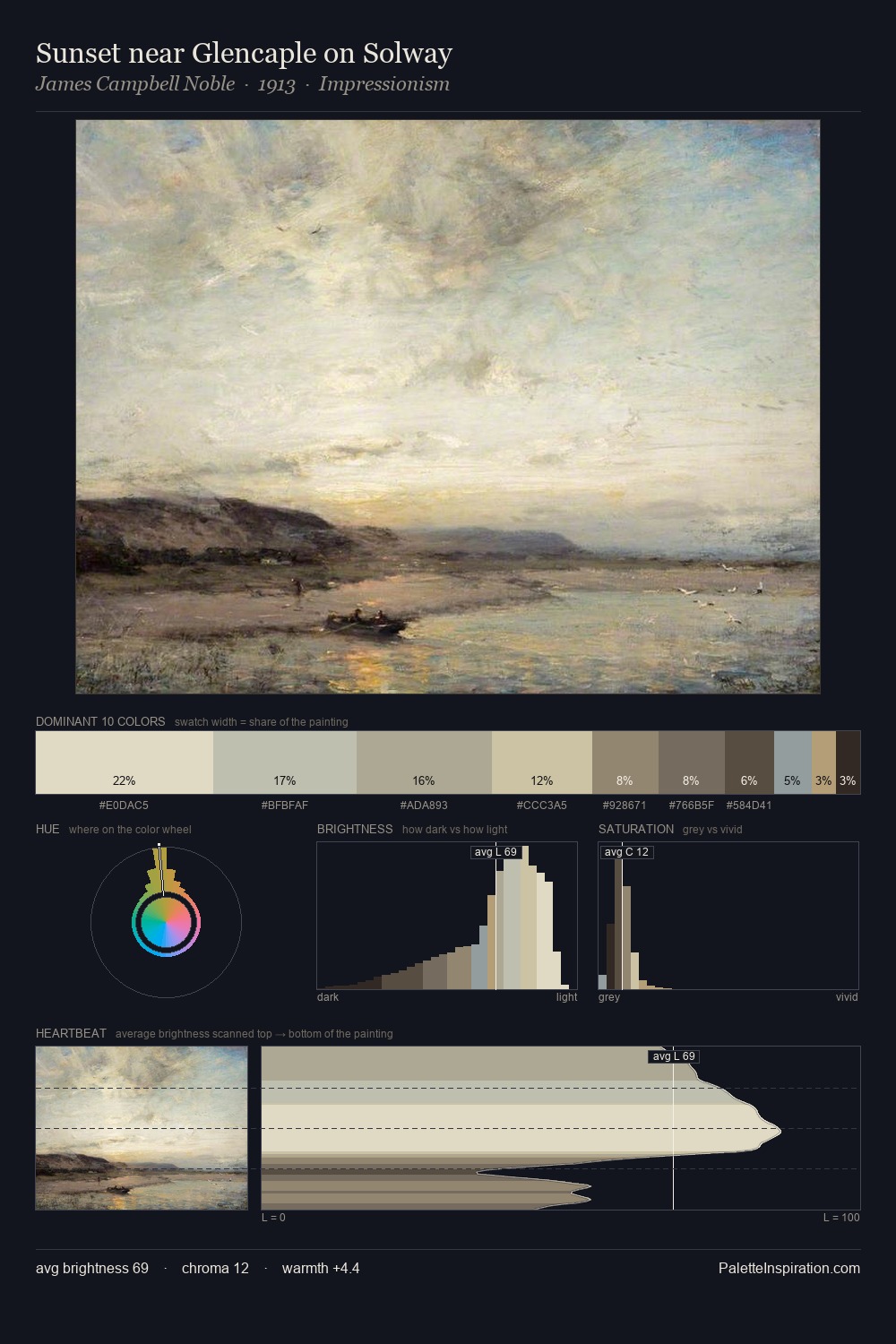
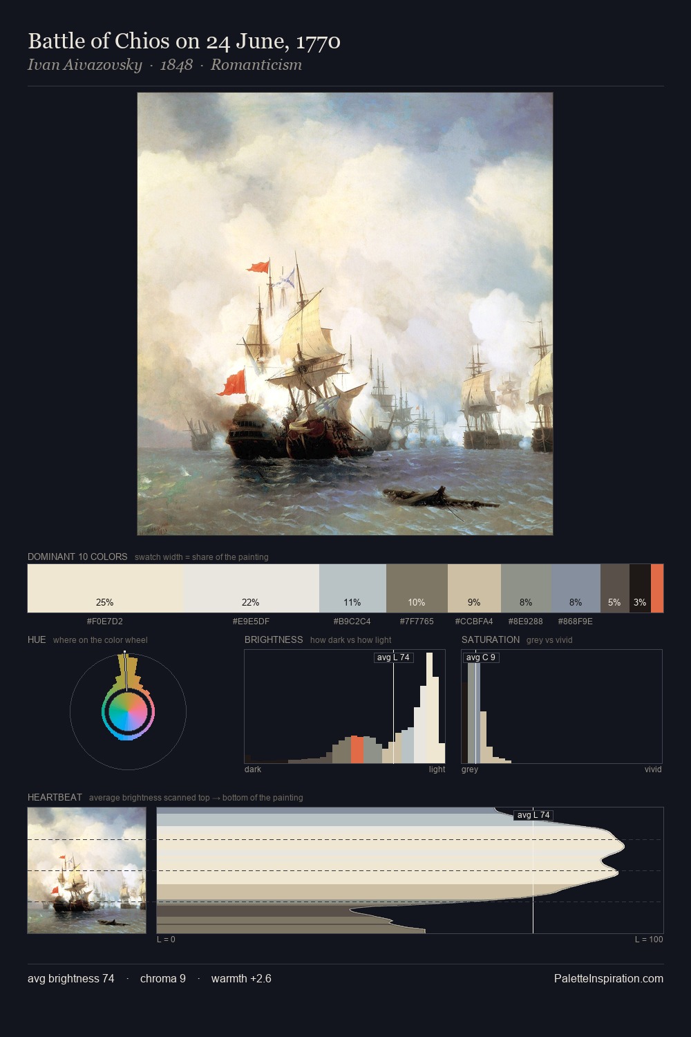
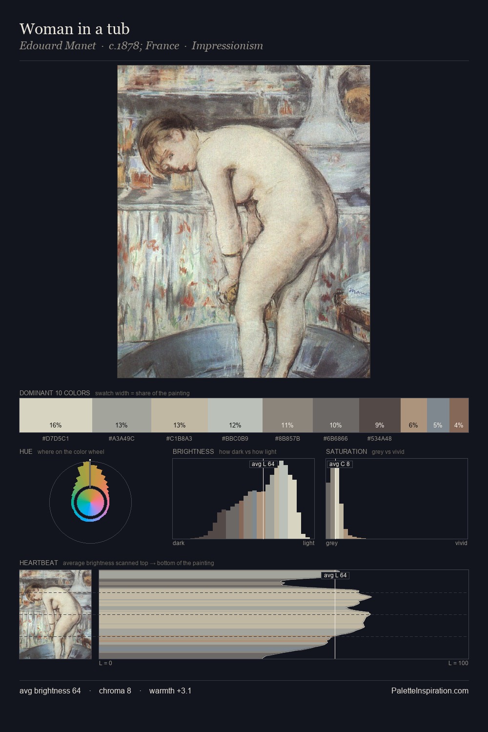
Henry Scott Tuke works in the upper reaches of the value scale, creating an atmosphere of brightness and expansiveness. Cool tones set the register here - the blues and greens easily outweigh any warm accents. Saturation is deliberately withheld - the beauty here lies in the near-monochromatic gradations rather than colour difference. Henry Scott Tuke gives 26.5% of the composition to a single #DEE1DA - a decisive chromatic anchor. The highest-chroma note - #BEB59A - appears at just 6.6%, deployed as a precision accent against the quieter ground. Value range is moderate at 48 units - enough contrast for legibility, not so much as to fragment the tonal unity. The palette has the character of outdoor light: cool, mid-bright, with colour rendered faithfully rather than expressively. In the context of Henry Scott Tuke's full range of palettes, group 1 represents one movement in an ongoing chromatic dialogue.
Example use cases
- food & beverage
- wedding stationery
- lifestyle brands
- interior design
- fashion retail
I Love This!
Copy, export, or download for your project