Henry Scott Tuke Palette 4

Palette Analysis
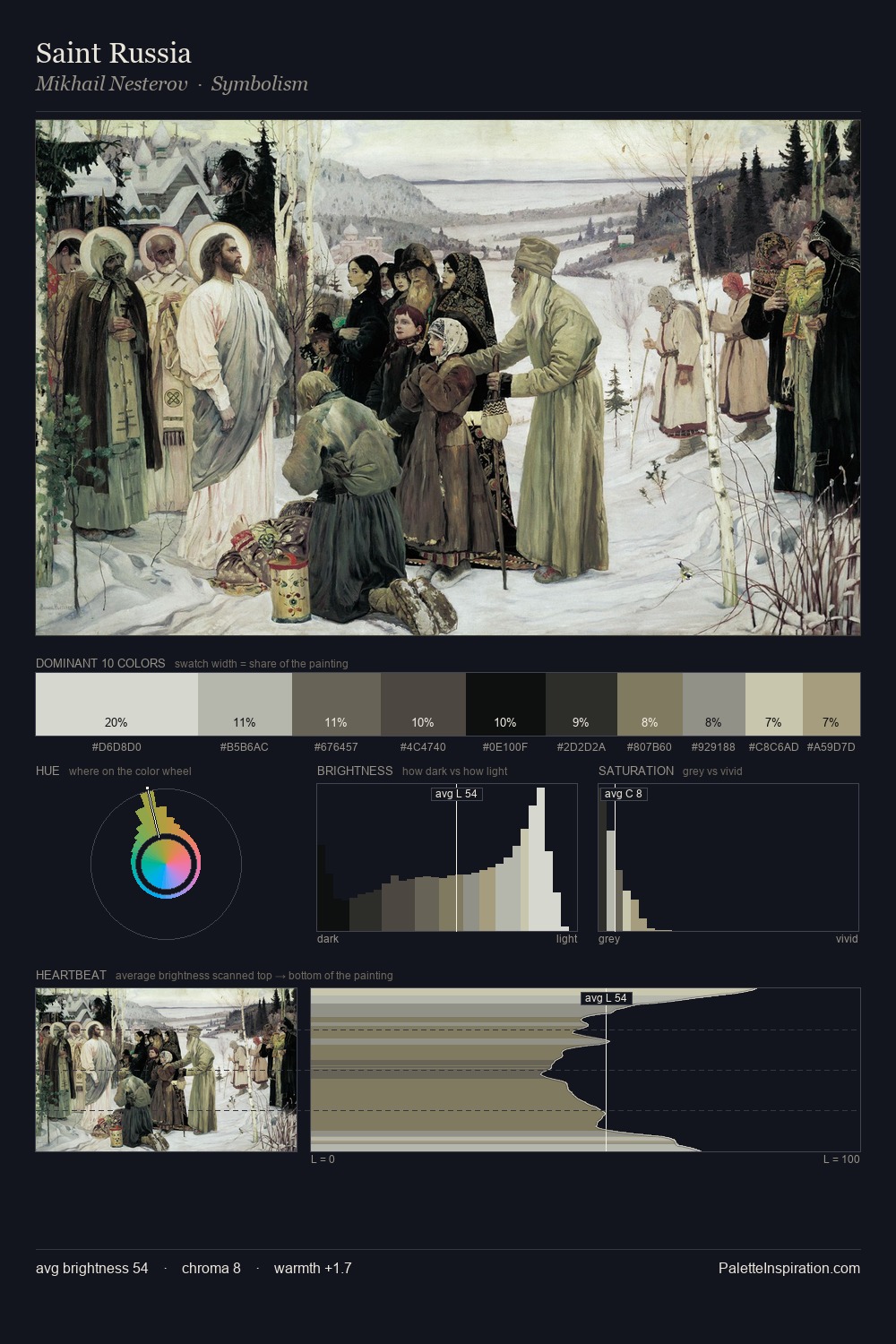
Values in Henry Scott Tuke tilt decisively toward white, giving the palette its luminous character. Temperature is cool-dominant, with blue and green families claiming the largest areas. All colours lean toward grey, building depth through value rather than colour punch. Henry Scott Tuke gives 50.0% of the composition to a single #D7D7D1 - a decisive chromatic anchor. #957E5A delivers the chromatic peak at only 1.7% - a small shot of colour with outsized visual impact. Spanning 45 units on the value axis, the palette achieves the balance between tonal flatness and fragmentation. The palette has the character of outdoor light: cool, mid-bright, with colour rendered faithfully rather than expressively. In the context of Henry Scott Tuke's full range of palettes, group 4 represents one movement in an ongoing chromatic dialogue.
Example use cases
- hospitality branding
- boutique hotels
- restaurant identity
- home goods
- florist branding
I Love This!
Copy, export, or download for your project