Henrietta Rae Palette 1
Penumbral Bister
Penumbral Partial shadow - the transitional zone between light and full dark, soft-edged.
Bister Dark warm brown - a traditional ink and wash pigment made from wood soot.

Palette Analysis
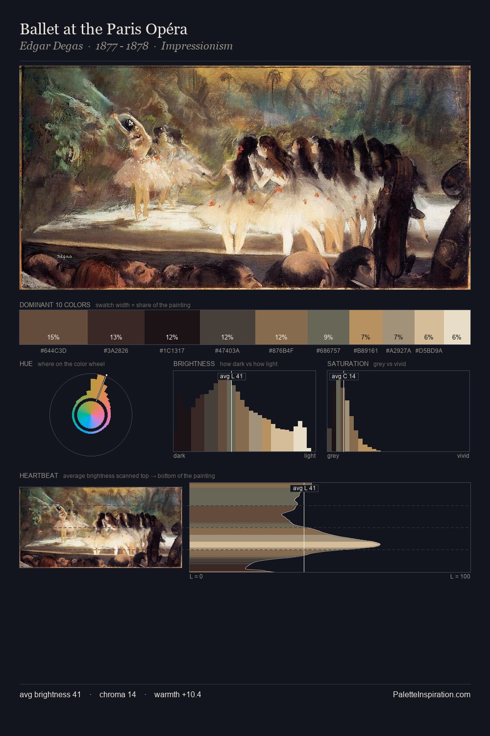
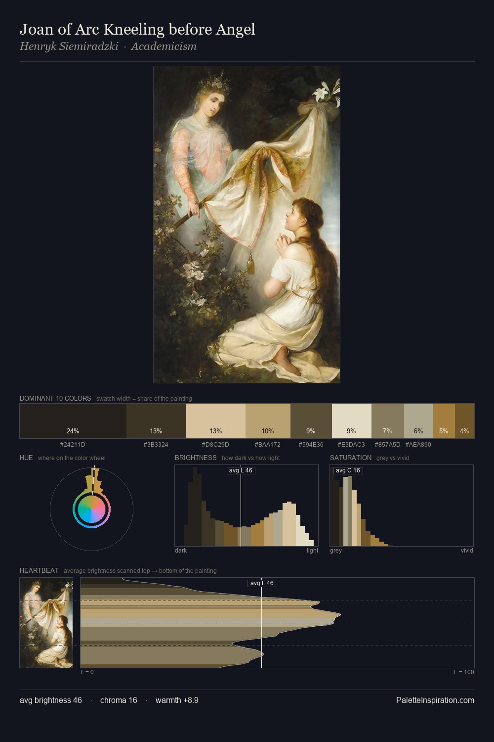
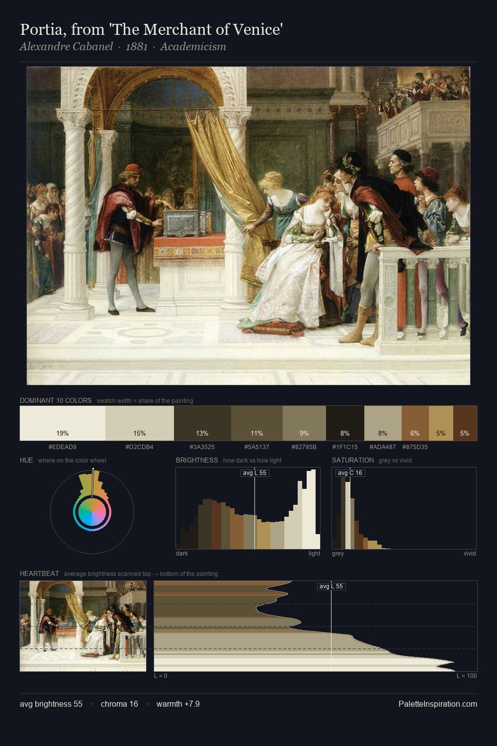
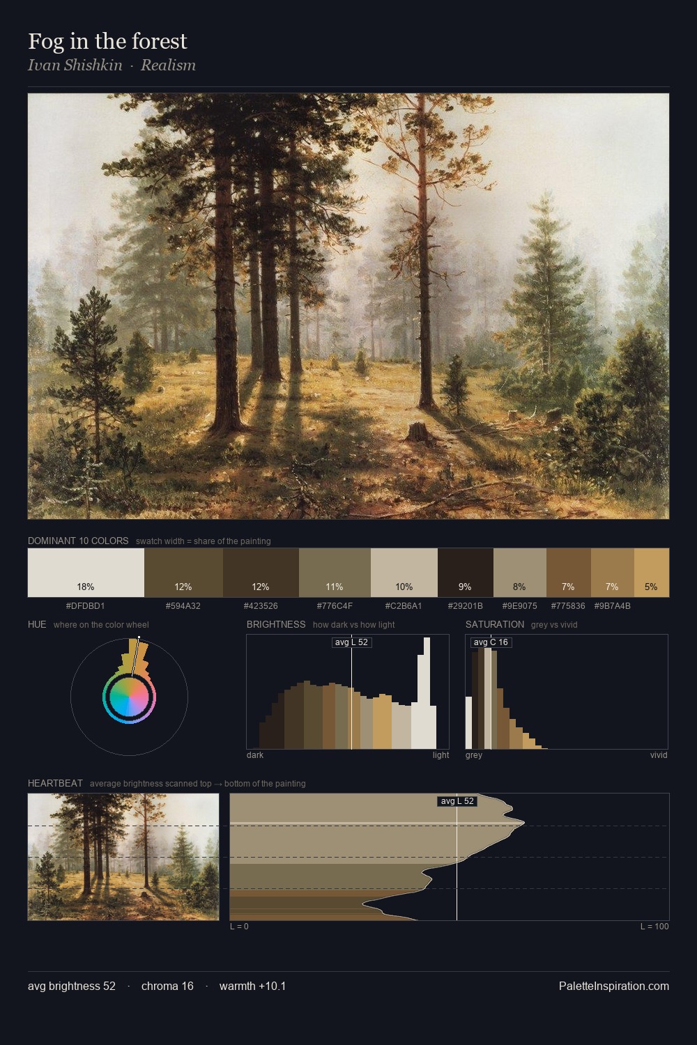
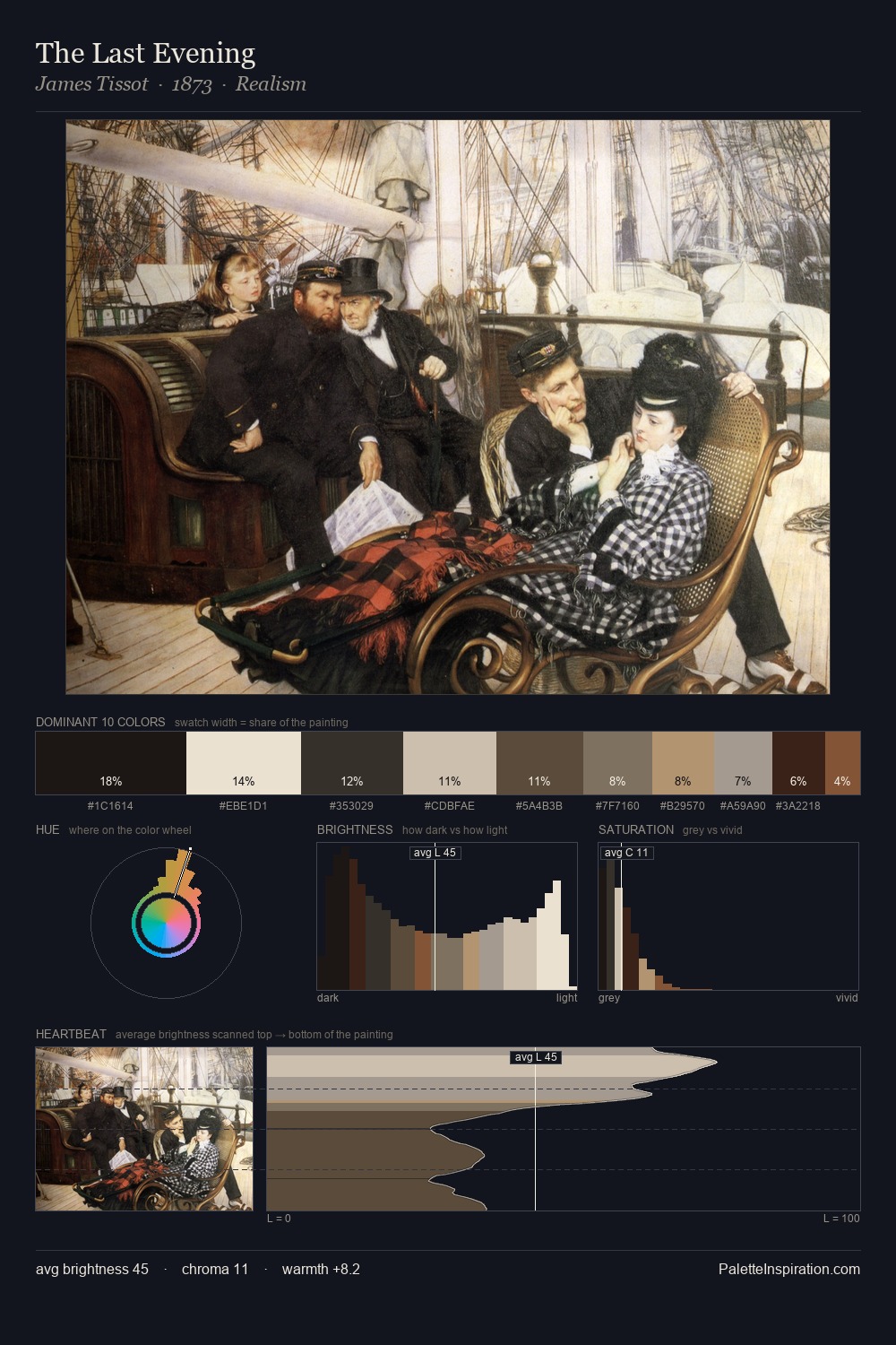
Henrietta Rae keeps values measured and balanced, a hallmark of tonal restraint. Yellow, ochre, sienna: warm hues that Henrietta Rae deploys as the palette's primary energy. Saturation is deliberately withheld - the beauty here lies in the near-monochromatic gradations rather than colour difference. The dominant colour, #1E1C1A, takes 26.0% of the total area, establishing the overall mood before any other hue is introduced. #DABE9D delivers the chromatic peak at only 5.9% - a small shot of colour with outsized visual impact. 69 units of value range underpin the palette's structural clarity: the eye always knows where light falls. This is palette 1 of Henrietta Rae's sequence - a single chapter in a chromatic story told across many works.
Example use cases
- theater design
- jewelry brands
- tobacco-adjacent retail
- event branding
- film & entertainment
I Love This!
Use This Palette
Copy, export, or download for your project
Copy, export, or download for your project
Copy:
Download:
Share: