Alexei Korzukhin Palette 4

Palette Analysis
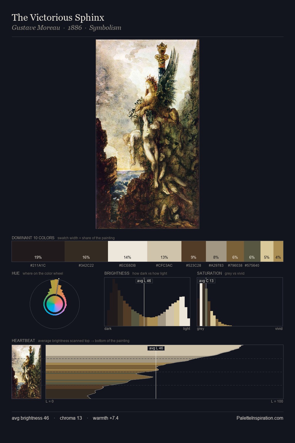
Values in Alexei Korzukhin rest in the mid-range - neither dramatically lit nor steeped in shadow. Alexei Korzukhin tilts toward cool - blues and silver-greys carry the structural weight. Saturation is deliberately withheld - the beauty here lies in the near-monochromatic gradations rather than colour difference. #1E1E1C claims 29.8% of the surface, functioning as the work's tonal foundation. The highest-chroma note - #CCC19B - appears at just 7.2%, deployed as a precision accent against the quieter ground. From deepest dark to palest light, the palette traverses 70 units of the value scale - a span that creates natural depth. The mid-to-high key, cool bias, and moderate chroma point to outdoor observation - sky and diffused daylight as the dominant light source. Alexei Korzukhin's palette 4 carries its own internal logic while remaining in conversation with the artist's broader colour intelligence.
Example use cases
- theater design
- jewelry brands
- tobacco-adjacent retail
- event branding
- film & entertainment
I Love This!
Copy, export, or download for your project