Alexei Korzukhin Palette 7

Palette Analysis
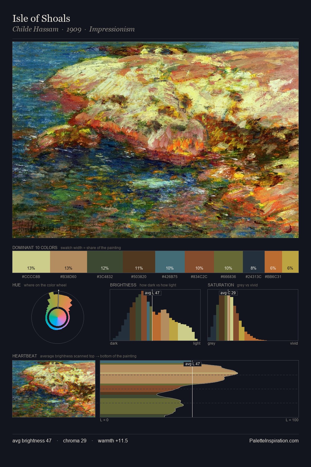
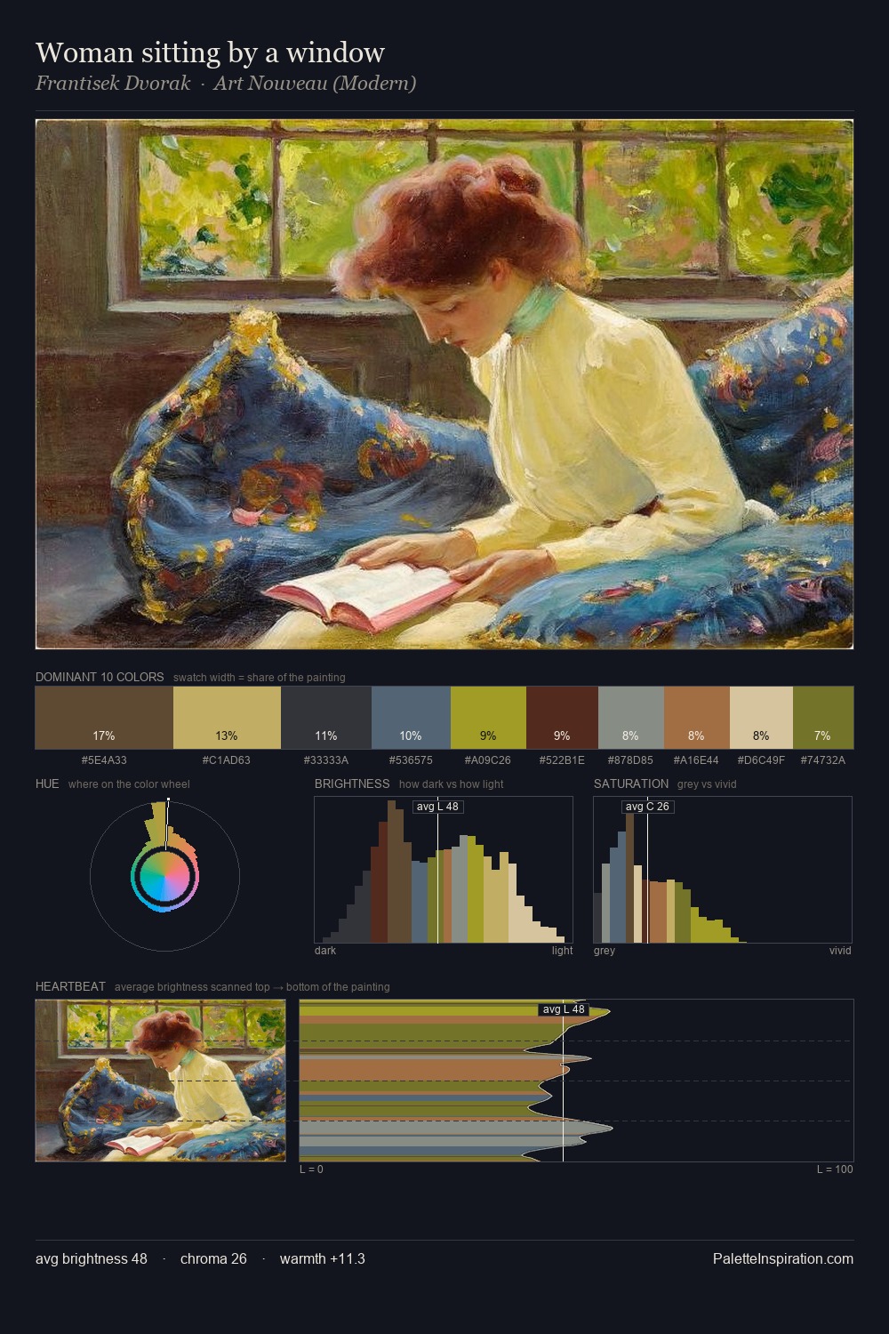
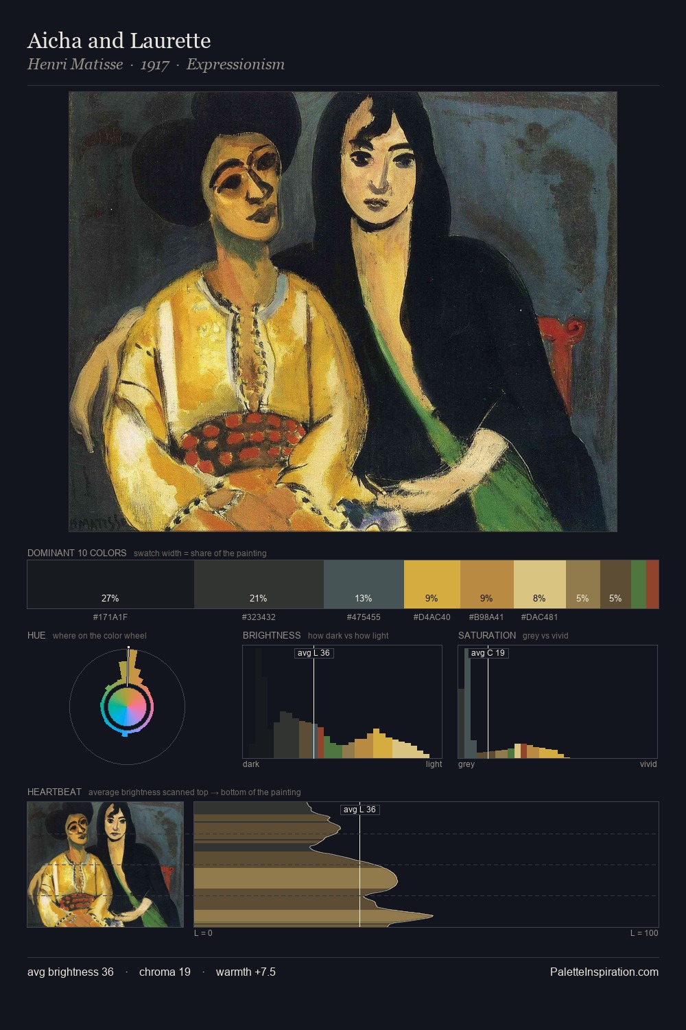
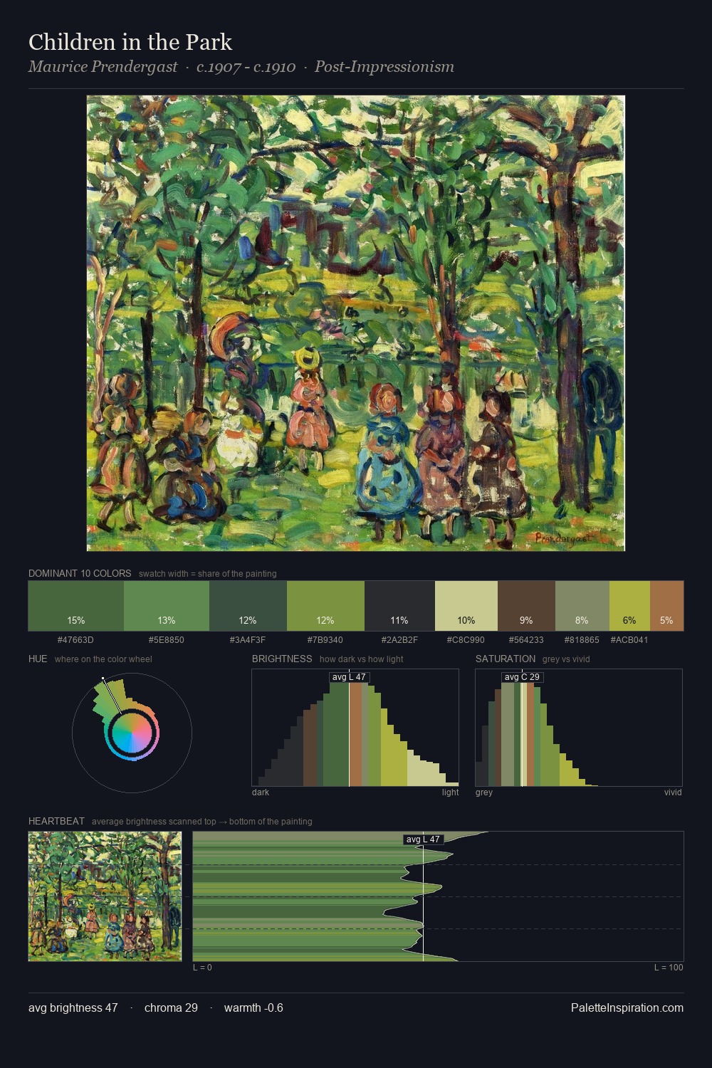
Alexei Korzukhin keeps values measured and balanced, a hallmark of tonal restraint. Alexei Korzukhin tilts toward cool - blues and silver-greys carry the structural weight. Muted throughout, the palette achieves its effects through value and temperature rather than chromatic force. The highest-chroma note - #B9AA2E - appears at just 2.4%, deployed as a precision accent against the quieter ground. From deepest dark to palest light, the palette traverses 62 units of the value scale - a span that creates natural depth. The mid-to-high key, cool bias, and moderate chroma point to outdoor observation - sky and diffused daylight as the dominant light source. Palette 7 sits within the larger chromatic argument that Alexei Korzukhin's complete body of work advances.
Example use cases
- publishing
- corporate identity
- consumer apps
- hospitality
- design agencies
I Love This!
Copy, export, or download for your project