Joshua Reynolds Master Palette

Palette Analysis
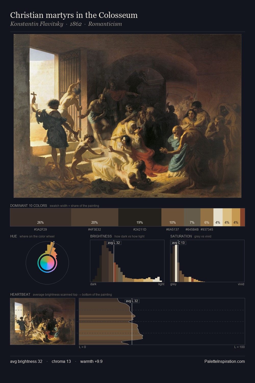
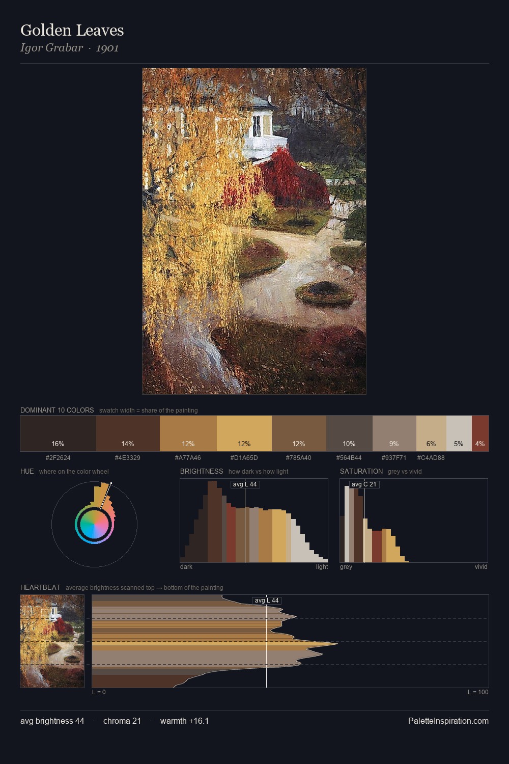
Joshua Reynolds keeps values measured and balanced, a hallmark of tonal restraint. Temperature reads distinctly warm: the reds and earth tones from Joshua Reynolds carry the compositional weight. Saturation is deliberately withheld - the beauty here lies in the near-monochromatic gradations rather than colour difference. The dominant colour, #191617, takes 27.9% of the total area, establishing the overall mood before any other hue is introduced. At 3.4%, #D5AE58 carries the palette's sharpest chromatic charge: an accent that earns its place precisely because it is withheld. At 64 units of value range, the palette has the tonal breadth to sustain complex spatial readings. Taken together, these qualities constitute Joshua Reynolds's chromatic voice - distinctive enough to be read across an entire body of work.
Example use cases
- theater design
- jewelry brands
- tobacco-adjacent retail
- event branding
- film & entertainment
I Love This!
Copy, export, or download for your project