Hendrick Terbrugghen Master Palette

Palette Analysis
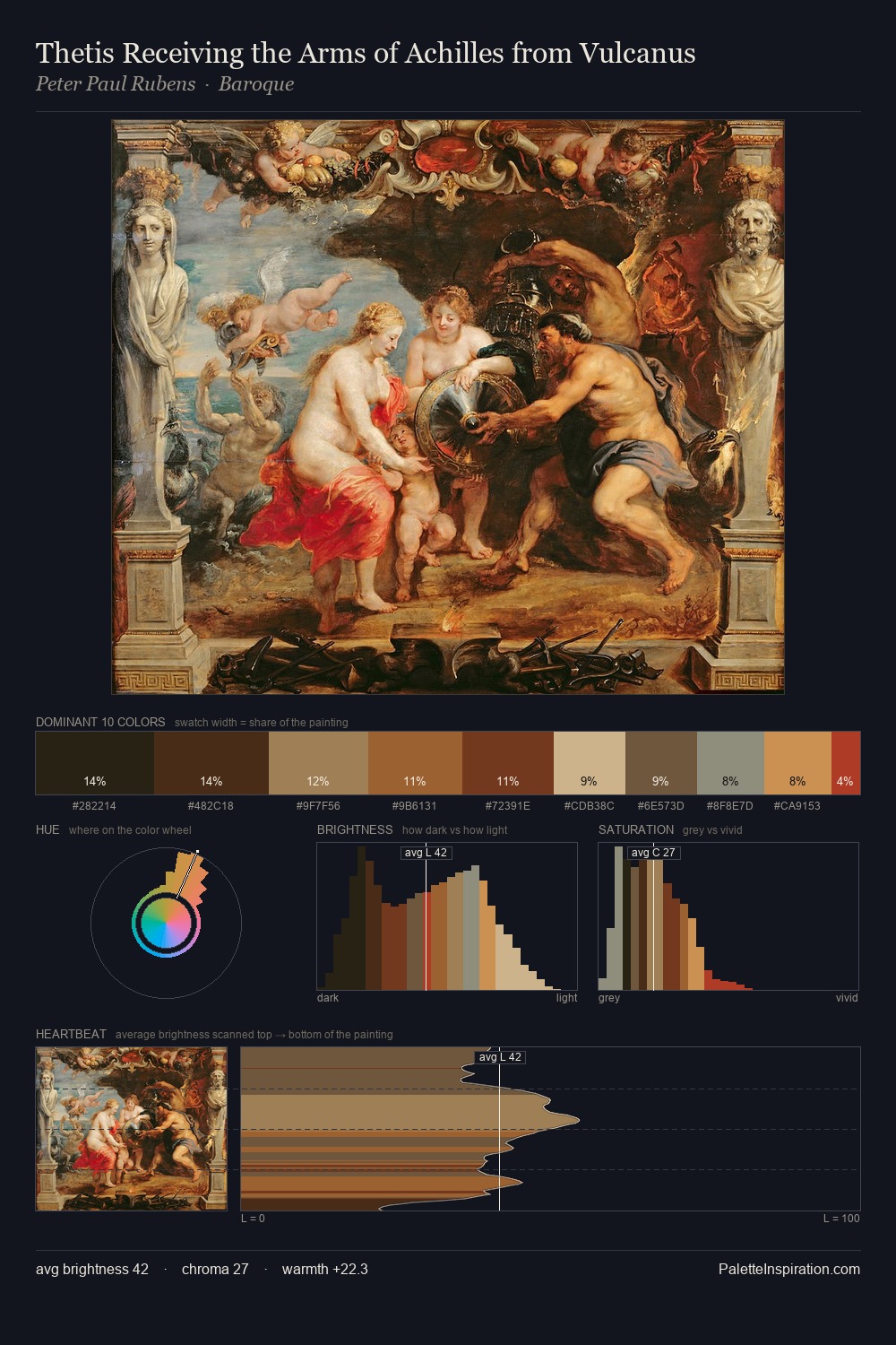
Mid-key values give Hendrick Terbrugghen its characteristic quietness - nothing blazes, nothing disappears. Warm hues command this palette; Hendrick Terbrugghen favours the reds, oranges, and yellows of firelight and earth. The absence of saturated colour is itself an expressive choice: this is a palette of restraint and atmosphere. 25.5% of the palette belongs to #231A15, a concentration that makes it the unmistakable visual centre. #9F2D12 delivers the chromatic peak at only 2.0% - a small shot of colour with outsized visual impact. A value spread of 58 units gives the palette both depth and air - shadows are genuinely dark, lights genuinely light. These proportions encode Hendrick Terbrugghen's instinctive sense of how much of each quality the eye can hold.
Example use cases
- theater design
- jewelry brands
- tobacco-adjacent retail
- event branding
- film & entertainment
I Love This!
Copy, export, or download for your project