Hendrick Terbrugghen Palette 1

Palette Analysis
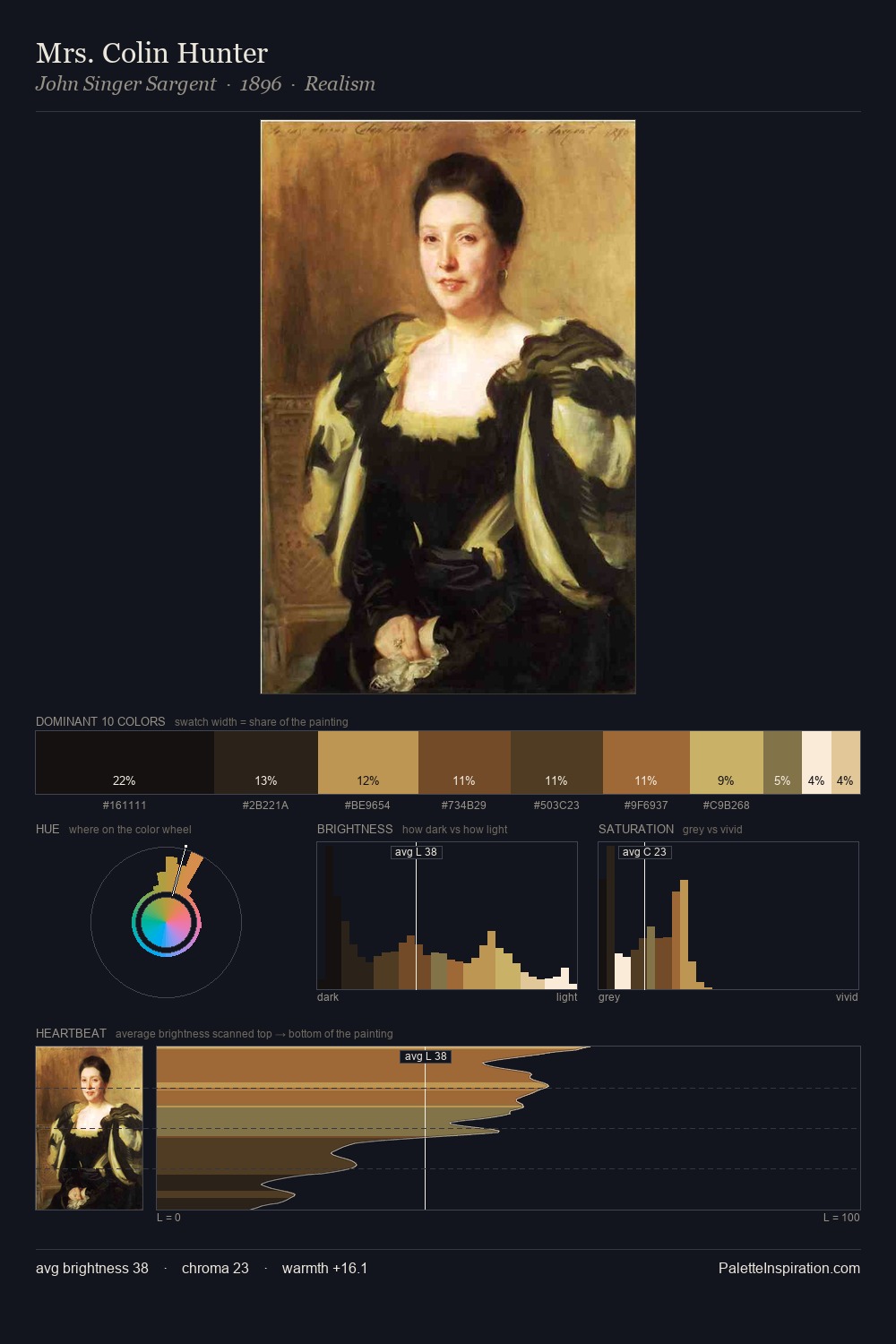
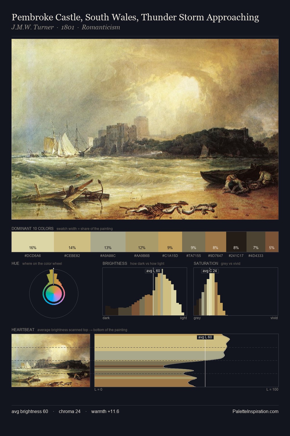
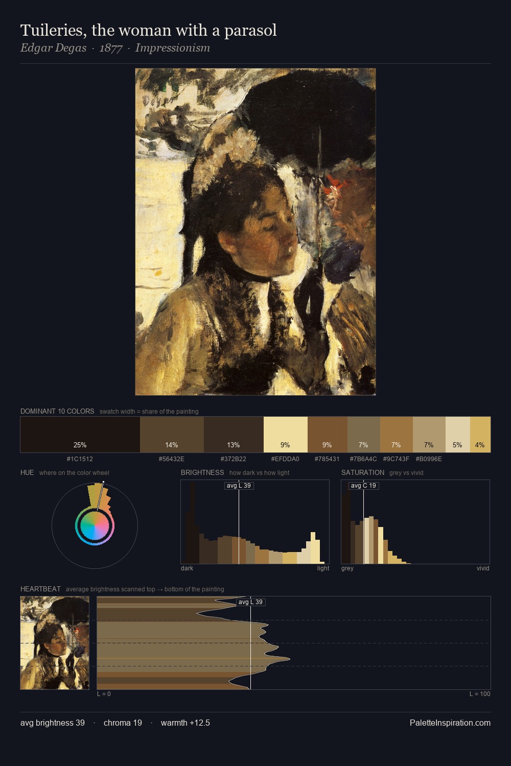
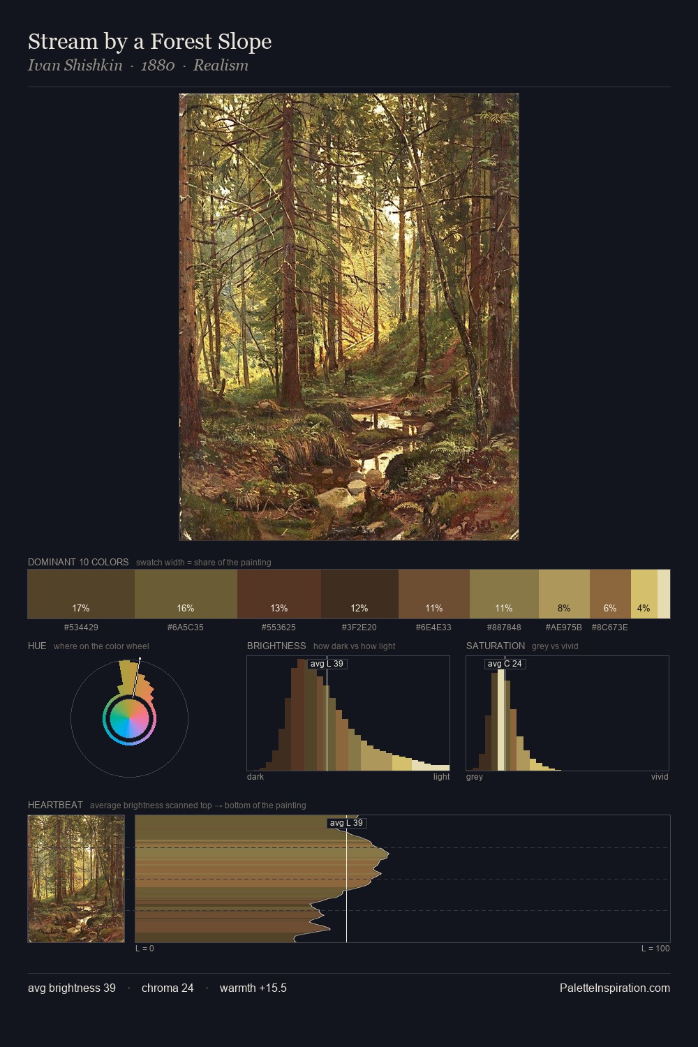
The value structure of Hendrick Terbrugghen is mid-key: quiet, controlled, and cohesive. Hendrick Terbrugghen tilts toward cool - blues and silver-greys carry the structural weight. Chroma is moderate: colours carry enough saturation to be read as colour, but the palette stops well short of garish intensity. The most saturated colour, #DBD3A0, covers 9.3% of the surface: too much to call an accent, too strong to ignore. The value range spans 58 units across the palette, providing the full gamut from deep shadow to near-white and ensuring clear tonal hierarchy. High luminosity and cool temperature suggest the plein-air condition: unfiltered daylight and open sky. Palette 1 sits within the larger chromatic argument that Hendrick Terbrugghen's complete body of work advances.
Example use cases
- publishing
- corporate identity
- consumer apps
- hospitality
- design agencies
I Love This!
Copy, export, or download for your project