Hendrick Terbrugghen Palette 8
Nocturnal Umber
Nocturnal Night-register palette - very low values, the world after dark.
Umber Dark earthy brown - raw or burnt umber, a foundational old-master earth pigment.

Palette Analysis
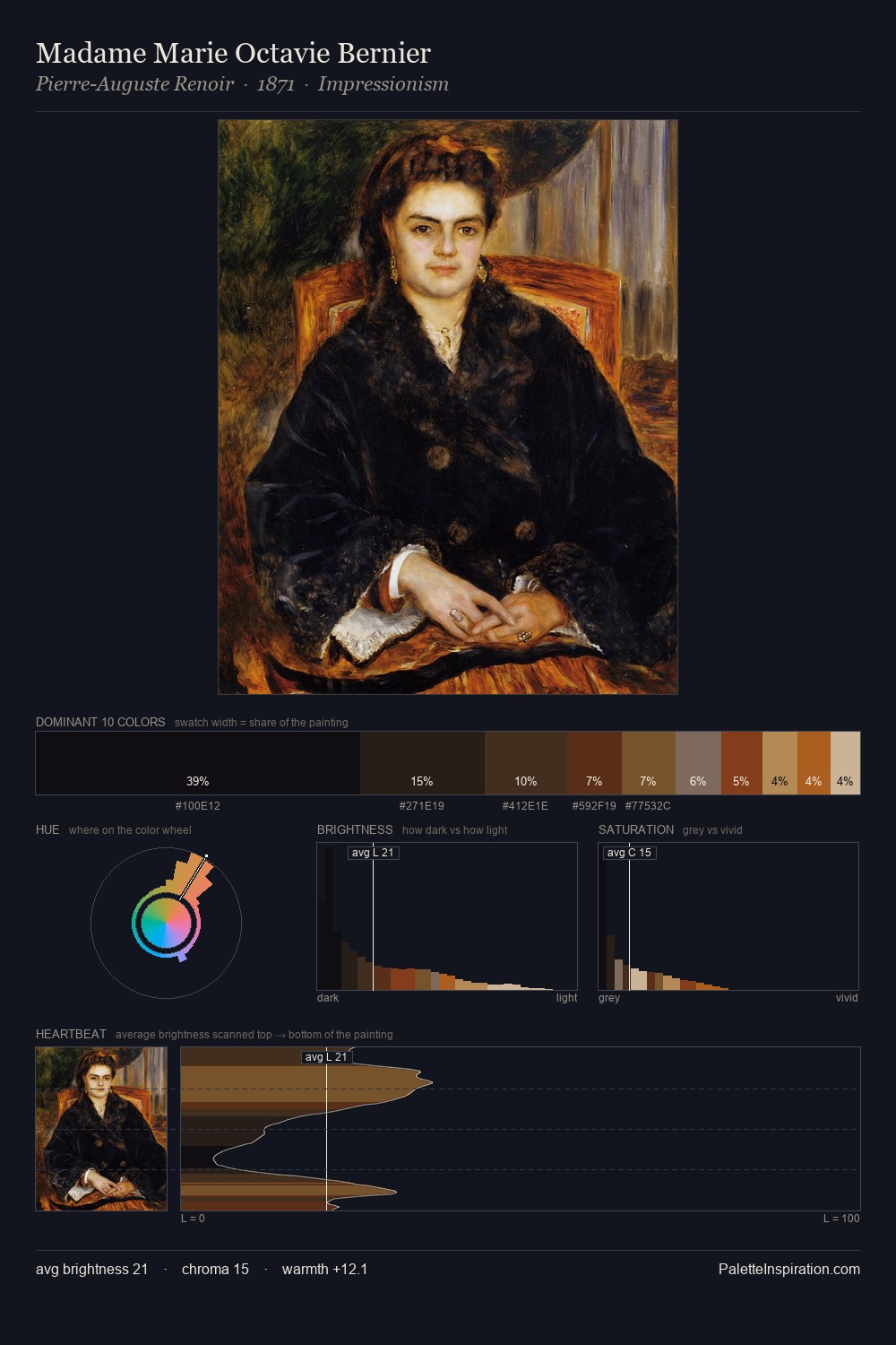
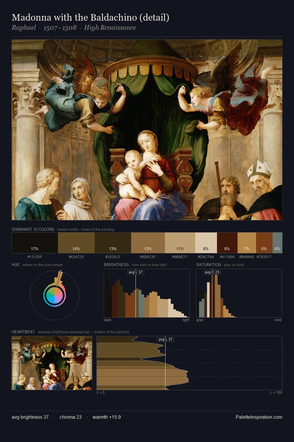
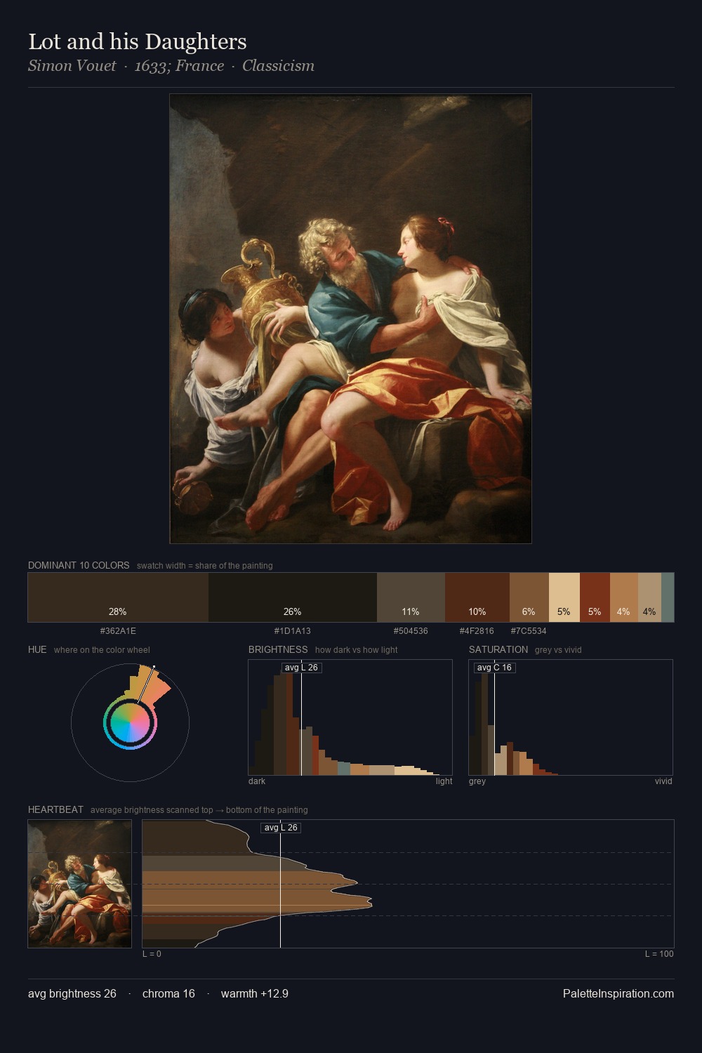
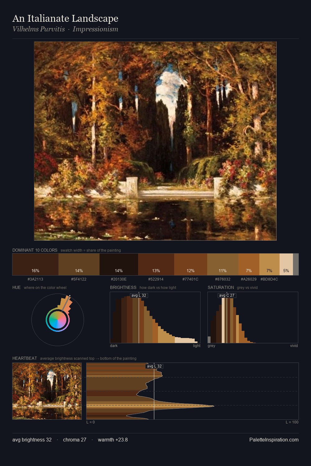
Hendrick Terbrugghen occupies the comfortable middle of the value scale, avoiding both extremes to hold the eye in a sustained middle grey. Hendrick Terbrugghen orchestrates warmth above all else - reds, ambers, and siennas take the lead. All colours lean toward grey, building depth through value rather than colour punch. The most saturated colour, #4F220E, is reserved to 4.9% of the surface, where it acts as a focal punctuation. From deepest dark to palest light, the palette traverses 67 units of the value scale - a span that creates natural depth. In the context of Hendrick Terbrugghen's full range of palettes, group 8 represents one movement in an ongoing chromatic dialogue.
Example use cases
- theater design
- jewelry brands
- tobacco-adjacent retail
- event branding
- film & entertainment
I Love This!
Use This Palette
Copy, export, or download for your project
Copy, export, or download for your project
Copy:
Download:
Share: