Heinrich Hansen Master Palette

Palette Analysis
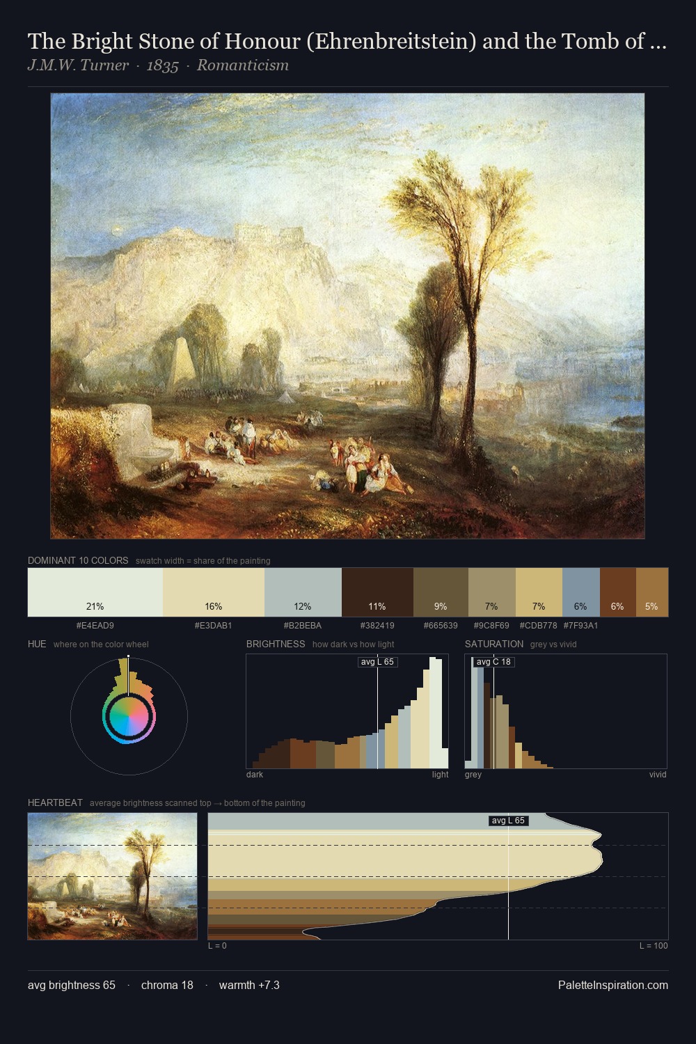
Heinrich Hansen sits in the centre of the value range, lending the palette a sense of even, sustained light. Heinrich Hansen tilts toward cool - blues and silver-greys carry the structural weight. Chroma hovers near zero; colour declares itself through subtle shifts in hue rather than outright saturation. At 27.5%, #3C2E23 functions less as a colour accent and more as a complete atmospheric environment. #A87F43 functions as the palette's exclamation mark: highest chroma, lowest percentage (3.9%). 55 units of value range underpin the palette's structural clarity: the eye always knows where light falls. The mid-to-high key, cool bias, and moderate chroma point to outdoor observation - sky and diffused daylight as the dominant light source. These proportions encode Heinrich Hansen's instinctive sense of how much of each quality the eye can hold.
Example use cases
- ceramics & pottery
- boutique hospitality
- menswear
- heritage food brands
- craft & artisan brands
I Love This!
Copy, export, or download for your project