Heinrich Hansen Palette 4

Palette Analysis
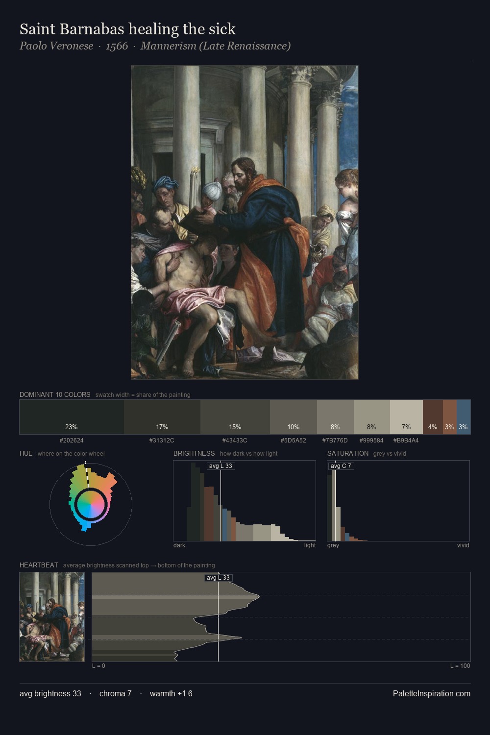
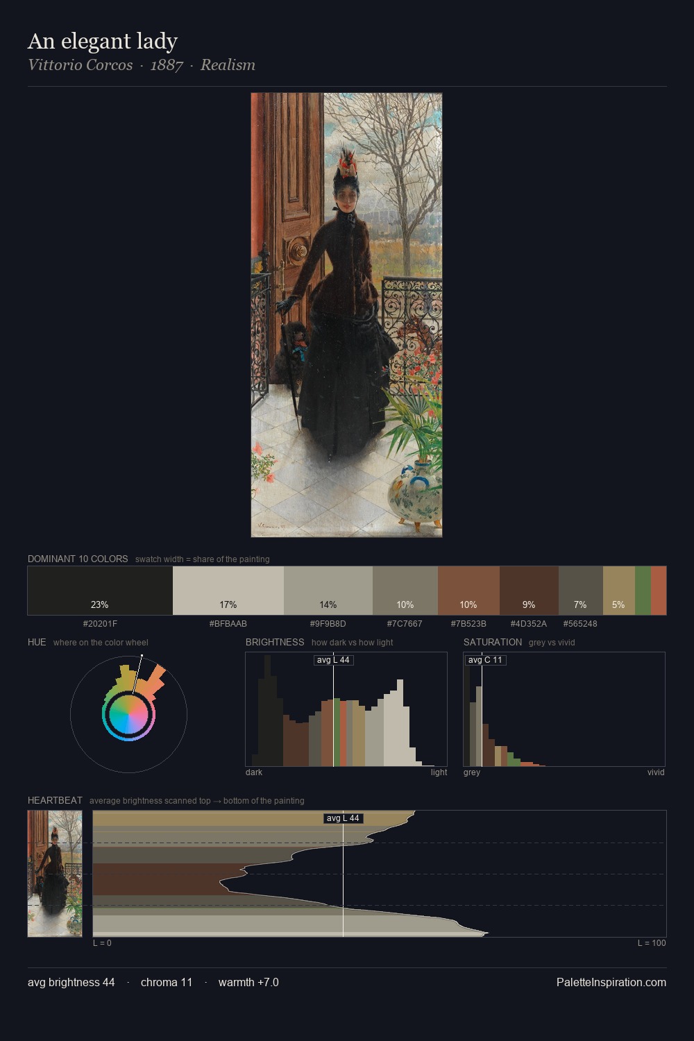
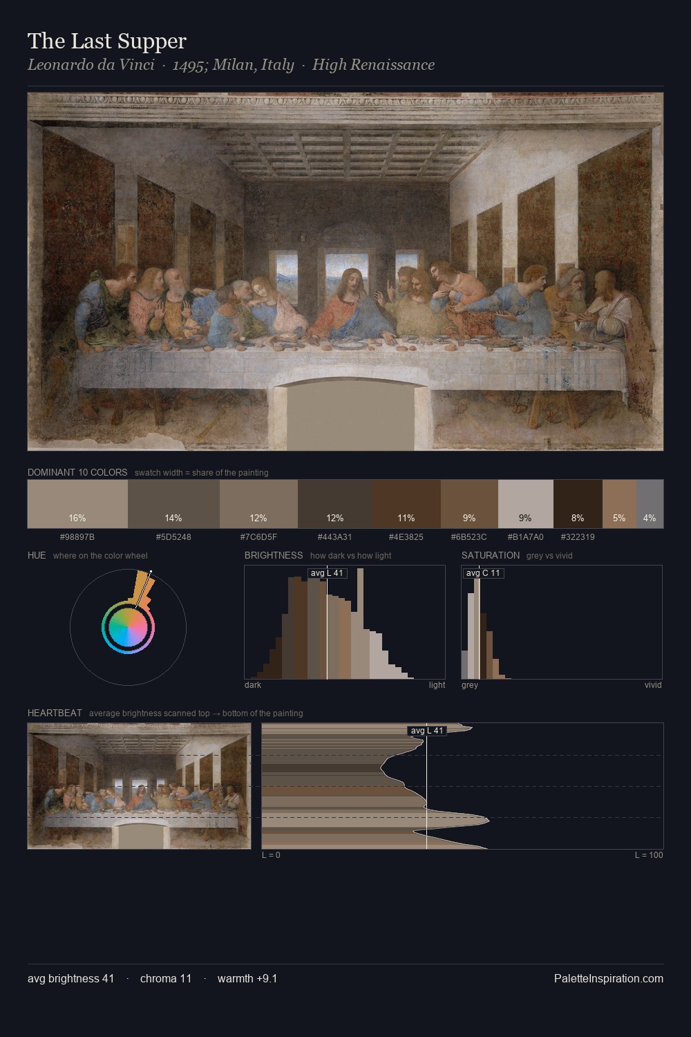
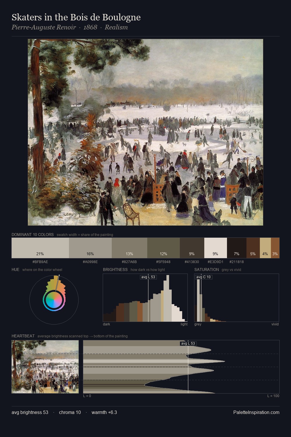
Heinrich Hansen occupies the comfortable middle of the value scale, avoiding both extremes to hold the eye in a sustained middle grey. Blues and teal-greys govern the palette, lending it an aquatic or atmospheric quality. Chroma is kept low across all colours, producing the soft, enveloping quality that characterises tonal painting. #504B43 at 34.0% of the palette: an overwhelming presence that pulls all other colours into its gravitational field. The saturated accent, #6E5542, registers at 1.9% - sparse enough to feel like a deliberate surprise. The value range of 41 units sits in the comfortable middle: enough depth, enough light, neither extreme. High luminosity and cool temperature suggest the plein-air condition: unfiltered daylight and open sky. Heinrich Hansen's palette 4 carries its own internal logic while remaining in conversation with the artist's broader colour intelligence.
Example use cases
- theater design
- jewelry brands
- tobacco-adjacent retail
- event branding
- film & entertainment
I Love This!
Copy, export, or download for your project