Giovanni Battista Gaulli Palette 3

Palette Analysis
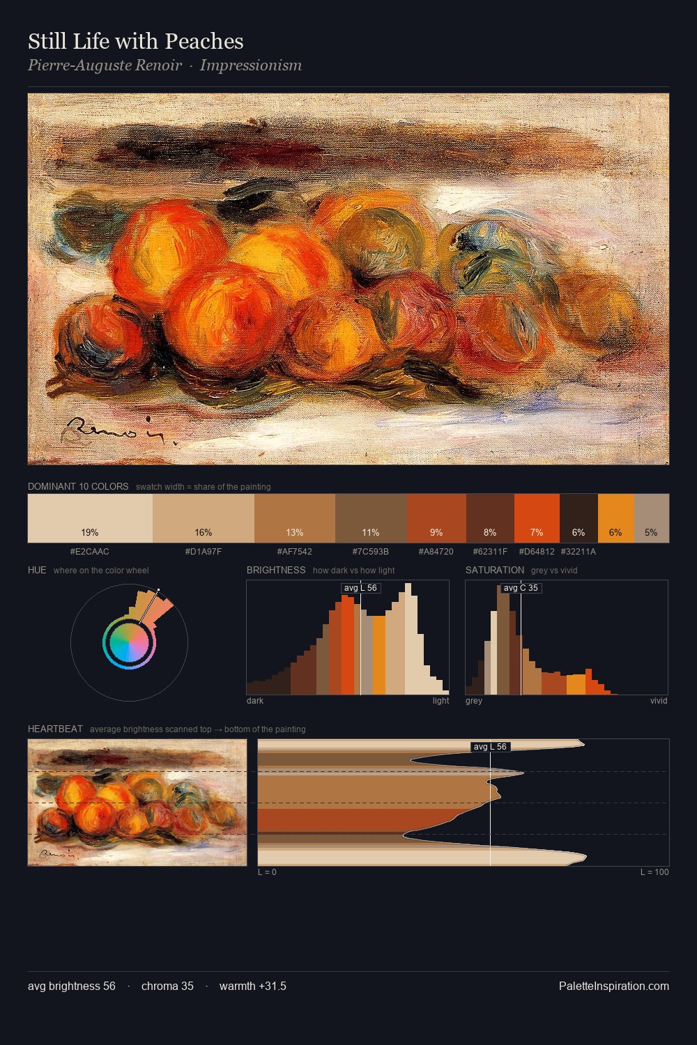
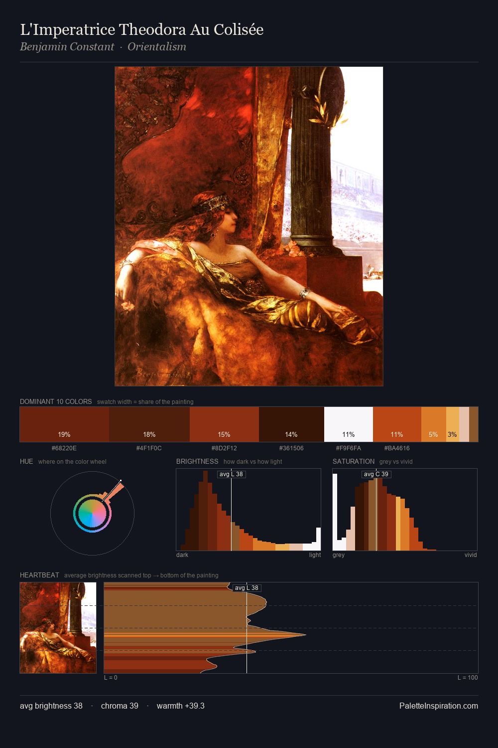
Giovanni Battista Gaulli occupies the comfortable middle of the value scale, avoiding both extremes to hold the eye in a sustained middle grey. Warm hues command this palette; Giovanni Battista Gaulli favours the reds, oranges, and yellows of firelight and earth. Colours are neither washed out nor blazing; they occupy the productive middle ground of the chroma scale. The highest-chroma note - #7F2F0F - appears at just 6.9%, deployed as a precision accent against the quieter ground. Value range is moderate at 54 units - enough contrast for legibility, not so much as to fragment the tonal unity. Giovanni Battista Gaulli's palette 3 carries its own internal logic while remaining in conversation with the artist's broader colour intelligence.
Example use cases
- publishing
- corporate identity
- consumer apps
- hospitality
- design agencies
I Love This!
Copy, export, or download for your project
Related Palettes

Giovanni Battista Gaulli Palette 1
Veiled Bisque

Giovanni Battista Gaulli Palette 2
Shadowed Parchment

Giovanni Battista Gaulli Palette 4
Shadowed Bister

Giovanni Battista Gaulli Palette 5
Shadowed Caramel

Giovanni Battista Gaulli Palette 6
Tenebrous Sienna

Giovanni Battista Gaulli Palette 7
Shadowed Caramel