George Romney Palette 17

Palette Analysis
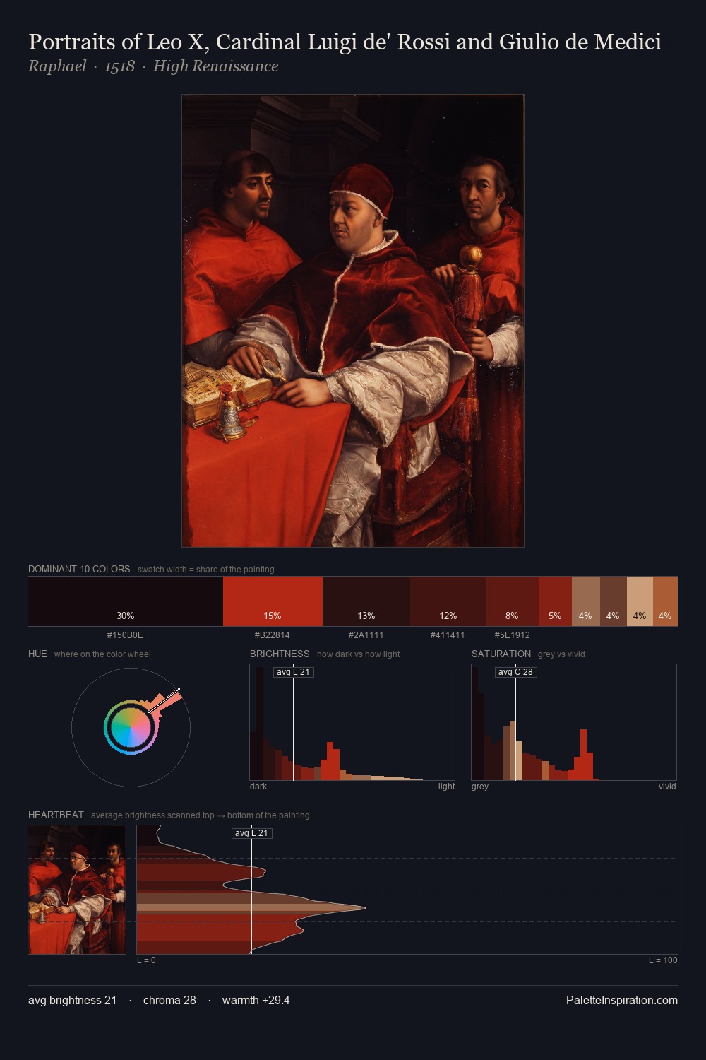
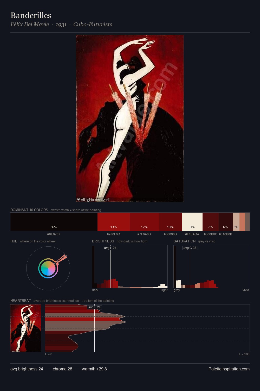
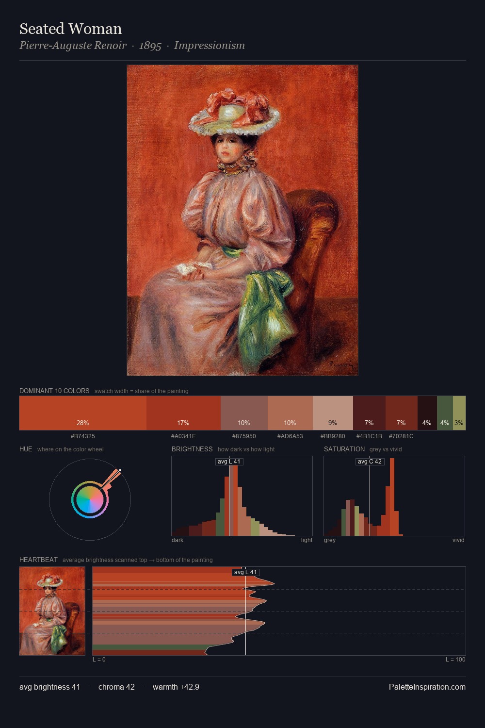
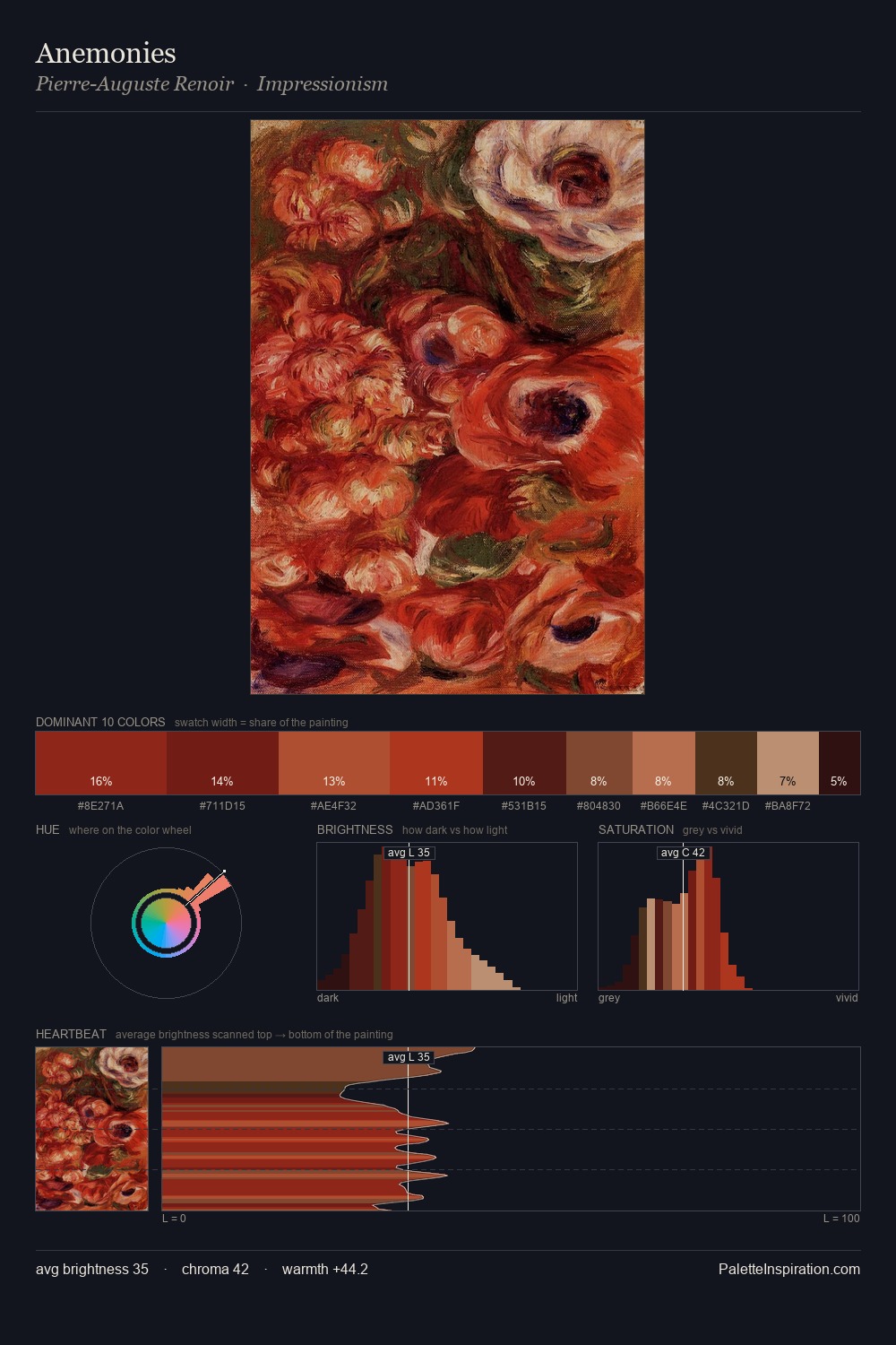
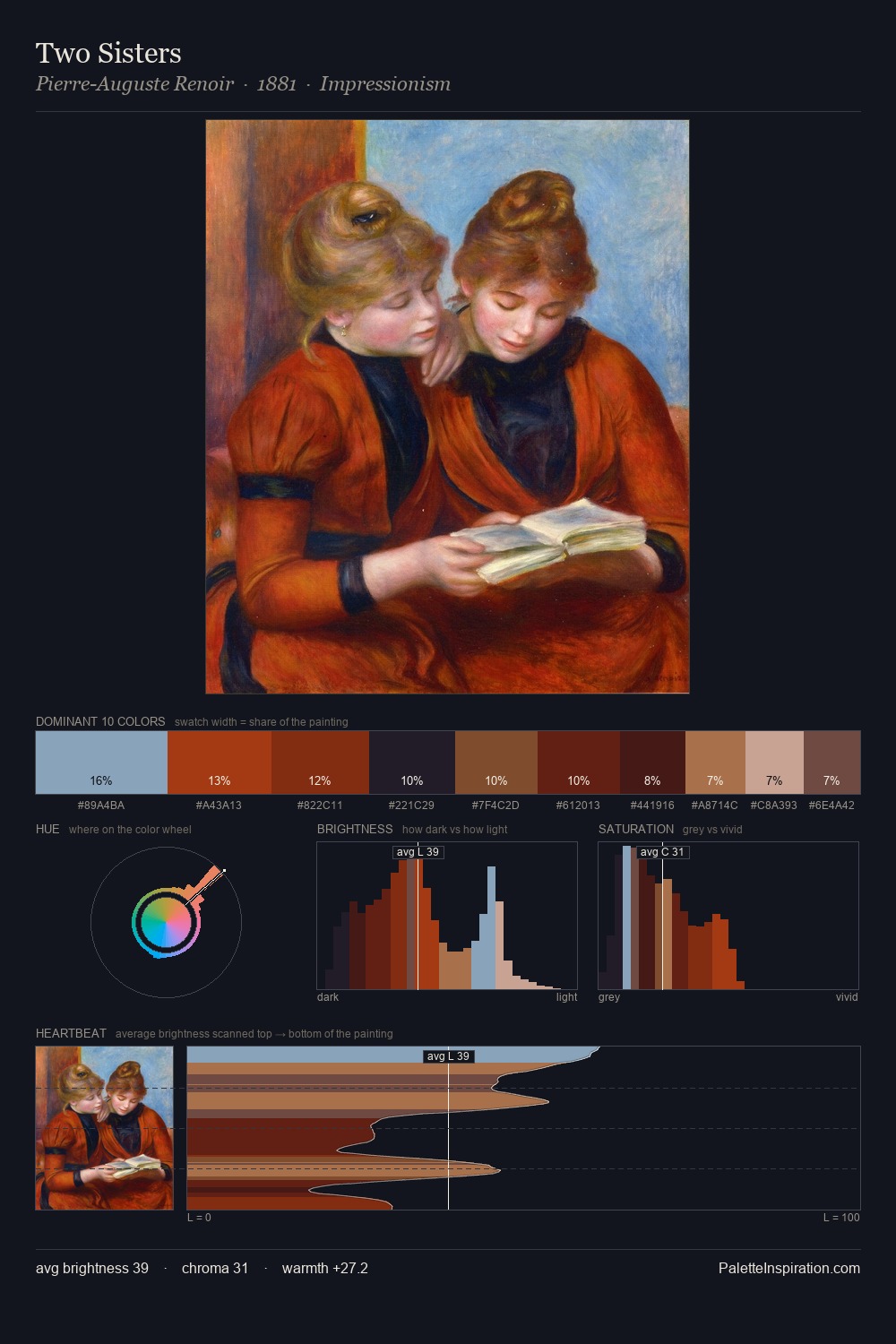
The palette of George Romney sits in the lower register of the value scale - dense, contained, and weighted. Warmth dominates - the palette of George Romney leans heavily on the yellow-orange-red arc of the colour wheel. Mid-range chroma keeps the palette grounded - colourful but not strident. A single dominant - #1A0A07 at 42.5% - sets the character of the whole composition. #A11806 delivers the chromatic peak at only 5.1% - a small shot of colour with outsized visual impact. At 56 units of value range, the palette has the tonal breadth to sustain complex spatial readings. These are the values of the Baroque studio - rich darks, measured warmth, controlled saturation. Palette 17 sits within the larger chromatic argument that George Romney's complete body of work advances.
Example use cases
- theater design
- jewelry brands
- tobacco-adjacent retail
- event branding
- film & entertainment
I Love This!
Copy, export, or download for your project