George Frederick Watts Master Palette
Shadowed Caramel
Shadowed Low-key - values weighted toward shadow, the palette of dim interiors and overcast skies.
Caramel Warm mid-brown - the color of cooked sugar, smooth and amber-toned.

Palette Analysis
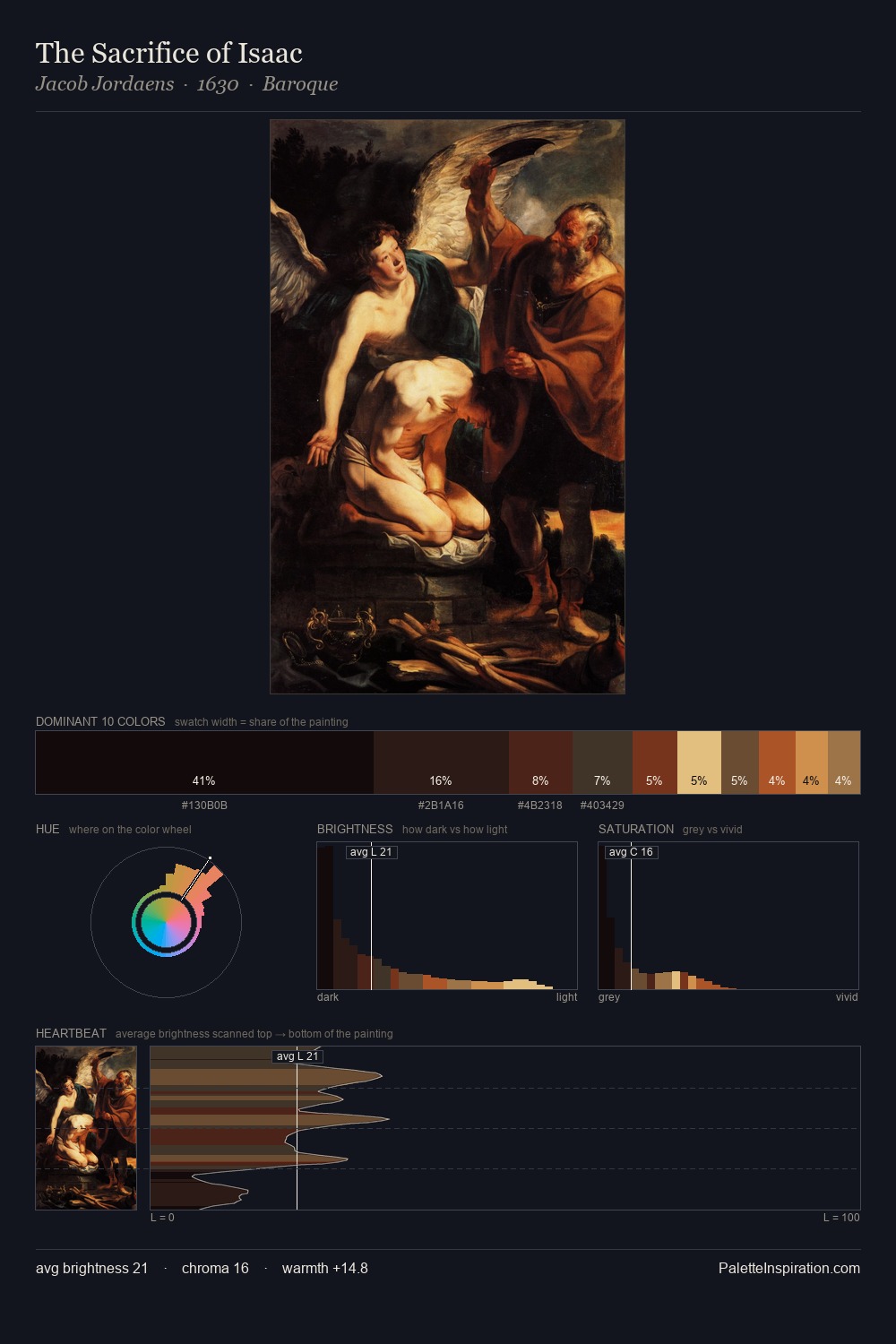
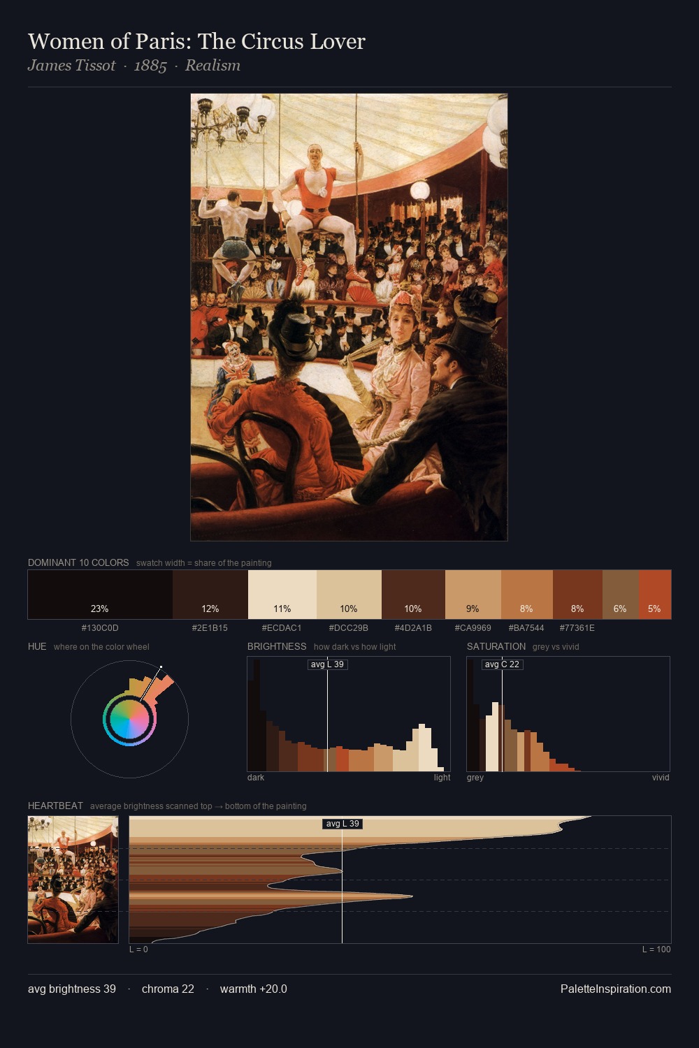
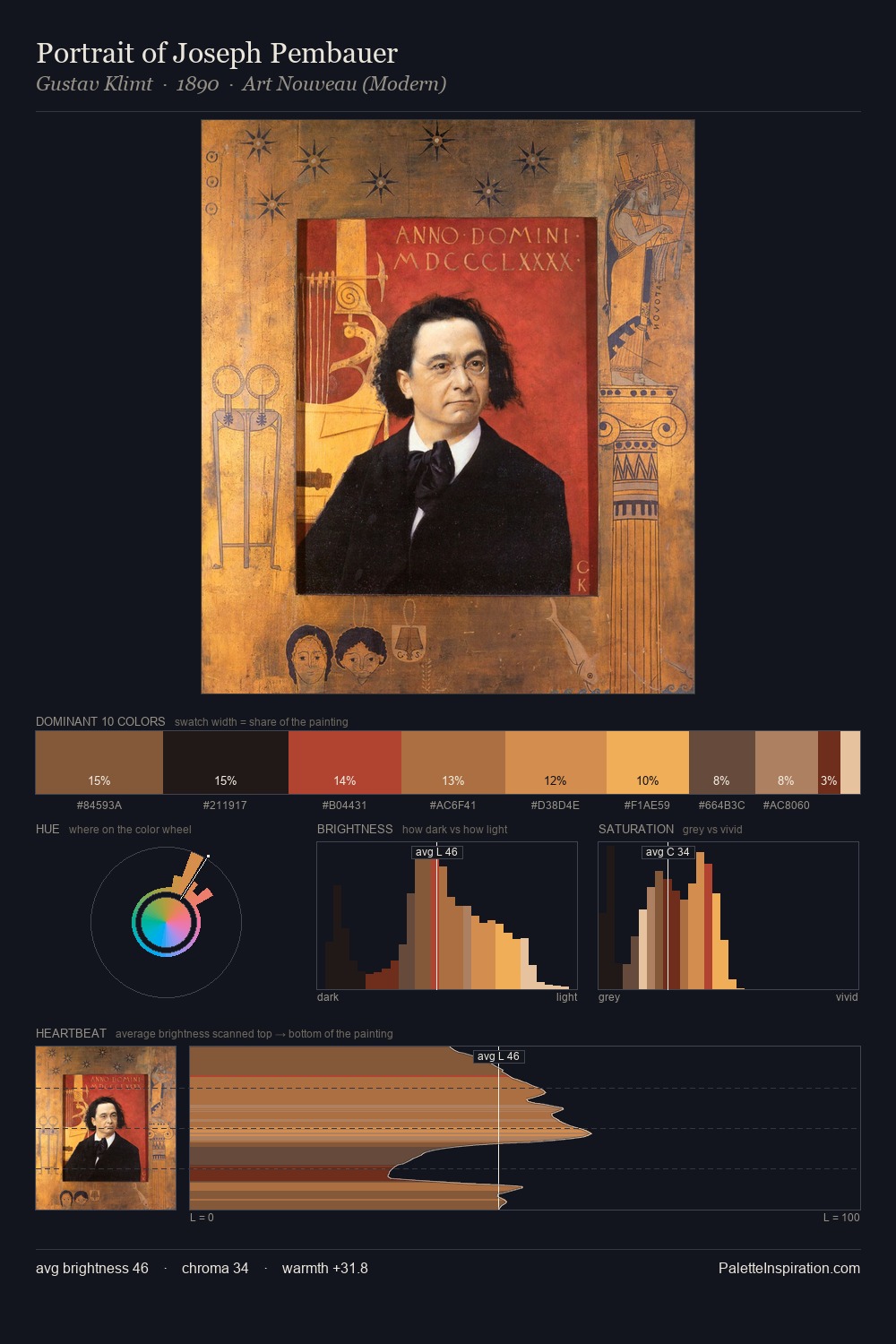
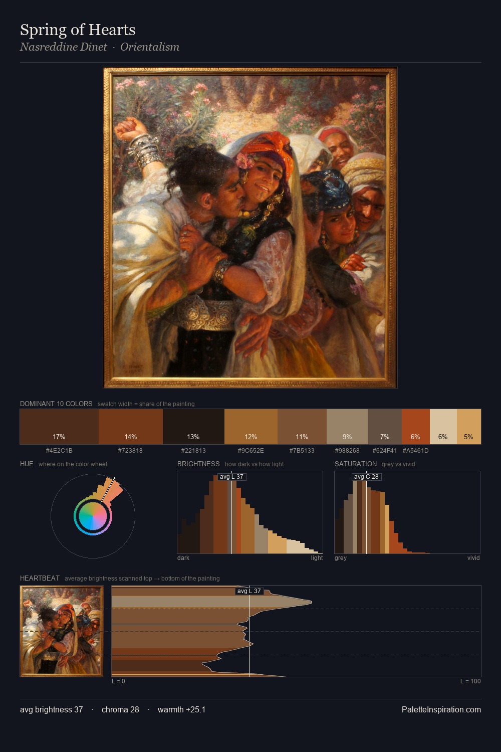
Values in George Frederick Watts rest in the mid-range - neither dramatically lit nor steeped in shadow. George Frederick Watts orchestrates warmth above all else - reds, ambers, and siennas take the lead. All colours lean toward grey, building depth through value rather than colour punch. At 10.8%, #C98944 carries the palette's sharpest chromatic charge: an accent that earns its place precisely because it is withheld. From deepest dark to palest light, the palette traverses 62 units of the value scale - a span that creates natural depth. These proportions encode George Frederick Watts's instinctive sense of how much of each quality the eye can hold.
Example use cases
- premium streaming
- cocktail bars
- fashion campaigns
- book covers
- music labels
I Love This!
Use This Palette
Copy, export, or download for your project
Copy, export, or download for your project
Copy:
Download:
Share: